Singapore-based Firmus Technologies has been recognised with the Asia Pacific Data Centre Project of the Year award for its AI Factory facility. The facility stands out for its advanced infrastructure and focus on energy efficiency, reflecting broader efforts to meet the rising demands of AI computing…
Why You Should Give Avid Titler+ Another Chance: A Comprehensive Update

In this article by Kevin P. McAuliffe for ProVideo Coalition, the author delves into Avid’s latest update to Titler+, addressing its controversial history and new enhancements with the Media Composer 2024.10 update. The piece encourages editors to reconsider their stance on Titler+ and highlights why this tool is now worth exploring.
The story begins with the challenges that led to the development of Titler+. Avid needed a replacement for its legacy Title Tool and Marquee, both of which became obsolete on updated Mac systems. However, the original release of Titler+ was plagued with issues, resulting in widespread dissatisfaction. With the 2024.10 update, Avid has revamped Titler+, promising a smoother, more intuitive experience for editors who rely on Media Composer for their productions.

One of the most significant changes in Titler+ is its shift to a generator-based title system, aligning with tools like Adobe Premiere Pro and DaVinci Resolve. Titles are no longer tied to physical media, meaning that once a title is removed from the timeline, it cannot be recovered. While this approach introduces flexibility, it also requires careful workflow adjustments. Editors are advised to avoid attaching titles directly to timeline media and to use separate edits for greater control.
Titler+ also introduces a host of user-friendly features, including a streamlined interface and enhanced compatibility with Media Composer’s Effect Editor. The new Anchor Point Tool offers greater precision when positioning text, and the dynamic scaling capabilities ensure that even large text remains crisp, thanks to vector-based rendering. These improvements resolve many of the issues from earlier iterations of the tool, such as inconsistent anchor point behaviors and subpar text quality at larger sizes.

Additionally, Titler+ now features a Foreground parameter, which simplifies animation across multiple titles in a frame. This feature allows for cohesive effects like fades or wipes for all elements simultaneously. However, McAuliffe notes that the tool lacks feathering for its crop parameters—a feature many editors would find useful.
Other updates include improved font support, enhanced cross-platform compatibility, and more efficient workflows for creating rolls and crawls. While some editors, including McAuliffe, may prefer tools like After Effects for advanced titling and logo integration, the improvements in Titler+ make it a strong contender for simpler projects directly within Media Composer.
McAuliffe concludes by acknowledging Avid’s initial missteps but emphasizes that Titler+ has now become a reliable tool for modern editors. With the latest updates, Avid has significantly bridged the gap between Titler+ and its competitors, making it a worthwhile addition to any editor’s toolkit.
Read the full article by Kevin P. McAuliffe for ProVideo Coalition HERE
Learn more about Avid Media Composer below:
How NETGEAR ProAV Switches Revolutionize AV over IP Networking

In this article by Patrik Lindahl, the transformative impact of Netgear ProAV switches on the AV industry is thoroughly explored. The post delves into how traditional AV installations relied on isolated networks for basic device communication, a practice that changed as AV technology evolved. The integration of IT innovations like Dante and other proprietary protocols, alongside standards such as AES67, increased the complexity of AV systems, making networking an essential component of modern installations.
A significant shift occurred with the move from HDBaseT to AV over IP (AVoIP), which introduced challenges for managing network traffic. This transition required AV professionals to grapple with concepts like IGMP snooping and increased bandwidth demands, creating hurdles for both AV and IT specialists. Between 2017 and 2018, the industry faced widespread confusion as it adapted to these new demands.
Netgear addressed these challenges by developing its ProAV switches, including the M4250, M4300, M4350, and M4500 models. The introduction of IGMP Plus, Netgear’s proprietary enhancement of the IGMP protocol, revolutionized how multicast traffic is handled across switches. In collaboration with major AVoIP hardware manufacturers, Netgear also created device-specific configuration profiles, streamlining network setup for AV professionals and improving performance.
The blog emphasizes the real-world benefits of Netgear’s solutions, as shared by Lindahl, who works in AV product support. He illustrates how Netgear switches often help demonstrate the ideal network setup to clients, leading to smoother installations and increased satisfaction. Lindahl also mentions his creation of instructional videos designed to help AV professionals configure Netgear ProAV switches, whether for isolated networks or multi-switch setups, ensuring seamless synchronization.
This article positions Netgear as a pivotal player in solving modern AV networking challenges, making its ProAV switches a must-have for professionals navigating the complexities of AVoIP. By integrating keywords like Netgear ProAV switches, AV over IP solutions, and modern AV networking, this blog is optimized to reach readers searching for insights into reliable AV network solutions.
Read the full article by Patrik Lindahl HERE
Learn more about NETGEAR below:
The Sequence Knowledge #463: Wrapping Up our Series About Knowledge Distillation: Pros and Cons
9 installments in our series about knowledge distillation plus a final essay….
NVIDIA advances AI frontiers with CES 2025 announcements
NVIDIA CEO and founder Jensen Huang took the stage for a keynote at CES 2025 to outline the company’s vision for the future of AI in gaming, autonomous vehicles (AVs), robotics, and more. “AI has been advancing at an incredible pace,” Huang said. “It started with…
20+ Free Admin Dashboard Templates for Figma – Speckyboy
A great dashboard is both attractive and informative. Users should be able to get what they need effortlessly. The look should be clean and easy to understand. The result is something users want to visit time and again.
Designing a dashboard from scratch is a huge task, though. Things can get complicated in a hurry with so many widgets competing for attention. Who has the time to deal with all of this?
That’s what makes a Figma template so helpful. A beautiful and functional design is already in place. There are also components for you to use, duplicate, and customize. That means your project will be off to a running start.
Does it sound like something you could use? If so, check out our collection of free admin dashboard templates for Figma. There are options here for virtually every use case. Choose your favorite and get started!
You might also like our collection of web and mobile UI templates for Figma.
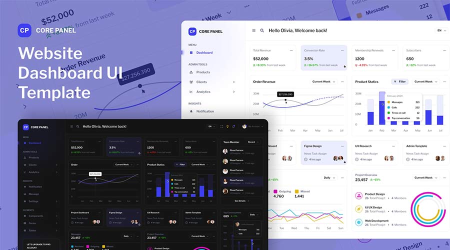
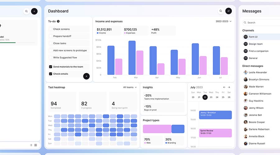
Give users an easy-to-navigate experience with this Figma UI template. It features a high-contrast color scheme, beautiful design components, and outstanding typography. Use it, and you’ll have a professional-grade dashboard in no time.

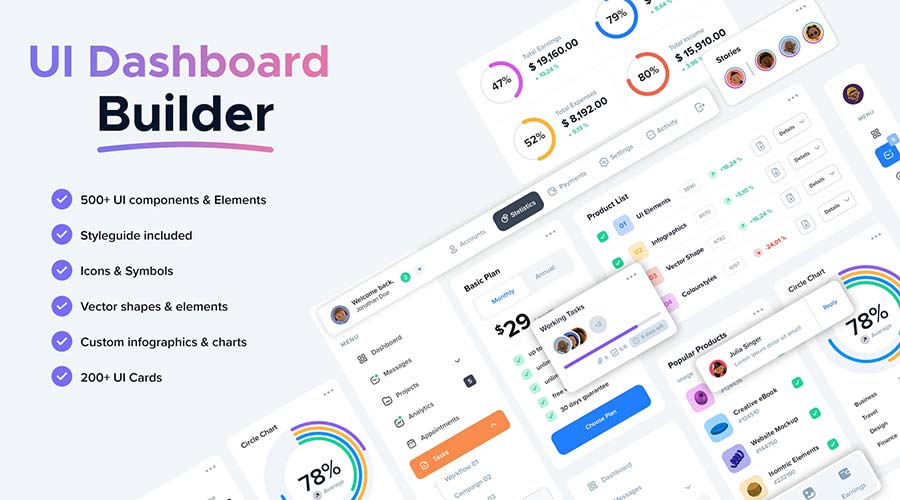
Download this Figma dashboard template and gain access to over 500 UI components. You’ll find charts, buttons, card layouts, navigation bars, and more. It provides the ultimate flexibility for your project.
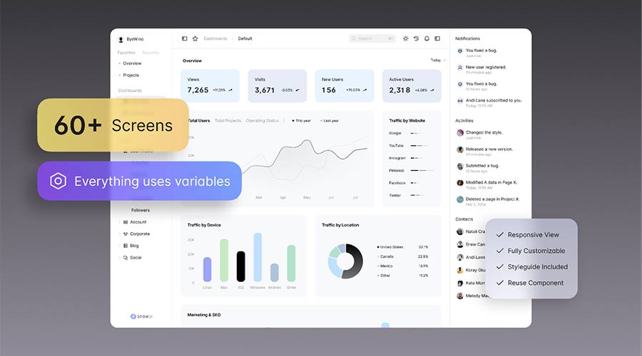
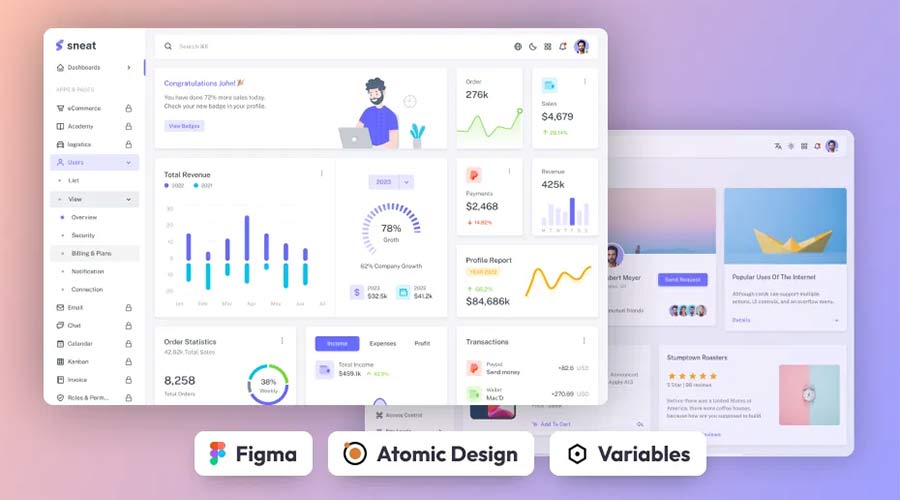
Here’s a UI kit that includes everything you need to build a dashboard layout. It includes multiple screens in both light and dark modes. It also uses Figma variables for easier customization.
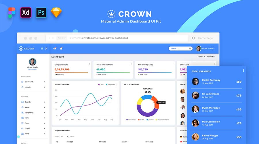
Crown is a dashboard template inspired by Material Design – Google’s open-source design system. This step makes everything seem intuitive and familiar. The components are colorful, and the layout is roomy.
This open-source dashboard template was designed to work with React. The package includes several templates and components with light and dark versions. It’s a versatile choice for building web applications.
Create an analytics-focused dashboard using this Figma template. It features a modern aesthetic and support for multiple color schemes. The template uses layers, making it easy to customize to suit your needs.
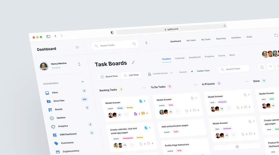
Kanban boards are great for organizing information for individuals and teams. This Figma template uses the concept to help you build a task management app. Use its clean design to improve communication and stay focused.
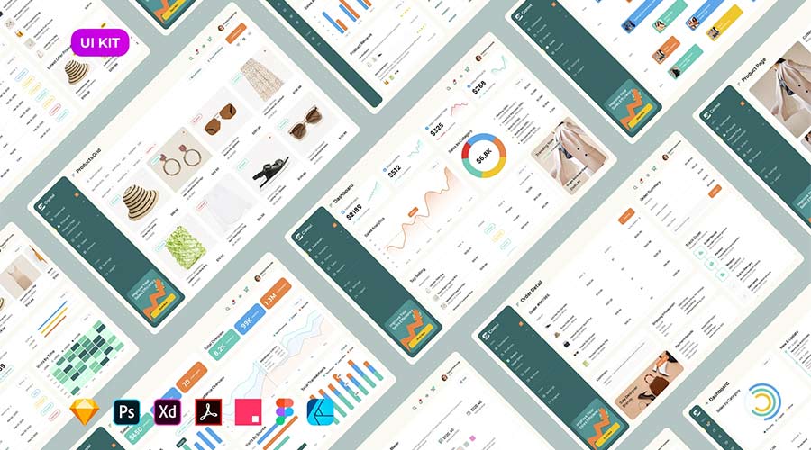
Sales Analytics Dashboard UI Kit has 16 predesigned screens for different use cases. You’ll also find plenty of widgets, well-organized layers, and an easy-to-customize setup. It’s also built for accessibility and meets WCAG 2 requirements.
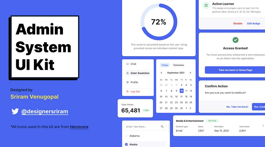
The components included in this UI kit will make your dashboard project a breeze. It’s all here: dropdowns, modal windows, navigation, charts, form elements, and more. Use them to build a custom application that’s beautiful and functional.
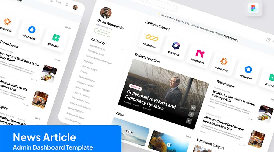
Here’s a different take on the traditional dashboard screen. NewsNet focuses on content more than statistics. That makes it a great choice for company intranets or personalized web portals. There are several creative possibilities here.
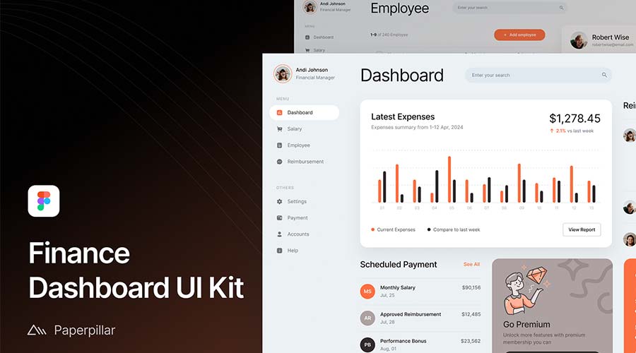
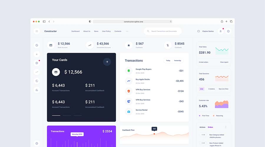
This free dashboard UI kit focuses on finance. You might use it for a company’s accounting department or as part of an employee portal. The design is clean and easy to read.
Create a custom dashboard layout in minutes using these beautifully designed component cards. Mix and match them to display an array of stats and info. These colorful cards are flexible, and many include crisp graphics.
This stylish template is perfect for use as an analytics dashboard. It includes all the basics in a simple and colorful layout. Customize it to your heart’s content. You’ll save time without sacrificing quality.
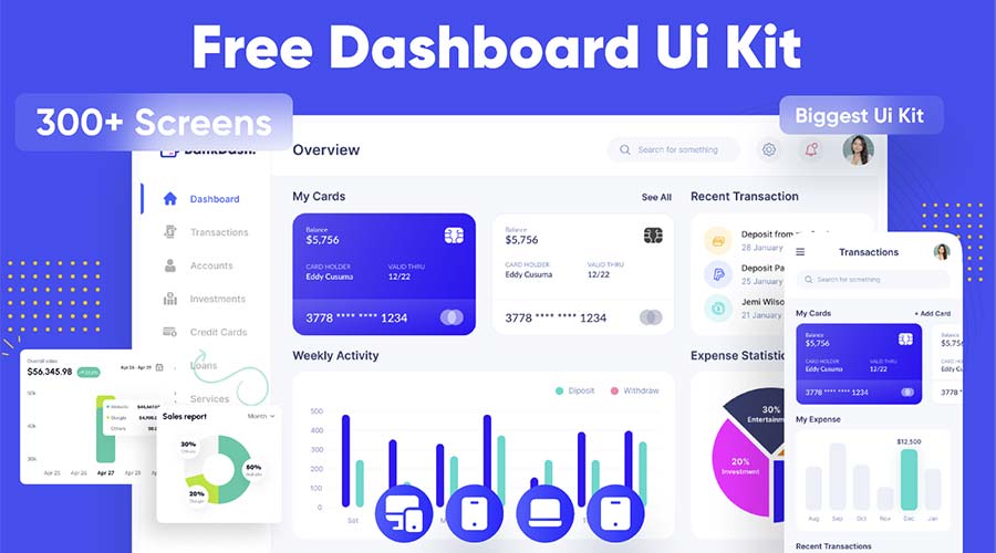
BankDash is a free dashboard UI kit that includes over 300 screen layouts. It uses the latest Figma features such as variables and auto layout. That makes it a fit for virtually any type of project.
There’s a lot to like about this free dashboard template. It’s clean, colorful, and includes mobile and desktop viewports templates. You’ll find plenty of resources to get your project off the ground.
This free Figma dashboard template includes plenty of ready-made components. Each can be customized to fit your content and color scheme. Pick your favorites and build a user-friendly interface!
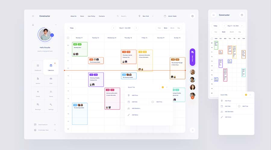
Do you want to build a collaborative dashboard? This calendar UI template will give you a terrific head start. It includes views for mobile and desktop. In addition, it outlines tasks in an easy-to-follow format.
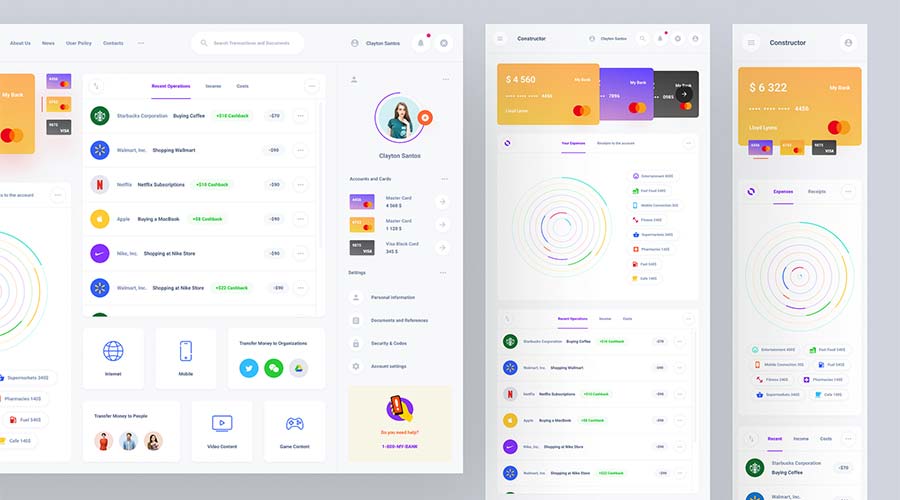
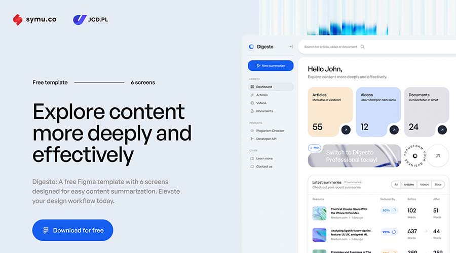
Digesto is a dashboard template that focuses on content organization. It’s perfect for user portals, client reputation tracking, or any project where media is front and center. The template includes six screens and several attractive components.
This free open-source admin dashboard kit includes an atomic design system. The template features UI elements like tables, charts, forms, etc. You’ll also have access to light and dark versions in an easy-to-edit package.
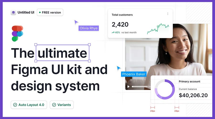
With more than 350 global styles and 10,000+ components, Untitled UI is a powerful package. That provides plenty of options for building a dashboard to match your needs. If you can dream it, you can do it.
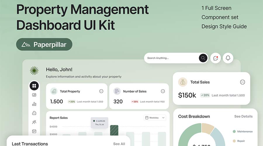
Use this dashboard UI kit for real estate and property management projects. Its well-organized layout will help users stay on top of their tasks in style. The kit includes one screen, a component set, and a style guide.
Form UI Kit uses a monochromatic color scheme to enhance legibility. It includes all the basics to build an attractive and functional dashboard. There’s enough here to cover a variety of needs.
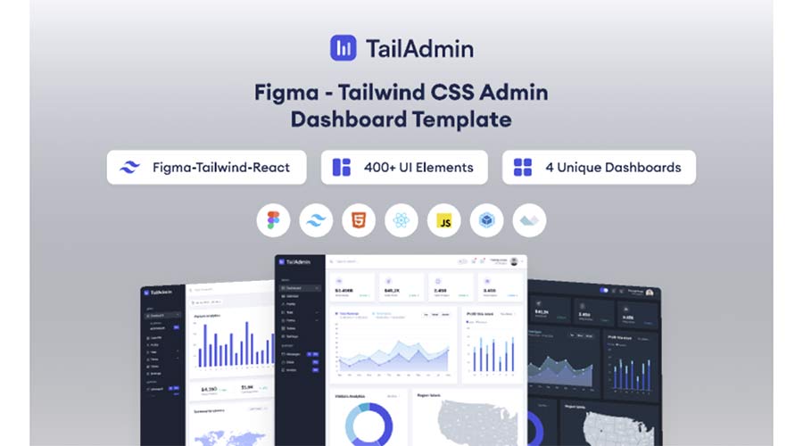
Users of Tailwind CSS will want to check out this admin dashboard template. The kit includes four distinctive dashboard layouts and over 400 UI elements. It’s a great way to combine the popular CSS framework with your dashboard project.
Build a Beautiful Dashboard in Less Time
Dashboards are among the most important and most difficult design projects. Users depend on them to perform tasks and gather information. However, building an effective one requires excellent attention to detail.
The templates in this collection are designed to make your job easier. They provide a solid foundation to build upon. The design and layout are taken care of. That allows you to focus on executing your plan.
Now that you have so many outstanding templates within reach – what will you build?
Related Topics
Top
Deus Robotics Raises $3 Million to Revolutionize Warehouse Automation and Enable Seamless Robot Interoperability
Deus Robotics, a leading force in intelligent warehouse automation, has announced the successful closure of a $3 million seed funding round led by U.Ventures, with participation from 1991 Ventures, SID Venture Partners, Sigma Software Labs, and SD Capital. With this investment, the company is now valued…
Life After the Hype: What Is in Store for AI Development?
After a long period of raising waves, the hype around artificial intelligence appears to have taken a turn. These days, we see more and more media headlines dominated by talk of how the “AI bubble” is close to bursting. Skeptical moods are growing in the market,…