Kay Firth-Butterfield is a globally recognised leader in ethical artificial intelligence and a distinguished AI ethics speaker. As the former Head of AI and Machine Learning at the World Economic Forum (WEF) and one of the foremost voices in AI governance, she has spent her career…
15+ Free Fonts with Classic Typewriter Styles for Creatives — Speckyboy
Typewriter fonts can bring a unique style to your creative projects. Their worn-out letters and subtle ink blots replicate those characteristics you associate with vintage typing machines. They are great for projects like posters, branding, or invitations that need a vintage aesthetic.
Most of the fonts in this collection have been digitally designed and inspired by classic typewriters. But we have also included some fonts that have been scanned from the typed text of real typewriters and have those original peculiarities like faded ink and uneven keystrokes.
Whether you’re looking for something clean and refined or a more worn, authentic feel, in this collection we share some of the best free typewriter fonts to help give your projects a classic touch.
Free to Download
The free font Tox replicates the pressed ink-on-paper effect you typically find when using old-school typewriters. Its rough and uneven edges make it perfect for vintage or industrial projects.

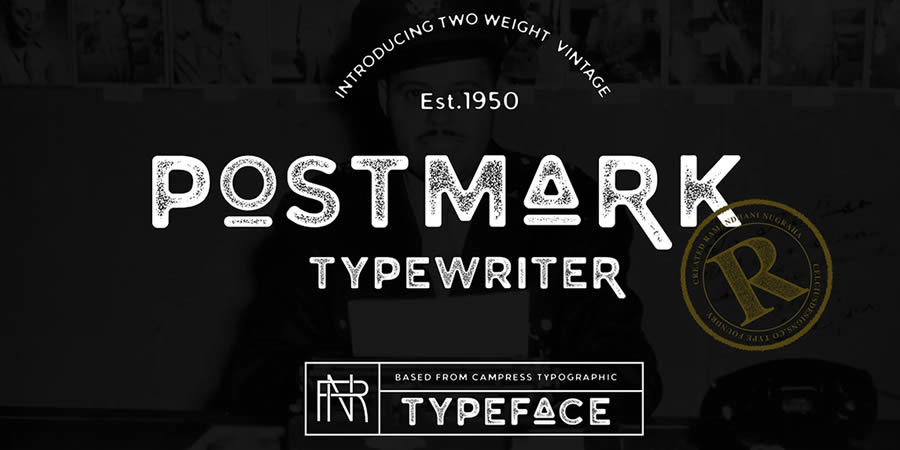
Postmark Typewriter has a clean yet slightly distressed style. The regular weight’s thin lines and occasional ink blot give it a nostalgic feel. This font suits projects that need an authentic typewriter aesthetic.
Free to Download
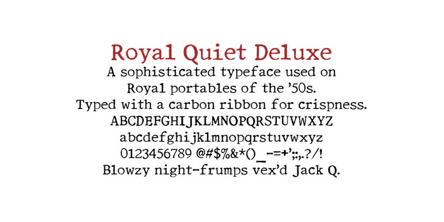
Royal Quiet Deluxe is a free font created using real typed letters from a 1950s Royal Portable typewriter. If you’re looking for a typewriter font with a crisp and uniform style and authentic glitches and flaws, this is the font for you.
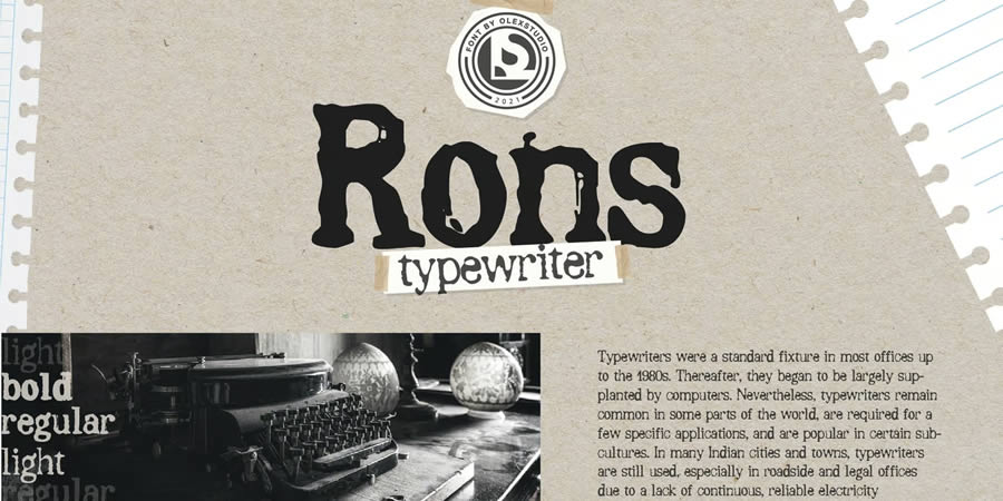
With its strong strokes and worn characters, Ron’s Typewriter feels heavy and dramatic, making it perfect for poster design. This serif font comes with regular, light, and bold weights.
Free to Download
Courier Prime modernizes the classic Courier font while maintaining its monospaced design. It’s clean, easy to read, and versatile. This font works well for code or any other text-heavy documents.

This font combines a typewriter’s classic structure with a handwritten feel. The ink-smudged appearance and uneven character spacing give it an organic and personal touch. It includes regular, outline, and italic weights.

Free to Download
Bygonest Typewriter is a worn and weathered free font with uneven strokes and faint imprints. Its rough edges make it look aged and used, creating the feel of old documents or typewritten letters.

Typedeermono is a typewriter font with a slightly distorted, hand-pressed appearance that has been designed to look as though a rubber stamp created the letters. It includes both regular and stamp variations.

Free to Download
Radio Newsman is a strong typewriter font that has been inspired by mid-century newsrooms. Its bold characters make it perfect for headlines or vintage-themed designs.

Taking inspiration from traditional typewritten text, Frontype is a clean serif font with slight imperfections. Those subtle blots give the impression of a freshly inked typewriter ribbon. It is perfect for retro projects that need to be legible.
Free to Download
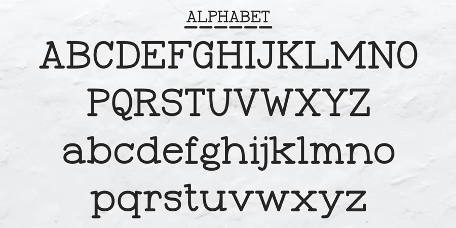
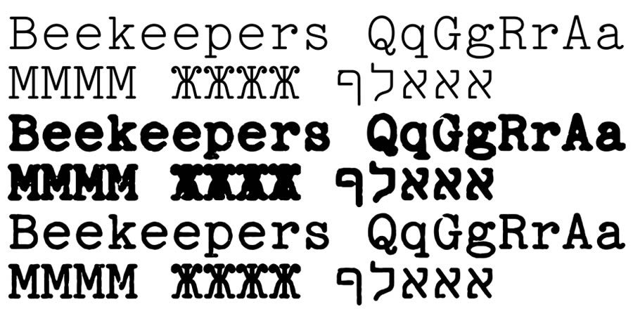
TT2020 offers a contemporary twist on classic typewriter fonts. Its precise lines make it feel modern while still retaining the irregularities that give typewriter fonts their character. This free font comes with six varied styles.
Free to Download
Xerography is a free serif font that imitates the look of a worn-out typewriter or copy machine. It has slightly rough edges with faded characters and a solid stamped background. This typewriter font would be perfect for bold poster designs.

Free to Download
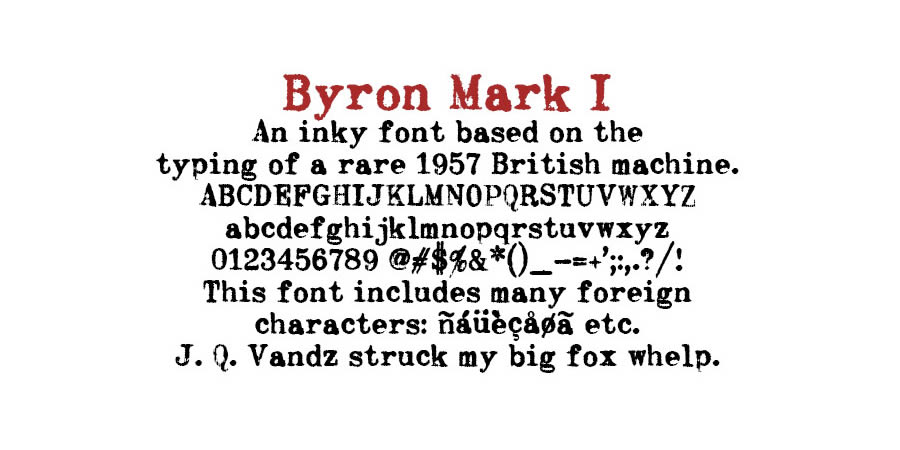
These free fonts were created by scanning the characters typed on Byron’s classic Mark I and Mark II typewriters. The slight imperfections are real and will add vintage character to any design project you’re working on.
Free to Download
Dull Boy is a free typewriter font with varying letter shapes and uneven spacing. Its bold style makes it excellent for projects that need a worn-down look.

Free to Download
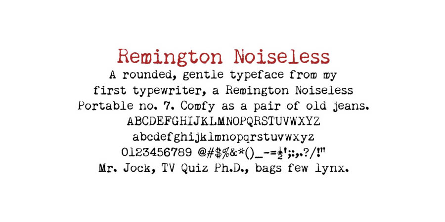
This free font was created using a Remington Noiseless typewriter. It is a slightly rounded and gentle typeface with all of the imperfections you would expect to see in vintage typewritten text.
Free to Download
Veteran Typewriter has a rugged, worn look, with rough edges that perfectly replicate the characteristics of a well-used typewriter. This free font would be excellent for designs that need an antique aesthetic.

Free to Download
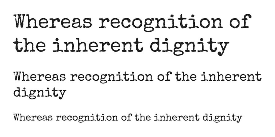
Special Elite is a grungy typewriter font that has taken inspiration from the Smith Corona Special Elite (where its name comes from) and Remington Noiseless typewriters. This free font is available on Google Fonts.
Free to Download
Adler is a free typewriter font with heavily distressed characters, replicating the text of a heavily used classic typewriter. If you’re looking for a heavily smudged and grungy typewriter font, this is the font you want.

Free to Download
Punk Typewriter is an edgy typeface with strong imperfections and erratic character shapes. Its bold, chaotic appearance would work well for projects that need a touch of rebellion.

Free to Download
Kyiv Machine is a free typewriter font with industrial and mechanical aesthetics. Each character appears worn and uneven, giving the font a sense of history.

Typewriter Font FAQs
-
What are typewriter fonts?
They replicate the typed text of traditional typewriters. They tend to have irregular letters, ink imperfections, and grungy design quirks.
-
Can typewriter fonts be used for logo design?
Yes, they are great for logo design. They are excellent for adding vintage character to your designs.
-
Are all typewriter fonts monospaced?
Most typewriter fonts are monospaced, but some may have inconsistent spacing. -
Are scanned typewriter fonts less polished than digital versions?
Scanned fonts are more authentic, while digital versions tend to be cleaner and more uniform.
-
Can typewriter fonts be paired with other fonts?
Yes, typewriter fonts often pair well with modern fonts, giving your designs a more balanced contrast.
-
Do typewriter fonts work best in large text sizes?
Yes, they do. The larger the text, the more you will see their unique details, like uneven strokes and ink imperfections.
-
Are these fonts free for commercial use?
Some fonts are free for commercial use, while others require a license. You should always read and review the terms and conditions of each font.
Related Topics
Tony Blair Institute AI copyright report sparks backlash
The Tony Blair Institute (TBI) has released a report calling for the UK to lead in navigating the complex intersection of arts and AI. According to the report, titled ‘Rebooting Copyright: How the UK Can Be a Global Leader in the Arts and AI,’ the global…
Study claims OpenAI trains AI models on copyrighted data
A new study from the AI Disclosures Project has raised questions about the data OpenAI uses to train its large language models (LLMs). The research indicates the GPT-4o model from OpenAI demonstrates a “strong recognition” of paywalled and copyrighted data from O’Reilly Media books. The AI…
Amazon Nova Act: A step towards smarter, web-native AI agents
Amazon has introduced Nova Act, an advanced AI model engineered for smarter agents that can execute tasks within web browsers. While large language models popularised the concept of “agents” as tools that answer queries or retrieve information via methods such as Retrieval-Augmented Generation (RAG), Amazon envisions…
The Best Practices for Managing Your Client’s WordPress Sites — Speckyboy
There’s nothing like the feeling of launching a new website. It’s the excitement of a happy client and a great addition to your portfolio. You can even admire all the cool things you did with WordPress. But as that chapter ends, another one begins.
We’re talking about website management. It’s all about keeping your client’s site in tip-top shape throughout its lifecycle. But there’s more to the process than hitting the “update” button every so often.
Modern websites are more complex than ever. Thus, there are also ongoing tasks for performance, accessibility, and security. The services and technologies surrounding websites also require regular attention.
Those responsibilities multiply for each site under your watch. So, how do you keep it all from going sideways? Keep reading to discover best practices for managing your client’s WordPress websites.
Take Note of Unique Features and Configurations
Every WordPress website has a story to tell. While some may be similar, some features make them unique.
For example, several clients may use the same theme. However, their websites could have key differences. Perhaps one uses WooCommerce and sells products online, while another might include a learning management system (LMS) plugin.
Seemingly similar websites can have many differences, including:
- Commercial licenses for plugins and themes (with differing expiration dates);
- Custom code that modifies WordPress behavior;
- Domain registrars;
- PHP versions;
- Plugins and custom modifications to them;
- Server resource requirements (storage, bandwidth, CPU cycles);
- Third-party library and script dependencies;
- Web hosting providers and packages;
These differences may be fresh in your mind when the site launches. However, it’s easy to forget them as time passes. You’ll be left searching for clues when it’s time to work on the site again.
The solution is to document the unique aspects of each site. Put them into a text or word processing file. It’s a handy reference for those little details and could save you a few headaches. Future maintenance will be that much easier.

Create a Website Maintenance Schedule
WordPress websites require frequent maintenance. Updates to the core software, themes, and plugins are plentiful. Thus, it pays to keep a watchful eye on each site you manage.
Updates play a key role in site security and stability. Missing a new version could mean exposing the website to hackers or a poor user experience. It’s not something to take lightly.
WordPress can perform automatic updates – and it’s a viable option. However, updates don’t always run perfectly. If something does go wrong, you won’t be around to notice. That could mean a buggy site or worse.
The better option is to create a website maintenance calendar. Pick a day each week (or two) and dedicate a portion to installing updates. It also helps to stay flexible – you never know when a critical security update will surface.
We get it – logging into every site you manage is tedious. Thankfully, you can streamline the process using a unified dashboard service like ManageWP or MainWP. You’ll have access to each site and can perform maintenance tasks – all from a single screen.
Regardless of how you do it, keeping a regular schedule will help this part of maintenance become second nature.

Stay Informed About WordPress and Web Development
Things change rapidly in web development. Software (such as WordPress), programming languages, and server technologies evolve. Like that iPhone you bought last year, things become obsolete before you know it.
These shifts impact your existing sites just as much as new ones. PHP versions are a prime example. Web hosts often stop supporting legacy releases. Thus, your website had better be compatible with a recent one. Wait too long, and you might have a broken site to repair.
Changes in WordPress are also worth paying attention to. New features are added to the core software, and some may benefit your clients. For instance, the Site Editor lets you build custom theme templates without knowing how to code. It may be the push your client needs to approve a redesign.
Meanwhile, themes and plugins come and go. It’s risky to leave abandoned software on your site. The sooner you know about a potential issue, the sooner you can address it.
And we can’t forget about third-party tools and services. Our sites often depend on them for functionality. A change to an API or even a billing policy could be impactful.
Such frequent changes make it more important than ever to stay informed. You don’t have to know everything – just the subjects relevant to the sites you manage. The project documentation we mentioned above can help you decide where to focus.

Put Security First
The burden of website security is a heavy one. It should be a top consideration in everything we do. The same goes for keeping client data safe.
In site management, that means not taking any risks. Ensure that software is updated, use strong passwords, enable two-factor authentication (2FA), track user activity, and use security tools. They help defend against hackers and provide a little peace of mind.
Security at the server level is also critical. For instance, ensure the correct file permissions for your WordPress installation are set. Scan the server for any suspicious files. Your web host may take care of some items – but it doesn’t hurt to verify them.
Any sensitive client data (like passwords and payment info) should be stored securely. Use encrypted services, when possible, to keep prying eyes away.
Security may be the most difficult part of website maintenance. Do your best to keep your websites, clients, and yourself safe.

Manage Your Client Websites Like a Pro
There are many aspects to managing a WordPress website. But they all have a few things in common.
First, you’ll need a deep understanding of every website you manage. Note the details in what theme and plugins they use, their hosting configuration, and the services they depend on. Gather every bit of information you can for future reference.
Second, pay attention to what’s going on. Stay aware of what’s changing and how it impacts the sites under your care. That will help you catch potential problems before they strike.
WordPress maintenance isn’t rocket science. Some basic organizational skills are a must. From there, it’s about creating a workflow that makes sense for your business. Take advantage of any tools that save time and increase efficiency.
Follow the tips above, and you’ll become a pro in no time!
Related Topics
Top
Anthropic provides insights into the ‘AI biology’ of Claude
Anthropic has provided a more detailed look into the complex inner workings of their advanced language model, Claude. This work aims to demystify how these sophisticated AI systems process information, learn strategies, and ultimately generate human-like text. As the researchers initially highlighted, the internal processes of…
Gemini 2.5: Google cooks up its ‘most intelligent’ AI model to date
Gemini 2.5 is being hailed by Google DeepMind as its “most intelligent AI model” to date. The first model from this latest generation is an experimental version of Gemini 2.5 Pro, which DeepMind says has achieved state-of-the-art results across a wide range of benchmarks. According to…
40+ High-Resolution Packs of Free Textures for Designers — Speckyboy
The number of options, directions, and aesthetic approaches you can take from simply adding a texture to your work is mind-boggling. Of course, not every design, photo, or video benefits from even the most subtle of textures, but you might be surprised at how a high-resolution texture can bring a design to life.
Knowing when to use a texture and which texture to use comes down to the flow of the design and the priority of information on the page. It is a good idea to keep certain textures in mind while working on a project, but don’t finalize them until you’ve seen the design as a whole.
Texture selection can be an involved and time-consuming process. Firstly, you have to search for that particular texture your design needs, and secondly, you have to test and tweak it to discover the one that actually works.
It is that search process we aim to help you with. We have a huge selection of free high-resolution textures for you today that are just shouting out for use in your next project.
Free Paper Textures
10 Ripped Paper Texture Set
Designed by TuomoDesign, in PNG Format

5 Glued Paper Textures
Designed by Indie Ground, in JPG Format

16 Free Vintage Paper Textures
Designed by Nassy Art, in JPG Format

10 Free Marble Paper Textures
Designed by Nastia Smiyan, in JPG Format

Free Dirt & Grit Textures
18 Free Grit Textures
Designed by Diego Arriagada, in PNG Format

Vintage Grit Textures
In AI, EPS & PNG Formats

10 Free Dust & Dirt Overlay Textures
Designed by GraphicsFuel, in JPG Format

Free Vintage & Retro Textures
8 Free Vintage Textures
Designed by Flash Graphics, in AI & EPS Formats

10 Vintage Halftone Textures
In EPS & PNG Formats

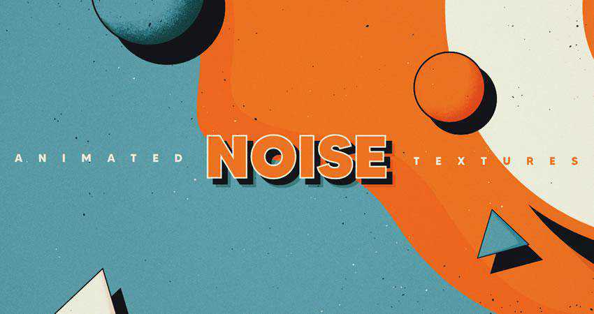
10 Vintage Noise Animated Textures
Designed by Diego Darriagada, in AE Format
12 Film Dust Vintage Grunge Textures
Designed by MiksKS, in JPG Format

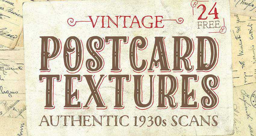
24 Authentic 1930s Vintage Postcard Textures
Designed by Spoon Graphics, in JPG Format
Free Grunge Textures
24 Free Grunge Textures
Designed by LTC Shop, in PNG Format

10 Free Digital Grunge Textures
Designed by Pale Supply, in EPS & PNG Formats

5 Subtle Grunge Vectors
Designed by Liam McKay, in PNG, EPS, SVG, AI & JPG Formats

10 Free White Subtle Grunge Textures
Designed by GraphicsFuel, in JPG Format

Free Grain & Noise Textures
20 Subtle Grain Textures
Designed by Bart Wesolek, in JPG & PNG Formats
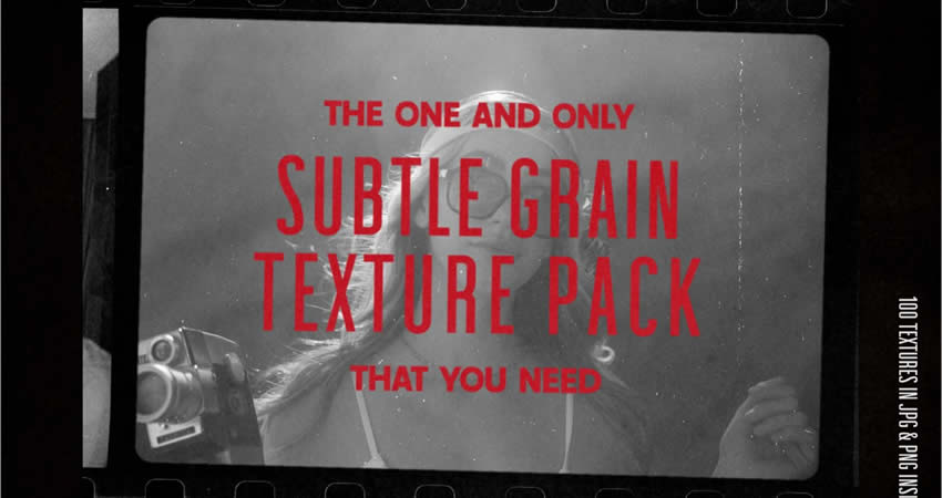
10 Film Grain Textures
Designed by Arkadzi Ulitski, in JPG Format
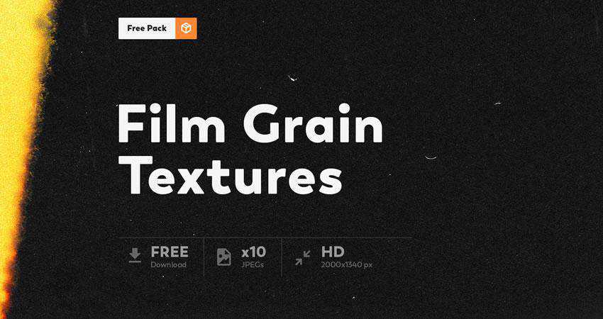
5 Photocopy Noise Textures
Designed by Indieground Design, in JPG & PSD Formats

Free Abstract & Fractal Textures
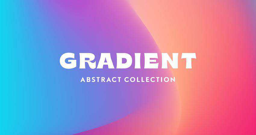
10 Vivid Gradient Abstract Textures
Designed by Unio Creative Solutions, in AI & PNG Formats
8 Free Ethnic Abstract Textures
Designed by Creative Veila, in PNG Format

8 Free Abstract Watercolor Textures
Designed by Creative Veila, in PNG & JPG Formats

5 Holographic Textures
Designed by Indieground Design, in JPG Format

18 High-Resolution Fractal Textures
Designed by Elliot Pessah, in JPG Format

Free Stone & Concrete Textures
20 Stone Wall Textures
In Photoshop PSD Format

Vector Concrete Texture Pack
Designed by Phil Goodwin, in PNG & EPS Formats

5 High-Resolution Brick & Tile Textures
Designed by Michael Hylton, in JPG Format

10 Old Wall Textures
Designed by GraphicsFuel, in JPG Format

10 Marble Textures
In EPS & PNG Formats

10 Free Concrete Textures
Designed by GraphicsFuel, in JPG Format

Free Metallic Textures
9 High-Resolution Metal Surface Textures
Designed by Orman Clark, in JPG Format

Free Paint & Graffiti Textures
Free Artistic Paint Textures
Designed by Deezy, in JPG Format

14 High-Resolution Graffiti Textures
Designed by Orman Clark, in JPG Format

16 Free Sprayed Vector Texture
Designed by Texture Fabrik, in EPS & PNG Formats

Free Wood Textures
5 Free High-Resolution Wood Textures
Designed by Isaac Gube, in JPG Format

12 Organic Textures
In PSD & AI Formats

20 Organic Vector Textures
Designed by GraphicsFuel, in PSD Format

10 Free Withered Wood Textures
Designed by GraphicsFuel, in JPG Format

Free Wood & Paint Textures
Designed by Eilert Janen, in JPG & PNG Formats

Free Fabric Textures
9 High-Resolution Fabric Texture Pack
Designed by Orman Clark, in JPG Format

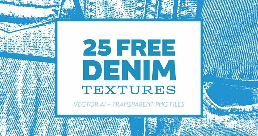
25 Denim Textures
Designed by Bart Wesolek, in PNG & EPS Formats
6 Free High-Resolution Fabric Textures
Designed by Design Instruct , in JPG Format

Free Black & White Textures
Black & White Seamless Textures
Designed by Timxez, in JPG Format

Free Miscellaneous Textures
100 Fire & Flame 4K Textures
Designed by Hyperpix, in JPG Format

Seamless Vector Textures
Designed by Timxez, in EPS & PNG Formats
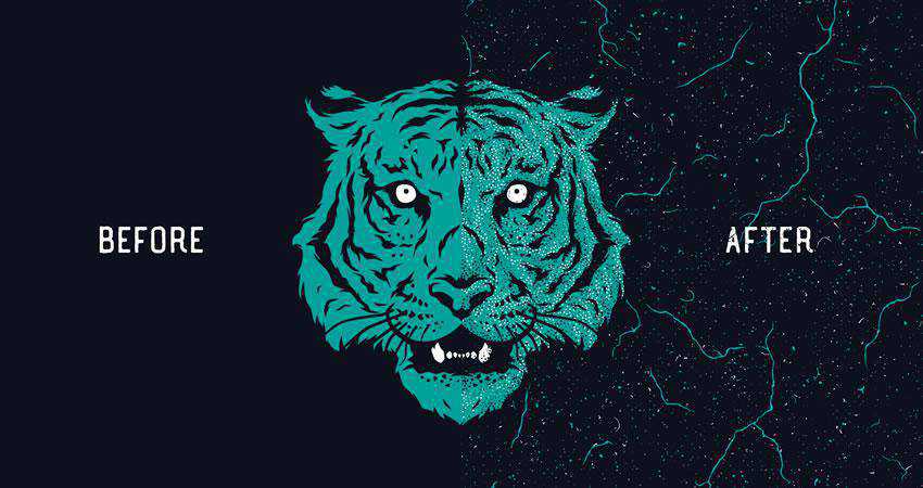
10 Chalk Textures
In AI, EPS & PNG Formats

7 Plastic Textures
Designed by Alessandro Silva, in JPG Format

Textures in Your Workflow
Once you’ve found the perfect textures, integrating them is a straightforward process. Most photo and video applications allows you to overlay textures onto your artwork. You can then adjust their opacity and blending modes to achieve the desired effect.
Remember to consider the context of your project when choosing textures. Whether you’re creating a vintage poster, a modern website, or an artistic masterpiece, textures can be your trusty companions on the creative journey.
By understanding the role of textures and experimenting with their application, you can breathe life into your work and engage your audience on a whole new level.
While it is true that you can use very subtle, unobtrusive textures, you should also keep in mind that some textures can draw the eye more than just a solid color. This means that it’s best practice to use textures that create contrast and highlight areas of the page that are important.
More Free Texture Packs
Related Topics
Why a Modular Approach Is Better for WordPress Development — Speckyboy
We have the power to bend WordPress to our will. A little (or a lot) of custom code can make the content management system (CMS) do more. The sky’s the limit when it comes to functionality.
That’s quite a magic wand in our pockets. However, it does bring up a few key questions.
Do we go big when building plugins and themes for WordPress? Do we add all the bells and whistles and account for every potential use case? Or do we aim for the bare minimum – just enough to serve our needs?
I prefer the latter approach – start small and adapt as needed. That minimizes bloat and saves on future maintenance. It’s a hard-learned lesson.
The elephant in the room is that our needs tend to change. The plugin that once did the job may no longer do enough, while the theme that helped us achieve one look may not be flexible enough to adapt to a new one.
This is where a modular approach to development is valuable. It’s all about building to suit your current needs while planning for the future. Change is inevitable – so why not account for it now?
Let’s explore this different way to do WordPress development. We’ll cover the basics of what it is, how it looks, and how it benefits your workflow.
First, Consider Your Short-Term Goals
It’s easy to go down a rabbit hole during a development project. The finished plugin or theme might not resemble the idea you started with. We get sidetracked by shiny features and the quest to deliver more than advertised.
Our intent is noble. However, we also complicate our project by straying from the initial plan. Did we build something sustainable? How will we manage the code a year from now?
There’s a danger in going too big, too soon. For one, it can lead to sloppy code and structure. The impacts can be felt in performance and security. You could miss something important while attempting to squeeze more into your project’s timeline.
In addition, half-baked features could be a pain to work with down the road. Poor structure means bolting on additions or (gasp) ripping things apart and starting from scratch.
To avoid this fate, consider your short-term goals. Ask yourself:
- What are the minimum requirements for the project?
- What features do I need now?
- How much time do I have to build this?
- How much testing will I need to do?
The idea is to focus on what you need to achieve in the time you have. Anything beyond that can probably wait.

Get Organized to Prepare for the Future
The websites we build will evolve. Clients change their mind or have something new to offer. WordPress and the underlying technology of our sites also move forward.
That impacts our custom plugins and themes. There will likely be new features to add or changes to existing ones. It’s all part of the development lifecycle.
Using a modular approach helps when it’s time for a change. The first step is to get organized. Having a sound structure allows you to build logically and efficiently.
The WordPress developer documentation gives you a head start by outlining plugin and theme structure. Following these guidelines ensures a sustainable start to your project. That’s better than reorganizing a messy jumble of files and code.
For example, here’s the suggested plugin structure:
/plugin-name
     plugin-name.php
     uninstall.php
     /languages
     /includes
     /admin
          /js
          /css
          /images
     /public
          /js
          /css
          /images
The ability to pick up where you left off is priceless. If you haven’t worked on that custom plugin for a few years, you might have difficulty remembering what you did and where things are. A well-organized plugin removes some of the guesswork.
Adding comments to your code also helps with organization. You’ll receive a high-five from your future self for documenting what each snippet does. It’s a small thing that makes a real difference.
The better your organizational skills, the easier it will be to maintain your work.
Add Plugin and Theme Features One at a Time
Sure, it would be cool if our plugin could do x, y, and z right out of the box. Perhaps that’s not realistic, given the budget and timeline. We don’t have to forget about those big ideas, though.
The priority is building something that works as intended. It should do what we outlined in our short-term goals. Once that is established, we can plan for those extra goodies.
Think of these features as items on a checklist where you can only do one at a time. Pick one, make it the best you can, and move on. That ensures your focus will be on the task at hand, rather than scrambling to fit puzzle pieces together.
Besides, trying to do all the things at once rarely works out. This is a difficult challenge for solo developers as there’s only so much time in the day. Not to mention those of us working on multiple projects.
Remember, good things take time. That’s why committing to a single task makes sense. Train your focus on one thing and do it well. The result will be improved quality and some mental clarity.

A Better Way to Build for WordPress
Every developer has a preferred workflow. We use our favorite tools and techniques to enhance our WordPress projects.
That individuality is both freeing and a bit troublesome. It’s great to write code how you want and when you want. However, a lack of foresight and organization can complicate things. It could lead to a buggy product that is a pain to maintain.
Starting with a modular approach is the cure for future chaos. Everyone benefits when every part of your plugin or theme has a place and purpose. You’ll love that you can find what you need with minimal effort. Clients and users will love that it works (even if they don’t realize it).
Writing code is challenging enough. The right approach can help you focus on getting it right.
Related Topics
Top

