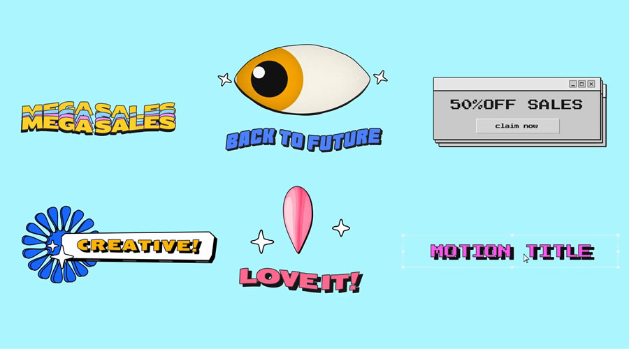
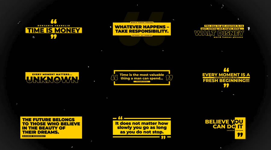
Technology means “science of craft”, and it is what this category is all about. Here you will find articles covering technological advances, innovations, and solutions based on science, computers and systems, engineering, etc…
Not everything on a website has to be displayed straightforwardly. Sometimes, it’s prudent to hide an element. We can then reveal it automatically or via user interaction.
That’s what makes reveal effects so compelling. They can serve dual purposes. The first is to keep our layouts nice and tidy. The second is to add a bit of flair to the user experience (UX).
And there are many intriguing options for web designers. Using CSS and JavaScript offers a path to creating high-end effects. They not only look great, though. There are ways to build features that are performant and accessible as well.
Want to explore some possibilities? Check out our collection of fantastic reveal effects. They run the gamut in terms of use cases and technology.
Scratch Card CSS Reveal by Nicolas Jesenberger
This reveal effect mimics a real-world experience – using a scratch card. Use your finger or pointing device to “scratch” off the silver foil. You’ll find a little surprise underneath. It’s both clever and well-executed.
Here’s a snippet that takes web magic to the next level. Move the magic wand from left to right to reveal the image gallery underneath. There’s also a subtle effect for nearby images. They’re blurry and displayed with a lower opacity.
You don’t need to go overboard with reveal effects. This simple presentation reveals more of the image upon hover. And it also adds a classy text animation. It would work well on a portfolio or About Us page.
How about a reveal effect that happens automatically? This animated headline is beautiful and sure to get a user’s attention. It’s also powered by CSS. That means there are no messy scripts to slow down your page load times. The JavaScript used in the snippet refreshes the demo.
These scroll-based animations are incredible. The artwork appears to be drawn on your screen as you scroll. The effect creates a mood to enhance the UX. It’s a case of special effects fitting the content to a tee.
Card UIs are a popular design element these days. But there’s only so much content they can hold. This snippet offers a solid workaround. Hover over a card to reveal further content. The layout remains neat while adding a bit of interactivity.
Yes, you can use reveal effects for an entire page! And this tool can help you create the perfect fit for your project. Choose from several animation types and other options to build a beautiful presentation. Plus, it’s just plain fun to experiment with.
Accessible Offcanvas Reveals by Vasileios Mitsaras
Offcanvas elements are a handy place to store extra info. They’re often used to hide mobile navigation so that users can focus on content. This demo uses jQuery to add elements that can be revealed in multiple ways.
Reveal effects can take many forms. They’re suitable for everything from a corporate website to an online game. Their potential is vast and varied.
It’s still important to consider the impact on users, though. The best implementations feel natural and add to the UX. Therefore, it’s best to avoid effects that get in the way of accessing content.
Thankfully, CSS and JavaScript provide plenty of leeway. You can use the combination that works best for your project.
Artificial intelligence, like any software, relies on two fundamental components: the AI programs, often referred to as models, and the computational hardware, or chips, that drive these programs. So far, the focus in AI development has been on refining the models, while the hardware was typically…
It seems like an odd mix on the surface. On one hand, WordPress is a content management system (CMS) that aims to democratize publishing.
It’s right there in the mission statement. That harkens back to its roots as a blogging platform. We install the software and push our content out into the world.
On the other hand, WordPress has become a tool to make money. Freelancers, agencies, and DIY users can build commercial websites with it. Developers create themes and plugins as part of an ecosystem.
Just so we’re clear: A corporation can use WordPress to bolster its billion-dollar portfolio. Just as a teenager can publish their thoughts.
Perhaps this sounds like two mutually exclusive ventures. However, they’ve coexisted for over 20 years.
That’s the juxtaposition of free, open-source software. So far, WordPress has handled it as well as anyone.
How has the project done it? And what potential risks could derail the balance? Let’s attempt to make sense of it all!
A Foundation for the Web
WordPress project co-founder Matt Mullenweg has said he wants the software to be the “operating system for the open web.” It’s one way to marry commercialization with democratization.
It makes sense for content creators and site builders. The software serves as a foundational piece. It’s free, widely supported, and extensible. Take it and build whatever you want.
This idea borrows from operating systems like Linux, MacOS, and Windows. They lay the foundation for a variety of use cases. An enterprise IT department depends on an OS. So does a student or small business.
Free software lowers the barrier to entry. Sure, there’s a cost associated with hosting a website. However, you’re not stuck with a particular host. WordPress is open-source. It can be hosted just about anywhere – even on a local machine.
This allows for a multitude of possibilities. One can publish, make money, or both. Those interested in web development can learn the software’s inner workings.
Expand it, change it, or use it as-is. That’s the flexibility of WordPress.
The Challenge of a Diverse User Base
As a project, WordPress has adeptly walked a tightrope. It has provided an opportunity for people around the world. It has also created an economy based on its ecosystem and custom development potential.
Maintaining balance is a challenge – and a great responsibility. The software must remain an attractive option for both camps.
Bloggers and small organizations depend on WordPress for low-or-no-cost flexibility. Developers, freelancers, and agencies want a powerful tool to fuel their growth.
That’s why some features spark debate. Take the Block Editor, for example.
Theme and plugin developers were concerned about this shift toward block-based content. How would it impact their products? Would they be rendered useless? Or require a complete overhaul?
Everyday users also had concerns. Would a new editing experience make it harder to publish blog posts? How large is the learning curve? Would it leave their existing website in the dust?
User perception also plays a role. Some may see a feature as favoring one side or the other. Sometimes, commercial and individual interests diverge.
That places project leadership in a tough spot. You can’t please everyone. But serving a diverse user base is part of the job.
Keeping the Coexistence for Years to Come
So, how can WordPress continue to provide the best solution for both worlds? It will take a concerted effort. And things seem to be off to a good start.
Recent years have seen a focus on ease of use. In addition, tools like the Site Editor aim to make a default WordPress install more powerful. Plans for a redesigned admin interface are also in the works.
These are all positive steps. A more user-friendly WordPress opens the door to attracting more users. Novices will be able to get started more quickly.
There are also opportunities for those with a commercial agenda. Commercial block themes have yet to take off. But block-based plugins have. There is plenty of space for growth in these areas.
What could go wrong? There are a few potential trouble spots.
A change in project leadership could push WordPress in a more commercial direction. A new regime could theoretically focus on features that primarily benefit corporate users.
The composition of WordPress project teams could also have an influence. Yes, some contributors are volunteers. However, sponsored contributors are only increasing their role in how things work.
One or more sponsor companies may gain an outsized say in the future. What if a future WordPress version integrated something akin to Google’s AMP? This nominally open-sourced technology caused a stir. This sort of move could harm the software’s reputation.
That’s just an example – however unlikely. The point is that maintaining balance requires stewardship. It’s an important part of the project’s future success.
It’s Possible to Do Good and Make Money
As a market leader, WordPress is in a unique position. It’s not a commercial product. However, we can use it for commercial purposes.
The software can also give an online voice to just about anyone. It’s a tool that facilitates free speech – even if a person’s circumstances can get in the way.
And, unlike large companies, the WordPress project isn’t beholden to anyone. For example, it doesn’t have to bend to the will of an oppressive regime to access its people. There’s no profit or shareholders to worry about.
Let’s hope it stays that way. We’re living in a world where costs are rising – as are barriers. WordPress bucks this trend as free software.
All you need is a copy of WordPress and an idea. What’s next is up to you.
Analog film aesthetics hold a timeless appeal in digital photography, offering a distinctive look that can create a feeling of nostalgia and rustic artistry. The rich tones, subtle grain, and little imperfections of analog film create a depth often sought after by photographers.
Achieving these effects can be challenging with modern digital tools alone, but Lightroom presets will help to simplify the process. They’re invaluable to photographers who are looking to replicate those classic film styles. These pre-configured Lightroom settings allow you to apply specific styles to your photos with just a couple of clicks, saving time and ensuring consistency across all of your shots.
Whether you’re striving for Kodachrome’s vibrant colors or Fujifilm’s muted tones, these presets offer an easy and effective way to transform your digital shots. In this collection, we share the best free analog film Lightroom presets currently available, each designed to bring the charm of vintage photography to your modern digital workflow.
This free preset offers a nostalgic film look with balanced colors and soft contrasts, mimicking the classic 800 ISO film. It is Ideal for portraits and landscapes and delivers a subtle, timeless aesthetic.
These presets deliver a vintage feel with warm tones and soft highlights. They are perfect for achieving an old-school look on both desktop and mobile and are great for lifestyle, portrait, and travel photography.
Kodachrome 64 emulates the iconic Kodak film style with vibrant colors and sharp contrasts. This free preset is suitable for various photography styles and brings out rich hues and fine details, making it ideal for portraits, landscapes, and travel photos.
The Lightroom preset collection offers a diverse set of presets that replicate classic film aesthetics. They have been designed to enhance color richness and add a vintage feel to photos.
Kinsfolk 1888 provides a nostalgic film look with muted tones and subtle grain. Perfect for simulating a vintage atmosphere. These presets work well for portraits, and lifestyle photography, adding a timeless quality to your images.
Analogue Beauty mimics the charm of Kodak 35mm film, offering a selection of presets that enrich color and add a vintage quality. They’re great for portraits, street photography, and lifestyle shots.
This free preset recreates the classic film look with rich colors and subtle grain. Ideal for portraits, landscapes, and street photography. It provides a timeless aesthetic, enhancing photos with a nostalgic, cinematic feel.
These presets offer a classic film look with soft colors and smooth contrasts, ideal for portraits and lifestyle photography. They emulate the iconic Kodak Portra film, enhancing skin tones and adding a warm, vintage feel to your photos.
This free preset will enhance your photos with vibrant colors and fine grain, emulating the popular Kodak Ektar 100 film effect. Suitable for various styles, this preset brings out rich details and bold hues, perfect for outdoor and travel photography.
This preset replicates the nostalgic 35mm film aesthetic. It provides a classic analog look with rich colors and balanced contrast, ideal for adding rustic charm to your photos.
This preset mimics the distinctive look of overexposed Kodak film. It enhances images with brighter highlights, softer shadows, and a slightly washed-out effect, creating a dreamy quality in photographs.
This Lightroom collection includes multiple presets designed to enhance photos with a natural analog film look. It provides consistency, a recognizable style, and a beautiful sun-kissed feel for your photos.
This free collection offers various presets that emulate classic analog film aesthetics. These presets enhance photos with rich tones and a timeless vintage feel. They can be used on both Lightroom mobile and classic.
This free Lightroom preset offers a sophisticated film emulation, enhancing your photos with elegant tones and a polished finish. Ideal for fashion and portrait photography, it will add a touch of cinematic quality to your shot.
This ColorMax Film preset will enrich your photos with vibrant, natural colors without oversaturation. It slightly lowers contrast for a balanced look, enhancing color depth and detail.
This free preset replicates the charming retro film effect of Kodak’s single-use camera. It enhances photos with light, warm tones, adding a nostalgic and playful feel to various photography styles.
This preset emulates the iconic Kodak Portra 400 film, known for its exceptional color accuracy and fine grain. It enhances digital photos with natural skin tones and balanced color saturation, perfect for portraits and general photography.
This free preset collection mimics the aesthetic of vintage analog film and will add classic film tones, a balanced contrast, and a nostalgic feel to your photos. The preset is suitable for both color and black and white photography.
This free Lightroom preset, inspired by Fujifilm film, will enrich your photos with vibrant colors and dynamic contrasts. It brings out rich details and vivid tones, making it ideal for portraits and landscapes.
This preset recreates the iconic look of Kodak Ektachrome film. It features a soft matte texture, vibrant yet natural colors, and balanced contrast, ideal for achieving a classic film appearance in your photos.
This preset mimics the aesthetics of traditional analog cameras. It enhances photos with vintage tones, balanced contrast, and a slightly muted color palette, creating a nostalgic and timeless feel.
This free Lightroom preset emulates the look of Fuji Superia 800 film, enhancing your shots with vibrant yet natural colors. It will add depth to your photos while maintaining smooth skin tones.
This preset captures the distinctive look of Fujifilm Cool Chrome film. It adds cool tones, increased contrast, and vibrant colors to photos, perfect for achieving a modern, polished look in Lightroom.
This free preset will give your photos a retro feel with light magenta hues. It creates a soft, vintage look reminiscent of old film, ideal for adding a nostalgic touch to various photography styles.
Analog Film Lightroom Preset FAQ
What are analog film Lightroom presets?
They are pre-configured settings designed to replicate the look of traditional analog film. They provide the distinctive tones, colors, and grain associated with classic film photography.
How do analog film presets enhance my photos?
They will transform your photos by adding rich tones, unique grains, and balanced contrast, giving them a timeless and nostalgic feel.
Are these presets compatible with all versions of Lightroom?
Most analog film presets work with Lightroom Classic, Lightroom CC, and Lightroom Mobile. Before downloading, check the specific compatibility details of each preset.
How do I install these Lightroom presets?
Open Lightroom and go to the Develop module. In the Presets panel, right-click and select Import. Locate the downloaded preset files and import them.
Can I make adjustments to the presets after applying them?
Yes, these presets are fully customizable. You can tweak exposure, contrast, color, and other settings to match your desired aesthetic.
Are analog film presets suitable for all types of photography?
They are versatile and can enhance various photography styles, including portraits, landscapes, and street photography. Experiment with different presets to find the best fit for your photos.
The Perfect Analog Aesthetic
These presets will save time, help maintain consistency, and simplify the editing process, making it easier to capture the desired analog aesthetic you have been looking for. They allow you to quickly add those rich tones, unique grains, and distinctive analog film effects to your photos.
Experiment with these presets and find the best fit for your personal photography style. Each preset provides a different interpretation of analog film, allowing you to explore various styles and enhance your creative expression.
Creativity can be freeing for web designers. There’s nothing quite like reaching that “a-ha” moment. It’s when an idea transfers from your head to a screen.
I had that feeling a lot during my early days in this industry. My work wasn’t great, mind you. But I felt the thrill of doing things I’d never done. And it was even better if I had made a client happy.
There was a lot of creative energy back then. The web was a new medium – and we were building it as we went along.
It’s no secret that the industry has changed dramatically. The old methods of building websites are gone. Now, we work with advanced tools and premade elements.
I sometimes feel like web design has lost its creative flair. Has it? Or have we changed how we use our creativity?
Let’s explore what it means to be creative in modern web design.
We No Longer Build from Scratch
An original web design isn’t always a top priority these days. We often prioritize efficiency, usability, and accessibility in our builds.
To that end, we start projects with frameworks and themes that provide a head start. Tools like Tailwind CSS feature readymade layouts and components. WordPress themes may offer a complete website for us to customize. And we can’t forget about the advent of block patterns.
That’s the reverse of how things used to work. We used to fire up Photoshop or some other design tool. We’d start with a blank canvas and build from scratch.
It’s easy to romanticize that era. We may think of web design as a lost art. It’s as if we were craftspeople who built sites the right way. None of these modern tools could match those techniques.
But that practice isn’t sustainable for busy designers. There’s not enough time or budget for a long design process. Not when there are multiple projects to complete.
For better or worse, our workflows have changed. Web designers have had to adapt to keep pace.
Adding a Personal Touch to Predesigned Components
How can we be creative when using predesigned components? Complete originality may be out of the question. However, there’s still an opportunity to add a personal touch.
There is no shortage of areas to change. An element’s color, size, and typography are prime examples. We don’t have to settle for the default look.
We can also choose components that include minimal styling. The WordPress block editor works this way. A default implementation is typically barebones. Tailwind CSS also prioritizes utility over looks.
Knowledge of these tools also helps. We can design in Figma with specific components in mind. That allows us to use our imagination while staying within the lines.
The process is reminiscent of a collage artist. It’s about pulling all of these different pieces together. From there, we seek to create a seamless user experience. The results can be compelling.
The added layer of convenience might make us feel guilty, though. For instance, page builder tools take the pain out of design. It’s more paint-by-numbers than drawing from memory.
Did we even “create” anything here?
Modern Web Design Is a Different Artform
Sure, the design process has changed. That doesn’t mean we’re no longer being creative, though.
We’re still using our creativity – just in a different way. We’re using our knowledge and experience to build the best website possible. And we’re using our keen eye to make it beautiful and functional.
If anything, we’re fortunate to have these new tools and frameworks. Websites are becoming more complex all the time.
Perhaps that makes web design harder than ever. Designing from scratch and managing functionality might be too much to handle.
Our focus needs to be in many places at once. So, maybe we’re creating a collage while juggling!
Find New Ways to Be Creative
One positive development is that designers don’t have to reinvent the wheel. We spend less time on the basics. That allows us time to concentrate on the details.
It’s the little things that can make a website stand out. We now have the tools to give us a head start.
Yes, these new methods can be limiting at times. However, web designers have plenty of experience in that area.
There have always been parameters for us to work within. It used to be the limits of CSS or user devices. Now, we try to bend and shape tools to match our needs. That also takes creativity.
You know what? Despite my initial concerns, those “a-ha” moments still exist. The change is in how we create them.
Halftone Photoshop brushes are typically used to create a dotted effect, reminiscent of old print media. They are useful for adding a vintage or comic book appearance to digital artwork, making them a popular choice for artists looking to add depth and texture to their work.
Halftone brushes can be used to create backgrounds, add shading, and greatly enhance illustrations. They are popular in comic book art, poster designs, and retro-style graphics. They can transform simple graphics into detailed and engaging visuals, making them valuable resources for artists looking to add a professional touch to their projects.
In this collection, you will find some of the best free halftone Photoshop brush packs currently available. They are perfect for digital designers at all skill levels and provide a range of options to suit various styles and requirements.
This set includes ten high-resolution halftone brushes, all perfect for creating unique digital art. You can also customize colors, sizes, and positions.
This free brush pack has been created to give your lettering a retro or vintage look and feel. Created by Ryan Hamrick, this halftone brush set is excellent for adding a subtle textures and a touch of shading to your typography.
This pack offers 12 grunge-style brushes ideal for graphic novels and distressed art. You will also get four high-resolution vintage paper textures.
This huge collection of free Photoshop brushes is perfect for anyone wanting to experiment with their digital art using different halftone effects. You can also use them in Gimp, Affinity Designer, and Procreate.
This shadow-hatching pack contains over twenty halftone line brushes, plus a set of high-resolution vintage paper textures as a bonus. These brushes are perfect for projects that need a light vintage touch.
This halftone brush set adds a light touch of age and distress to your digital artwork. There are seven free brushes in this pack, and you can use them for your commercial work.
This pop-art-inspired set includes 18 square and dot brushes, all perfect for creating vintage comic books, retro artwork, or enhancing existing designs with a vintage flair.
This free collection comes with fifteen high-resolution brushes, all ideal for creating detailed halftone effects. Each brush is over 2500 pixels, allowing for precise and impactful digital art.
More Halftone Photoshop Brushes
These free brush sets were created using older versions of Photoshop but will still work in the latest versions. They are also not of as high a resolution as the brush packs above, but they are all still high-quality and worth your consideration.
How to Install Brushes in Photoshop
With these simple steps, you will be able to quickly download, install, and organize your halftone brushes in Photoshop, ensuring they’re always at your disposal for your design projects.
Download the Brush Pack: Choose and download the Photoshop brush pack you want to use and save the file to your computer.
Extract the Files: Locate the downloaded ZIP file, right-click it, and select Extract All to unzip it. Save the extracted files in a folder on your desktop.
Open Photoshop: Launch Photoshop on your computer.
Access the Brushes Panel: Go to Photoshop’s top menu, click Window, and then select Brushes from the dropdown menu to open the Brushes panel.
Import the Halftone Brushes: In the Brushes panel, click on the menu icon (three horizontal lines) in the top right corner. Select Import Brushes and navigate to the folder where you saved the extracted brush files. Select the .abr file and click Open to import the brushes.
Organize Your Brushes: Click the folder icon at the base of the Brushes panel to create a new brush group. Name the group (e.g., “New Halftone Brushes“) and drag the imported brushes into this folder. This helps keep your brushes organized and makes it easy to find them the next time you need them.
Halftone Brush Packs FAQ
What are halftone brushes?
They are resources used in digital design to create patterns of dots or lines. These patterns simulate different shades of color, adding texture and depth to digital artwork.
Why should I use halftone brushes?
Halftone brushes can add a vintage or comic book style to your work. They can make flat graphics more interesting and give your projects a unique, textured look.
Can I use these halftone brushes for commercial projects?
It depends on the license of each brush pack. Check the terms of use provided by the creator. Some brushes are free for personal use, while others may be used commercially.
Are halftone brushes compatible with other design software?
These brushes have been created for Photoshop, but some may work with other design applications like GIMP or Procreate. Check the compatibility before downloading.
How can I improve my designs look better with halftone brushes?
Use halftone brushes to add texture to flat areas of your design. Combine them with other design elements, like shapes and colors, to create more dynamic compositions.
Can I adjust the size of halftone brushes in Photoshop?
, you can. Use the brush size slider in the Brushes panel (or press the bracket keys) to re-size the brush.
The web is in a constant state of change. What we build today will inevitably need to adapt tomorrow. And the challenge of keeping up is only growing.
Modern websites have multiple dependencies. They include everything from PHP, your content management system (CMS), to JavaScript libraries. Even the classic 5-page brochure site can’t escape their clutches.
None of these items are immune to change. Sometimes, those changes add extra work to our plates.
The situation presents a multitude of challenges for developers. We may need to refactor a feature’s code. Or go through an arduous manual testing process. Both involve a lot of time and money.
So, how do you carry out such an endeavor? Here are some tips for managing software changes that impact your website.
Assess the Impact of the Change
On the surface, some software changes may not seem so serious. For example, updating your WordPress install. It’s often a routine task – until it’s not.
Sometimes, a theme or plugin undergoes an overhaul. The new version could mean changes to your implementation. Thus, you won’t want to click the “update” button until you assess what’s happening.
You can learn a lot by reading documentation regarding the change. For example, a changelog may offer vital information.
Hopefully, you’ll gain a clearer picture of what steps you need to take. If not, it’s time to contact the developer or post in a support forum.
We’re also assuming you have intimate knowledge of your website. That includes an understanding of how the site was built – along with its dependencies.
What if you inherited the website from another developer? You may need to dig a little deeper to gauge the impact of an update.
Create a Staging Environment for Testing
It’s always worth repeating: Don’t implement critical updates without testing. You run the risk of something breaking in the process. Not fun at all.
A staging environment will allow you to test without risk. It’s an exact copy of your website, hosted locally or on a remote server.
Think of a staging environment as a playground for experimentation. You can turn on debugging or install development tools to catch any errors. Plus, you can add and remove components like plugins or libraries.
You might make a mistake or two – but that’s OK. There’s always an opportunity to reverse your changes or start fresh.
A staging environment is perfect for process-oriented updates – like upgrading to a new version of PHP. You’ll have a separate space to investigate and repair each issue. Again, it’s not something you want to do on a production site.
Your web host may offer a staging option. That may be your best bet. Ideally, you’ll want to use a server configuration that is as close as possible to your production environment.
If that’s not possible, try to get as close as you can with a local install. Having a place to test is the most important thing.
Take Notes as You Test
Some web hosts allow you to push your changes from staging to production. However, this isn’t always an option. Therefore, you’ll want to take notes during testing.
There are a lot of steps involved with software changes. For example, you may have implemented several code tweaks. A crucial item could easily get lost in the process. That might be a problem when it’s time to launch.
Having some project documentation on hand can be helpful. It will serve as a reference as you deploy any changes.
What should you include in your notes? Here are a few ideas:
A list of changed files;
Changed server or CMS settings;
Items (like plugins or libraries) that have been added or removed;
These examples are a starting point. Feel free to document anything you think is relevant to your project. You’ll be glad you took the initiative when looking back! This step lessens the chances of making a mistake.
Oh, and be sure to back up your site before making changes. That can be a lifesaver should something go awry.
Prepare for Launch
Now that you’ve tested (and taken good notes), it’s full speed ahead! Much of what happens next will depend on the scope of your project. However, there are a few best practices worth following.
The first is to schedule a time to make the required changes. Try to do so when user impact will be minimal. Be sure to give yourself enough time for deployment and testing. You’ll also want to alert any stakeholders of what’s happening.
Next, create a checklist of tasks. List each step of the process in order. It’s a simple thing – but handy for keeping track of progress.
Also, make sure you have access to everything you need. For example, you may need permission to overwrite files on the web server. Or the account details for a third-party provider.
And don’t forget about any two-factor authentication tied to client accounts. You may need to coordinate a time to gain access.
Once you’re fully prepared, you can move forward with confidence.
Turn Big Changes into No Big Deal
Updates to system software and site components could mean extra work. It’s a staple of website maintenance. And you never know when something new will pop up.
Web designers need all the help they can get. As websites have more moving parts, so does the likelihood of something major coming along.
It may sound a bit scary – but do not worry! A solid process can simplify matters.
Assess your situation, test on a staging environment, and document your work. Prepare for the change as you would a job interview. When something comes up, you’ll be able to handle it gracefully.
Futuristic fonts are characterized by their geometric shapes, clean lines, and creative shapes. Each contributes to a clean aesthetic that resonates with contemporary viewers. Their appeal lies in their ability to transform basic typography into something more modern, elegant, and innovative.
They can add a stylish, contemporary edge to your work. They are particularly effective in projects that deal with future-thinking ideas or aim to present an ultra-modern image. Because of their distinct appearance, futuristic fonts are popular in logo design, digital media, advertising, or any area where a high-tech aesthetic is needed.
The use of futuristic fonts can influence how a message is perceived. They can make a brand appear more sophisticated and aligned with cutting-edge technology. This can help attract viewers who are interested in innovation, potentially increasing the impact and effectiveness of your design.
In this collection, we have a curated selection of professionally and beautifully designed – and, of course, free – futuristic fonts for you. By choosing the right futuristic font, you can make your work stand out and appeal to the modern viewer.
Maswen draws inspiration from space travel. Round and bold, it comes in regular, outline, and stencil styles. It is perfect for adding a modern touch to your projects.
Science is a minimalist, futuristic font inspired by the technology seen in sci-fi movies and games. It comes in two slightly different variants, offering a clean and modern aesthetic for your projects.
Halfomania is a free futuristic sans-serif with sharp uppercase and rounded lowercase characters. Its minimalist design makes it ideal for projects looking for a modern and innovative aesthetic.
Planeto is a bold, futuristic font with geometrical shapes and sharp angles, giving it a distinctly technological appearance. It is available in a single style, uppercase.
Strato is an outline font with a clean, geometrical design. Its characters are a mix of rounded corners and smooth lines, making it ideal for projects that need a minimalistic yet distinctive typography style.
Bokrun is a futuristic font with an angular, sharp, and unique design. It offers three variants (regular, outline, and shadow) and would be perfect for gaming UIs or cutting-edge branding.
Necosmic is characterized by its unique cosmic-inspired design. It features elongated lines and rounded edges, and is perfect for projects that need an otherworldly aesthetic.
Great Futuristic is a modern, sci-fi-inspired display font with bold, uppercase characters designed to convey a sense of advanced technology and innovation.
Coder is a futuristic font designed with a minimalistic, digital aesthetic that mirrors the precision of coding. Its characters are a blend of angular and rounded shapes, perfect for any technology-related projects.
Lombok is a distinctive typeface with sharp, geometric cuts and a minimalist style. It’s particularly well-suited for logo design. The light version is available for personal use only.
Venera is a free futuristic sans-serif font with weights ranging from light to heavy. Each weight has its own unique character, giving it a dynamic and contemporary look.
Kleemax is a free display font with bold, sharp angles and smooth curves that perfectly capture the cyberpunk aesthetic. It is ideal for high-impact visuals like advertisements or branding design.
Orbitron is a dynamic, futuristic font that features clean, geometric shapes with a techno, space-age aesthetic. It is available in multiple weights, including light, medium, bold, and black.
Designed with a dystopian aesthetic, Angular is a free futuristic font with sharp, angular lines that give it a bold and impactful look. It is ideal for projects that require a bold and edgy typeface.
Stifly is a free, futuristic display font that combines pixelated lines with a blocky structure, making it perfect for delivering a strong message. It is well-suited for bold headlines and modern branding.
Potra is an all-caps futuristic font with a rounded, geometric design, giving it a distinctly elegant look. Its smooth curves and clean design make it highly readable for both print and digital media.
Mars is a bold, futuristic display font with clean lines and blocky geometric shapes. This hard to read font should only be used on strong and impactful projects.
Space is a free futuristic font with a retro touch that has been designed to emulate the form and order found in spaceships through its use of curved edges and large block elements.
Exo is a free geometric font with a futuristic aesthetic. Its clean, precise lines ensure optimal readability across both digital and print, giving you a versatile font for modern projects.
Futuristic Font FAQs
What are futuristic fonts?
Futuristic fonts are typefaces designed with modern, inventive features, often influenced by science fiction and technology. They usually include geometric shapes, clean lines, and are created to appear advanced and stylish.
How do I choose the right futuristic font for my project?
Consider the project’s theme and the message you want to share. Look for a font whose style aligns with the overall design and enhances the project’s aesthetic without compromising readability.
What is the best use for futuristic fonts?
While futuristic fots are versatile, they work best in contexts that align with themes of innovation and modernity, such as tech startups, gaming, and digital marketing. They might not be suitable for more traditional projects.
What should I consider about readability when using futuristic fonts?
Futuristic fonts often have unique designs that can affect readability, especially at smaller sizes. Always test the font in context to ensure that it remains legible and effective in communicating your message.
Should futuristic fonts be paired with other font styles?
Yes,futuristic fonts can be paired with other font styles to create a balanced design.It’s usually best to pair them with simple, more neutral fonts to maintain focus and ensure the design doesn’t become overwhelming.
What are the common uses of futuristic fonts outside of digital media?
Apart from digital projects, futuristic fonts are popular in print media such as posters, flyers, and brochures for events or products. They are also used in product packaging and signage to attract a tech-savvy audience.
A web designer’s schedule can be challenging. We try to plan so that projects don’t overlap. Scrambling to launch multiple websites simultaneously isn’t ideal. But it seems like something always disrupts our carefully crafted agenda.
A stalled project is often to blame. Everything is moving along – until it isn’t. Suddenly, your eager client has gone quiet. And you’re left to wonder and wait.
It may be a temporary situation. But it can drag on for months or longer. And the delay can have a significant impact.
Not only does the situation hurt your schedule, but it can also affect your bottom line. That money you were expecting hangs in the air along with the project. It’s not a good situation for your business.
So, why do web design projects come to a standstill? Here are a few thoughts on the root causes. Along the way, we’ll offer some tips to get things moving again.
Too Much Design by Committee
Project stakeholders must work together effectively and efficiently. But the more people involved, the harder it is to collaborate. And we can’t forget about the difficulty in achieving consensus.
The result is something that web designers loathe: design by committee. It’s a situation where everyone puts their ideas on the table. The ideas often conflict with and contradict each other. A lack of leadership and a clear vision for the project cause chaos.
This internal strife can grind progress to a halt. Even worse is that web designers are caught in the middle. We listen to the gripes but feel powerless to act.
All is not lost, however. If your client’s leadership is amiss, you might be able to help. Stepping into the void and bringing people together can restart progress.
The key is to get everyone working toward the same goal. Once that happens, things can come together quickly.
The Woes of Client-Created Content
Clients can be great at thinking big when it comes to content. They’ll have grand ideas for in-depth pages and blog posts. They envision a website that’s teeming with compelling articles.
Ideas aren’t the problem. The ability to deliver on them gets in the way. The reality tends to hit clients when it’s time to do the work.
It’s among the most common reasons for a slowdown. Ambitious clients bite off more than they can chew. They may feel overwhelmed by the task ahead of them.
The difficulty for web designers is that content is often the last piece of the puzzle. We can’t move forward without it. Thus, a beautiful new website may sit dormant while we wait.
Thankfully, it’s another area where we can pitch in. Our clients aren’t necessarily content creators. Therefore, they need someone to act as a guide.
You can walk them through the content creation process. Provide writing prompts or templates that clients can fill in. Short of that, you might also offer to produce the content yourself.
Content-related delays can go on indefinitely. Being proactive could make a positive difference.
A Client That’s Strapped for Time
Some clients have multiple responsibilities. It’s especially the case for small organizations. A decisionmaker may wear many hats. Their website is just one.
Building a website requires time to focus on the details. A client will need to review the site’s design and content. They’ll also need to coordinate with team members. There’s also the time needed for meetings and brainstorming.
It’s a challenge even during relatively quiet times. And it can slow things down immensely when something unexpected pops up.
It can be difficult for a client to ramp things back up. Regaining momentum after a long break doesn’t come naturally. Thus, they may put the project on the back burner.
You could wait for your client to restart things. But this also adds uncertainty to your schedule.
Communication might bring the project back to life. Get in touch with your client and offer assistance. Try to encourage them to delegate tasks when possible.
Everyone has limited time to get things done. Demonstrating a willingness to help may ease a client’s burden.
Deal with Project Delays Like a Pro
Dealing with project delays is a part of being a web designer. We may pride ourselves on being timely. But client-related stoppages are out of our control.
And there are a variety of reasons for a standstill. A client may have too much on their plate. They might also struggle with managing other stakeholders. Or they had an unexpected issue with their budget. The sky’s the limit.
The challenge for designers is that we need client participation. Sure, we can perform some tasks in the background. But we can’t finish the job without their feedback and approval.
Sometimes a delay is a positive. It frees up time to work on other projects while we wait. But that’s not always the case.
Indeed, the uncertainty can hang over our heads. When a client does get around to restarting, it inevitably clashes with our schedule. We’re left trying to squeeze the project into what we’re already doing.
The best we can do is to try and keep things moving forward. Making an effort here will be appreciated by your clients. As is knowing they aren’t alone in wanting to finish the project.
If you’re a designer, you know how important it is to have a library of resources that can help you enhance your projects and take them to the next level. One resource that can make a significant difference are seamless and tileable patterns.
Seamless patterns are versatile and can add depth and richness to your designs, making them suitable for both web and print projects. A well-designed seamless pattern can elevate the look of a business card or product packaging, giving it an attractive and professional appearance.
With seamless patterns, you have the freedom to unleash your creativity and make designs that are highly unique and memorable. And the best part? There are countless free, high-resolution, seamless, and tileable pattern sets available that you can download and use in your projects right away.
With so many options to choose from, finding the perfect pattern set for your project can be time-consuming. That’s why we’ve done the hard work for you and collected the best free seamless pattern sets from around the web.
From geometric to floral, damask to abstract, and circle to stripe patterns, you’ll find everything you need to bring your designs to life. And these patterns come in various formats, such as Photoshop PAT, Illustrator AI & EPS, JPG, and PNG, making them easy to use in different design tools.
They are collections of patterns that can be tiled repeatedly without showing any breaks or seams. They’re used in design projects to create continuous, cohesive backgrounds or textures.
What can designers create with these seamless pattern packs?
You can use them for website backgrounds, graphic designs, textile designs, packaging, and much more. They add depth and interest to any project.
Who would benefit from using these pattern packs?
They’re great for graphic designers, web designers, fashion designers, interior decorators, video editors, and anyone who needs a consistent pattern in their creative work.
Are these free seamless pattern packs of good quality?
Yes, these free packs offer high-quality patterns that can compete with paid versions, providing a range of styles and themes.
Do these pattern packs work with all design software?
Most are versatile and can be used with design software like Photoshop and Illustrator. It’s a good idea to check the file format for compatibility.
Are the patterns easy to use and customize?
Generally, yes. They’re designed for ease of use, and many can be customized to fit your design project in terms of color, scale, and more.
Do I need special skills to work with these patterns?
Basic graphic design skills should be enough. Knowing how to manipulate patterns in your chosen design application will help you make the most of them.
Can using these patterns save time in the design process?
Definitely! They provide a quick and effective way to add professional-looking patterns to your designs, saving you the time of creating your own from scratch.