Ai2 is releasing OLMo 2, a family of open-source language models that advances the democratisation of AI and narrows the gap between open and proprietary solutions. The new models, available in 7B and 13B parameter versions, are trained on up to 5 trillion tokens and demonstrate…
OpenAI enhances AI safety with new red teaming methods
A critical part of OpenAI’s safeguarding process is “red teaming” — a structured methodology using both human and AI participants to explore potential risks and vulnerabilities in new systems. Historically, OpenAI has engaged in red teaming efforts predominantly through manual testing, which involves individuals probing for…
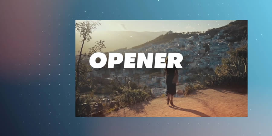
20+ Best Slideshow & Photo Gallery Templates for DaVinci Resolve – Speckyboy
Slideshows and photo galleries are a great addition to any video presentation. They serve as a storytelling vehicle and a way to keep viewers interested. You can also use them to transition to a new scene.
These segments work wonderfully as the star of the show or as a bit player. Their flexibility is handy for product videos, documentaries, event recaps, and more.
Creating a slideshow or gallery from scratch can be time-consuming, though. Constructing a scene for your photos and adding effects will slow down even experienced video editors.
That’s why we love these DaVinci Resolve templates. All the hard work has already been done for you. They offer professional-grade effects and are easy to customize.
Add your photos and perhaps a bit of text. The result is a top-notch presentation that is sure to impress.
Look below and see which templates can improve your next video project.
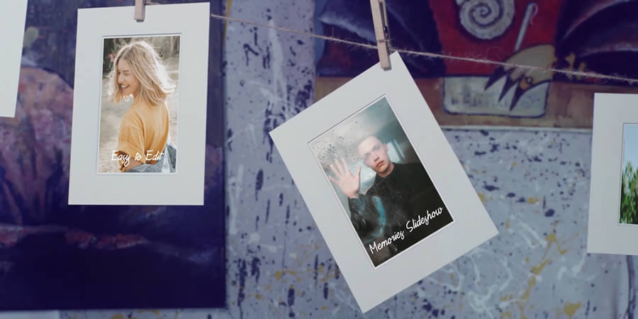
Here’s a fun way to display your photos. This template includes an elaborate scene featuring your images hanging from a clothesline. It’s a unique effect that will have viewers talking. It is a perfect choice for family photo albums.
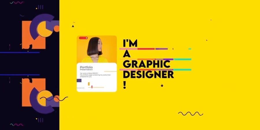
Show off your best work with a portfolio video slideshow template. Inside, you’ll find a place to list your skills, biography, and contact information. There’s also space to add examples of your work.
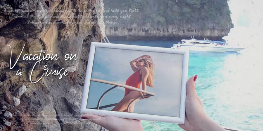
This video template is designed to help you relive the best moments of your vacation. It’s also a great choice for travel bloggers or hospitality companies. It features vintage film effects and sunny transitions.
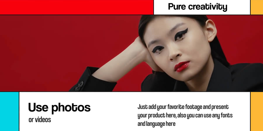
Use this flexible template to recap a recent event or create a corporate presentation. Its clean, modern style also works well for video introductions. You’ll find plenty of color and bold typography here.
Here’s a slideshow that blends modern and classic looks. Polaroid-inspired photos scroll by – complete with social media icons as decoration. Beautiful lens-flare effects are included to add a professional touch. Add your travel or family photos and enjoy.
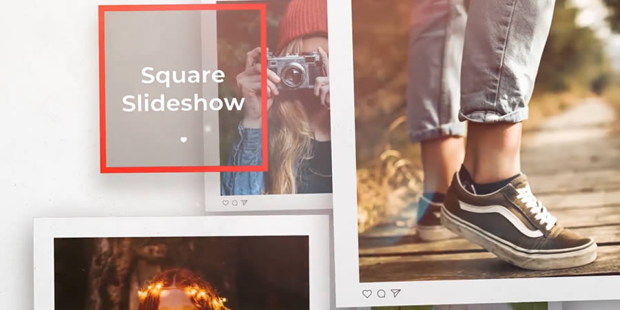
This template features a simple and beautiful layout in a square viewport. Photos are highlighted with a variety of border shapes and backgrounds. You’ll also find plenty of smooth animations and fun special effects.
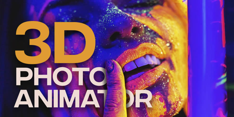
Are you looking for a unique effect? This template includes awe-inspiring 3D parallax animation. It adds depth and a new perspective to your static images. Choose from three macro presets to create just the right look.
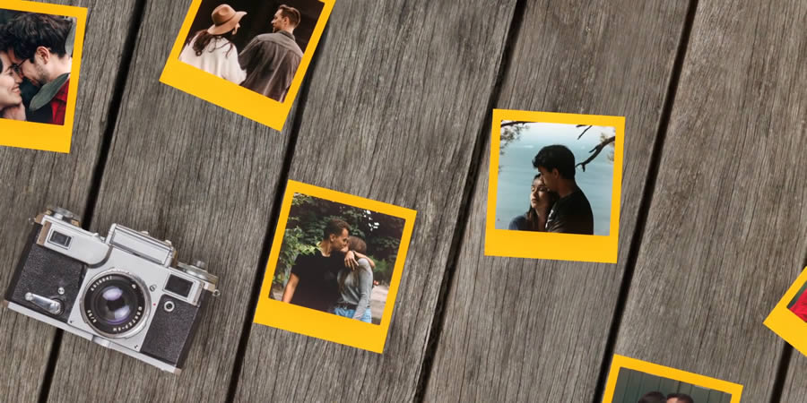
Bring a retro vibe to your videos with a Polaroid slideshow. Place your photos within the iconic frame and evoke memories of good times. Use it for family photos, reunions, or anywhere else you want to spread cheer.
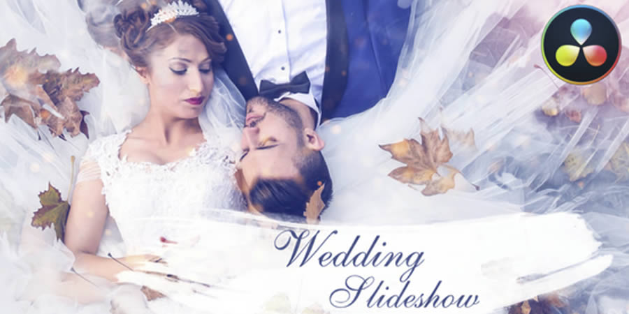
This wedding slideshow template will help you share memories from a special day. The package includes stunning reveal effects and a place for captions. The happy couple, friends, and family will be amazed at the results.
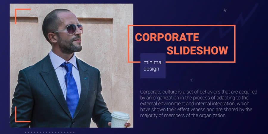
Introduce your team via this slick corporate slideshow. The template is modular and easy to customize with photos and text. The included vertical and horizontal versions help you target mobile and desktop devices.
This vintage slideshow template adds a classic cinematic look to any photo or video. The effects and typography used here are perfect for celebrating the past. It’s like a bit of Hollywood magic is within your reach.
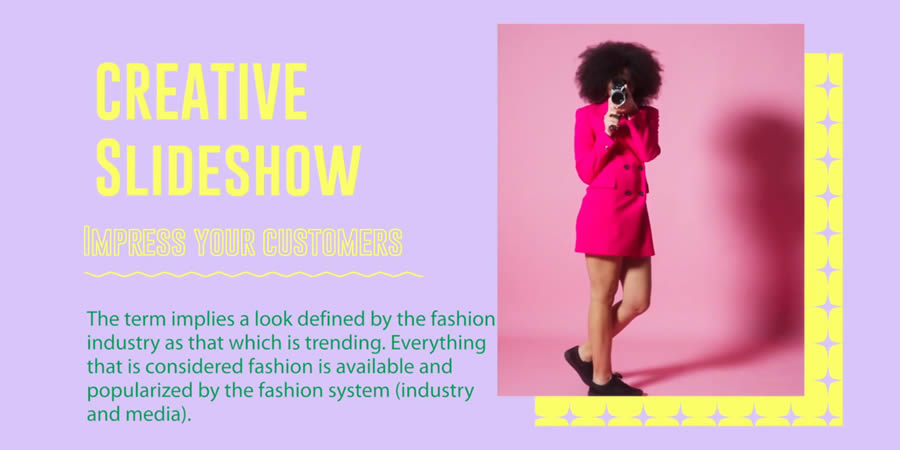
Want to add bold colors to your video? Check out this eye-catching magazine template. See colorful blocks come together as your images and text are displayed. There’s a lot of modern charm for viewers to admire.
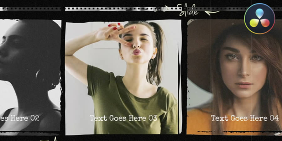
Here’s proof of how powerful a filmstrip can be. Add your photos to this template with vintage film effects and frayed borders. A gentle scrolling effect is easy on the eyes and creates a classic presentation style.
Fun and unique, this slideshow template will add personality to your photos. A mix of geometric shapes and exciting animation effects make a compelling result. There’s also plenty of space for adding custom text.
Parallax effects are popular in web design but also great in video production. This video slideshow template makes adding the effect to your photos easy. You’ll find three versions included with room for dozens of photos.
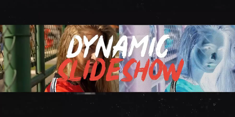
Use this template to feature your action shots or adventure videos. It’s a fast-paced presentation that goes well with sports, outdoor lifestyle, or health-related presentations. There’s enough energy here to inspire viewers to get up and moving.
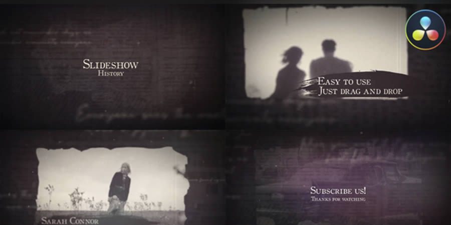
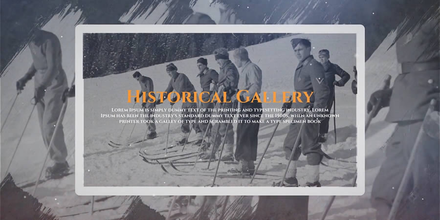
Historical photos are a perfect fit for this photo gallery template. The included effects evoke the past with film textures and dreamlike animations. You might use this one for a video timeline or family history project.
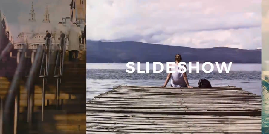
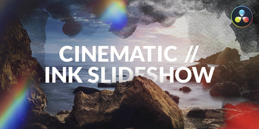
Those looking to add dramatic flair to their photos should look no further. This cinematic slideshow includes top-notch professional effects that keep viewers glued to their screens. Use it for introductions, closings, or teaser videos. The possibilities are pretty much endless!
Share your good times with the world using this social media template. It features a vertical viewport for easy viewing on mobile devices. There are also fun shapes and effects for dressing up your images.
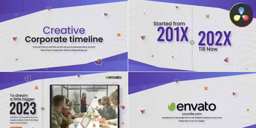
This template is built to help you share your company’s history. Create a beautiful timeline, complete with professional animation and an easy-to-read layout. It would make a great feature on your website’s “About Us” page or as an introduction to a corporate presentation.
An Easy Way to Add Custom Galleries and Slideshows
You don’t need to be a pro to create a high-quality video gallery or slideshow. The templates in this collection offer a range of styles in an easy-to-edit format. Everything from classic to modern is available.
Choose your favorites from our collection and download them. You may find yourself using them again and again.
Related Topics
Top

EU introduces draft regulatory guidance for AI models
The release of the “First Draft General-Purpose AI Code of Practice” marks the EU’s effort to create comprehensive regulatory guidance for general-purpose AI models. The development of this draft has been a collaborative effort, involving input from diverse sectors including industry, academia, and civil society. The…
20+ Artistic Effect Lightroom Presets for Creative Photographers – Speckyboy
The right photo effect can transform an ordinary image into a work of art. Adjustments to lighting, color balance, and texture help you create the perfect mood for your project.
You can use Lightroom presets to achieve professional results in no time. They run the gamut from subtle touches to bold statements.
Each one is configured to change the look of your image. And much of the hard work has been done for you. However, they’re flexible and allow you to adjust them to match your needs.
If that sounds amazing, you’re in luck! This collection features more than twenty Lightroom presets that add artistic effects to any photo. They’re a great addition to your photography toolbox.
Check out our collection and find the presets that catch your eye. They’re so handy that you’ll want to use them again and again.
You might also like our collection of art effect Photoshop actions as well.
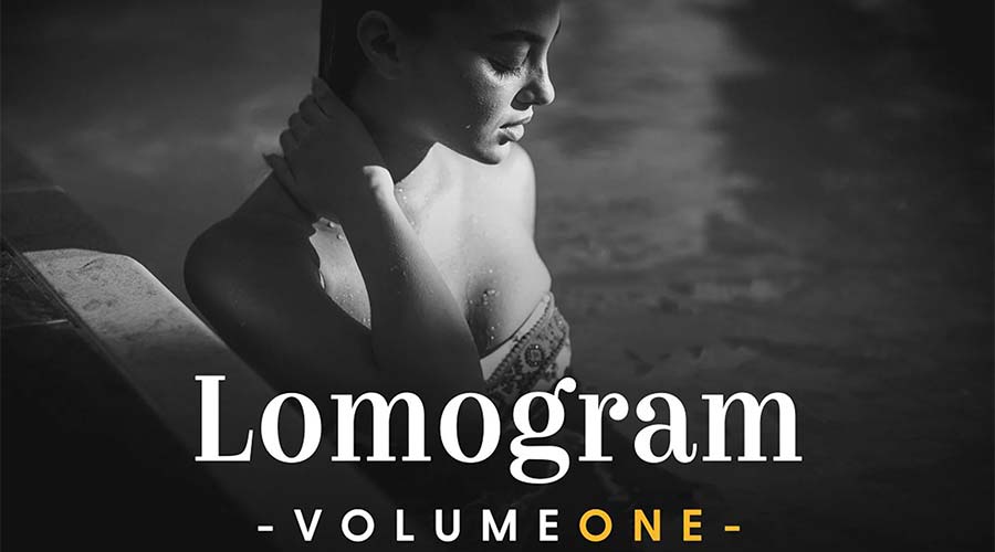
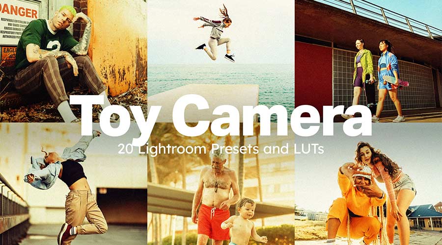
Inspired by Lomography, this suite of 19 presets provides a variety of interesting effects. They’re meant to mimic the non-technical joy of classic toy cameras. The effects aren’t meticulously crafted – but that’s the point.
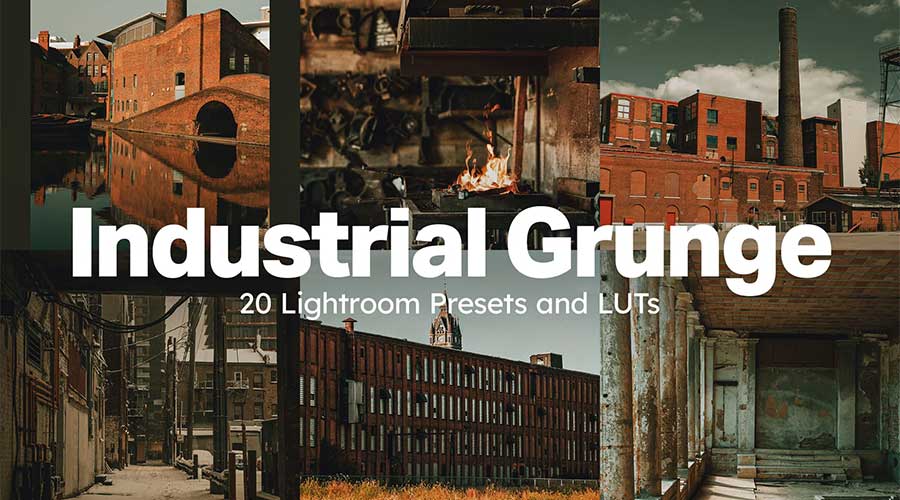
Bring a rough industrial look to your photos using these grunge presets. They support the Lightroom adjustment slider to tweak the effect’s intensity. That makes it easy to go from subtle to dystopian in no time.
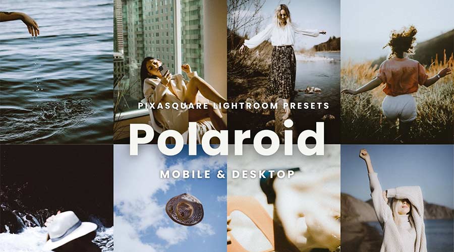
The look of a Polaroid instant photo is timeless. You can add this classic effect to your images via this set of five Lightroom presets. The washed-out aesthetic brings a retro quality to your portrait photography.
Artistic photo effects can be fun! The 20 presets in this collection add a memorable lo-fi look of a toy camera. They also support Lightroom Mobile, so you can take the party with you.
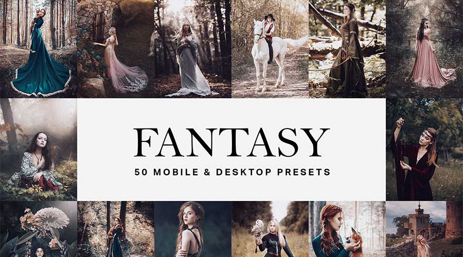
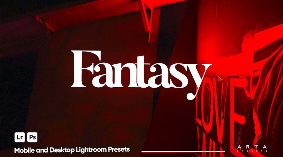
Fantasy fans will want to check out this suite of 50 surreal presets. Their style is reminiscent of popular period pieces like Game of Thrones. There’s plenty here to help you create a whole other world.
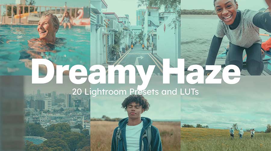
Use these presets to add a dreamlike haze to your photos. They feature soft tones and an airy ambiance that feels like a retro film camera. Give your images a past life with just a click.
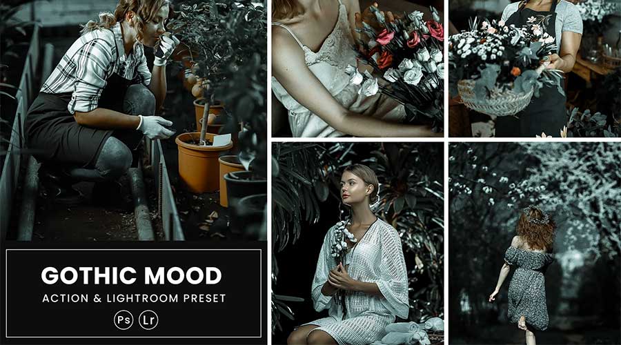
Dark and moody, this collection offers muted colors and sharp lines. These versatile presets can be paired with portraits, fashion shots, and landscapes. They’ll make any photo stand out from the crowd.
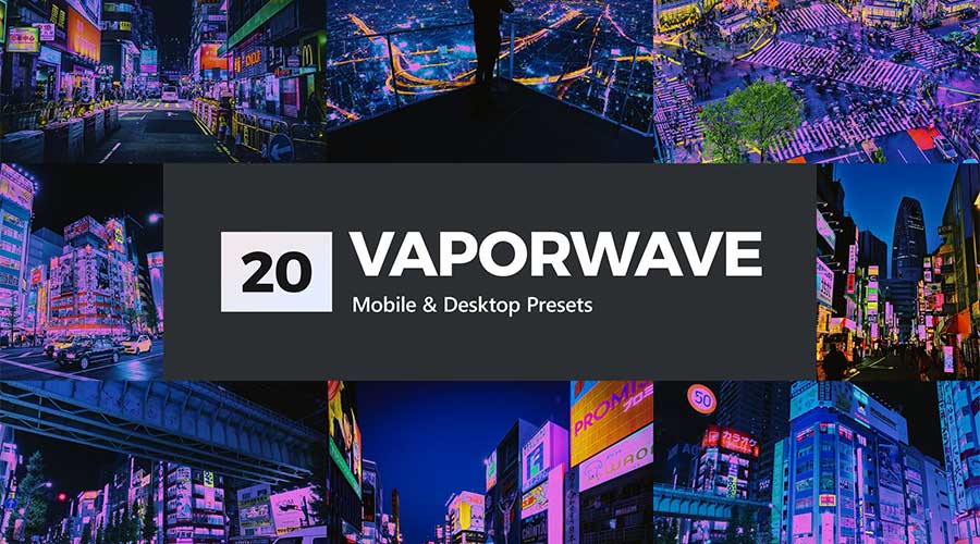
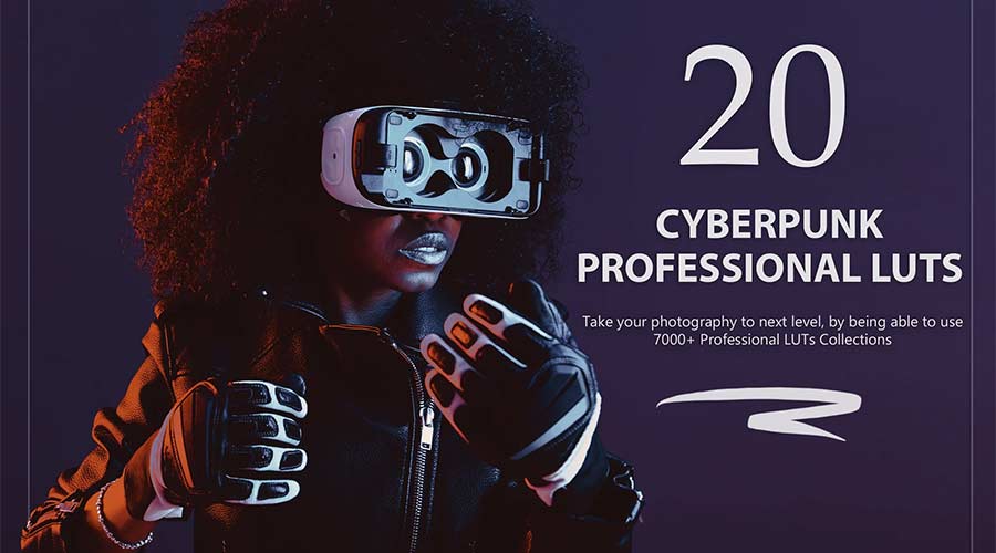
The future is full of color according to this suite. Add a bright look to your nighttime landscape photos – especially those including neon signs. Rich hues and high contrast are the calling cards here.
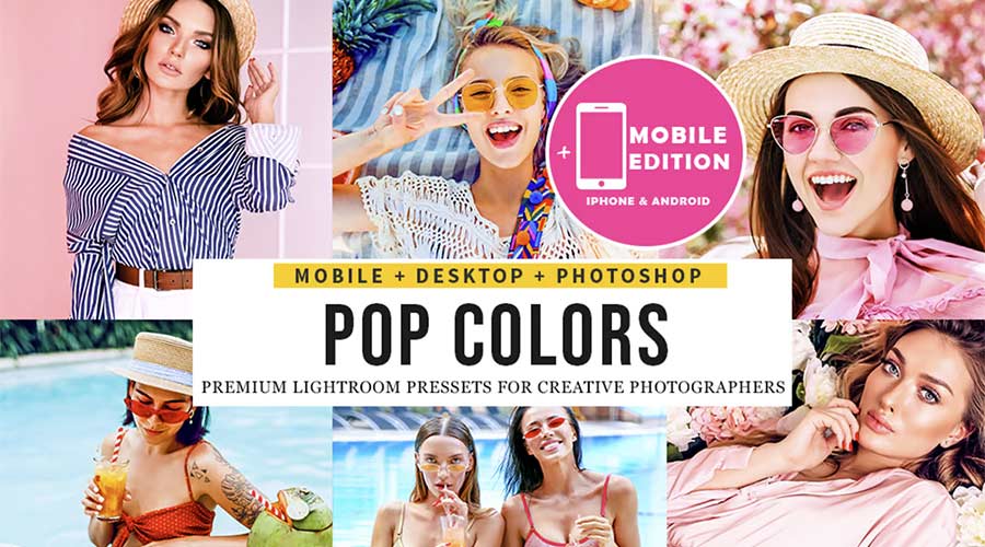
Want to add some serious vibrance to your images? This collection of six Lightroom presets will boost even the dullest of photos. They make it easy to bring out the bold with a click.
These presets add a high-intensity effect to your lifestyle images. Your colors will be brighter and lines sharper. It’s a great choice for night photography or anywhere dark and light contrast.
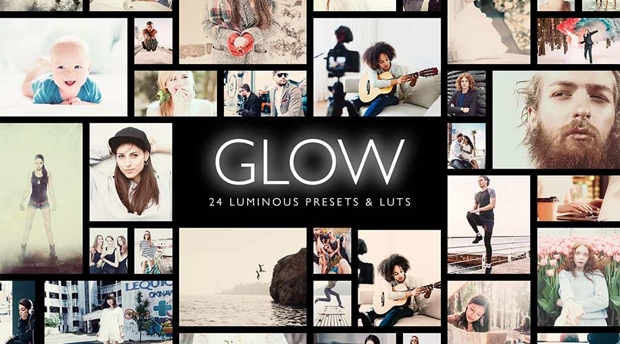
This collection of 24 Lightroom presets includes a variety of luminous options. Whether you want to add a subtle light boost or something extreme, you’ll find it here. You can also adjust them to find just the right look.
Brighten and balance your photos using any of the 14 presets included here. They work well for outdoor shots or any image that could use a natural color enhancement. You’ll be surprised at how much life is hiding in your image.
Use these color-grading presets to add a moody vibe to images. Colors are boosted to bring out a dramatic look. There’s a lot of opportunity to experiment with the 20 included effects.
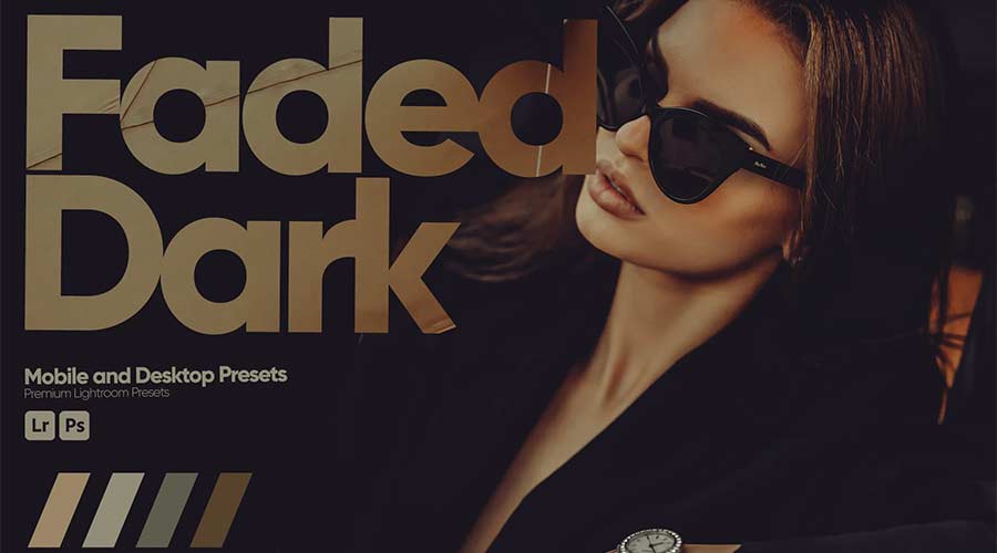
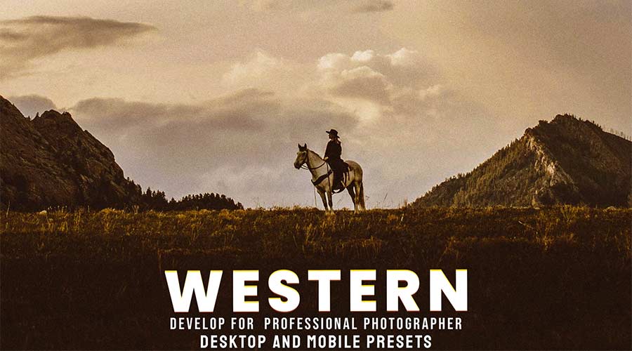
Embrace the darkness using this collection for Lightroom. Add a tint to photos while emphasizing earthy tones. The effect perfectly adds a cinematic feel to portraits and architectural images.
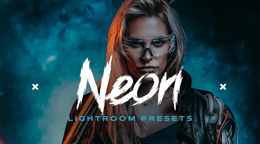
Here’s a way to bring a neon glow to your photos. These presets enhance light colors and bring them to the forefront. Your images will shine with a powerful visual statement.
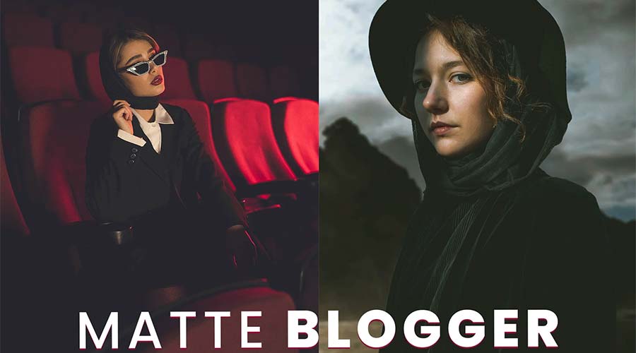
Add a calm balance to any image with these matte effect presets. Inside, you’ll find ten options to achieve a classic film look. Use them to dress up portraits, landscapes, and lifestyle photography.
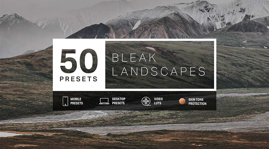
Your travel photos will benefit from this set of 50 Lightroom presets. They add a washed-out effect that makes them perfect for use as backgrounds. Website headers and hero areas are possibilities, as are print advertisements.
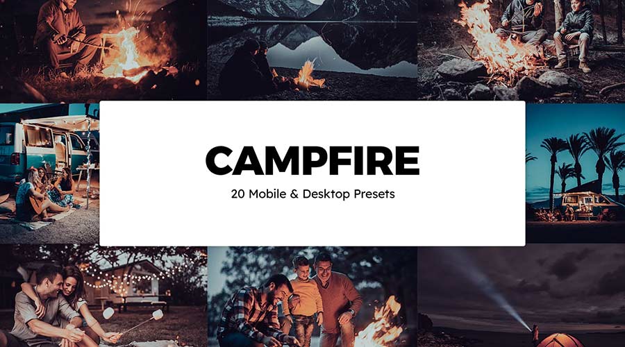
Bring a little heat to your fire images with presets built just for them. They aim to create a modern look while avoiding oversaturation. There are several options to choose from to achieve unique results.
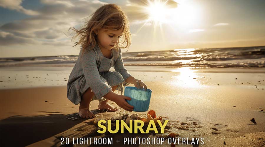
Realistic sunshine effects are easy to implement with this collection of overlays. They brighten up any photo with bright rays of light. Add them as a separate layer and experiment with opacity and blends to make something special.
Vintage looks and warm colors make these presets a great option. Use them to turn a dull outdoor image into a dramatic scene. The 10 included effects make it easy to add some retro charm.
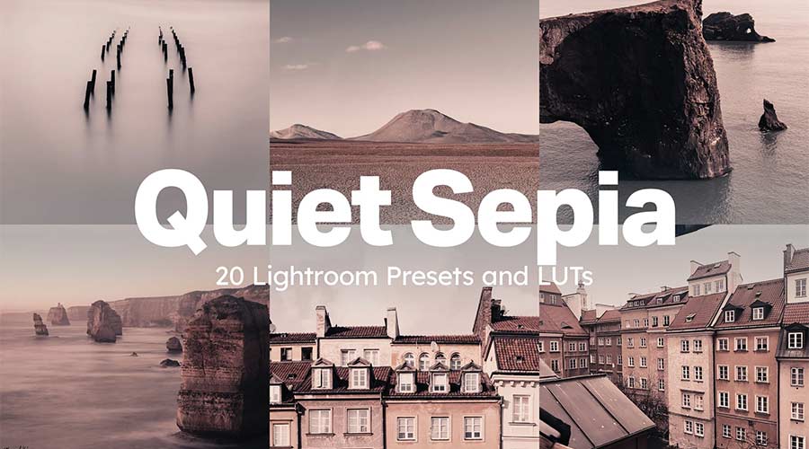
This collection of 20 presets will add the timeless beauty of sepia to your photos. The effect is subtle and still allows colors to come through. The result is an antiqued look that is sure to please.
Add Some Artistic Flair to Your Photos
Sometimes your photos need an extra boost. That’s where the Lightroom presets in this collection come in. They quickly add virtually any type of artistic effect imaginable.
What’s more, they’re great fun to experiment with. You can adjust them or even combine effects to create something unique. There are so many possibilities!
We hope you enjoy the options above and make them part of your photo editing workflow.
Related Topics
OpenAI faces diminishing returns with latest AI model
OpenAI is facing diminishing returns with its latest AI model while navigating the pressures of recent investments. According to The Information, OpenAI’s next AI model – codenamed Orion – is delivering smaller performance gains compared to its predecessors. In employee testing, Orion reportedly achieved the performance…
When Website Builder Tools Get in the Way of Best Practices – Speckyboy
We talk a lot about web design best practices. The tenets of accessibility, performance, resiliency, and security should be part of every project. They’re essential to a successful outcome.
It doesn’t always work that way out of the box, though. We are becoming more dependent on site-building tools. As such, we rely on them to do things the right way.
These tools aim to simplify the design and build processes. Some do it very well. But there’s a side effect: They take control of the output. And there’s no guarantee that they’ll employ best practices.
It’s an issue as old as the WYSIWYG editor. The difference is that it’s harder to override any problematic code.
There are some less-than-great tools on the market. Site builders that are outdated or deeply flawed. But even a great tool can get in the way. None of them are perfect.
Let’s look at a few scenarios when a tool hinders your ability to follow best practices. In addition, we’ll show you some ways to get around these issues.
How Site Builder Tools Can Impact Accessibility
It’s never a good idea to assume your website is accessible. Doing so is a risk. You might have created a poor user experience. At worst, the site may not be compliant with the law.
Site builder tools can make accessibility issues less obvious. For example, they may not warn you if you choose an inaccessible color scheme. Subtle color differences could make a big difference.
They might also produce code that isn’t semantic. That makes it harder for screen readers to interpret your content.
There’s also the implementation of special effects. You might add intense animations that are harmful to some users. The tool won’t always tell you the potential consequences. Thus, it’s up to you to use it responsibly.
Accessibility testing is the only way to know – regardless of how you built the site.

Included Features Aren’t Always the Best Option
Site builders often include advanced features. Elements like sliders, modal windows, and media players come to mind. These items are essential for some projects.
Their inclusion doesn’t speak to quality, though. The tool may produce inefficient or buggy code. The result is poor performance.
There’s also a chance of a conflict with other software like themes or plugins. And there’s no guarantee of browser compatibility.
There’s a high level of convenience with these features. You don’t have to search for a plugin that does x, y, and z – it’s already there. However, they’re not always the best fit for the job.
WordPress page builder plugins are an example. The one you use may come with a forms module. Awesome! But does it do everything you need? Are the forms accessible?
It’s worth doing an honest assessment of these items. Look at what they do. Run performance benchmarks. Monitor your browser console for errors. That will help you determine if it’s worth using.
If not, there are plenty of other options. You don’t always have to settle. And moving to a different solution could offer better results.

The Potential for Becoming Locked In
Sure, a site builder may claim to offer everything under the sun. But will it grow along with your needs? How portable is your site’s content?
You’ll want to know the answers sooner rather than later. Otherwise, you might be stuck with a tool that can’t keep up with you. And moving on can be a tedious process.
That happens with WordPress. A page builder plugin may no longer meet your needs. Or you might want to switch to the native Block Editor.
Making a change is possible. But it’s not always easy. Page builders often have different ways of outputting code. Thus, you might be left to reformat content piece by piece. The WordPress Data Liberation project aims to help with this.
The challenge is a bit different with proprietary systems. Not all of them offer third-party plugins. And some make it hard to move your site to a new provider.
Either way, it isn’t easy to rid yourself of monolithic tools. A modular approach is more efficient. It’s easier to swap elements or add new ones.
Site Builders Are Great – Just Be Realistic
There’s so much to consider when building a website. That’s why site builders are popular. They aim to provide an all-in-one experience. And there’s a lot to like about them.
But there are also some drawbacks. It doesn’t mean you should avoid them altogether, though. Consider the pros and cons before committing.
Look for reputable tools that have a history of stability. Review their features and determine how they fit into your project. Ideally, you’ll find one that will serve you well into the future.
It’s also a good idea to set realistic expectations. A site builder can’t possibly cover every use case. There are times when you’ll need to go outside the box.
With WordPress, that means finding a separate plugin to perform the function you want. On other systems, you may need to write custom code.
The goal should be a website that looks and functions how you want. It should also be flexible enough to accommodate growth. Tools play a significant role.
Keep that in mind throughout the process. It may save you a headache or two along the way.
Related Topics
Top
20+ Best Color Grading LUTs for Lightroom – Speckyboy
You can use Lightroom Look-Up Tables (LUTs) to improve the look of any photo. They provide an easy way to add all manner of professional effects. They are a must-have addition to every designer’s toolbox.
Today, we’ll introduce you to some fantastic color-grading LUTs for Adobe’s Lightroom. These presets help you tell visual stories by adjusting aspects of your images, such as color, saturation, curves, and white balance. It’s a way to convey emotion, mood, and even time.
Our collection features a variety of color grading options. Use them to depict times of day, seasons, and color temperature, among other unique effects. The possibilities are nearly endless!
You might be surprised at what can be accomplished through these simple add-ons. Not to mention the time you’ll save by not having to edit your images manually.
Ready to get started? Keep reading to find the perfect fit for your visual storytelling project.
You may also like our free collection of Lightroom LUTs.
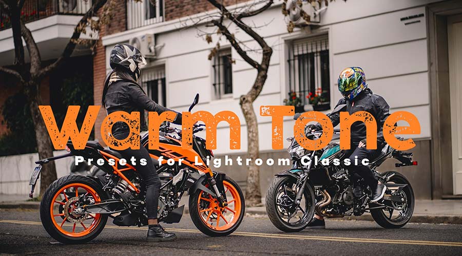
Add warmth to your photos with these Lightroom presets. They’re designed to bring out orange, red, and yellow tones. Use them to enhance landscapes and portraits with a sunny glowing effect.
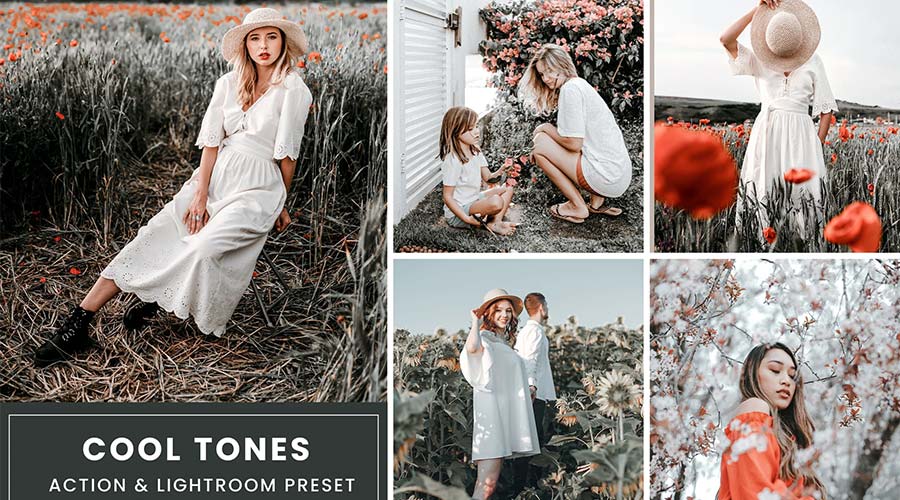
Are you looking to add a cool touch to your shots? These LUTs accentuate cool color tones, making your image stand out to a whole new level. They’re perfect for making your subject pop.
Quickly add beautiful vintage film effects to your images with this collection. You can use these presets to bring out rich film tones and create a sense of magic. You’ll find everything you need to design a classic look.

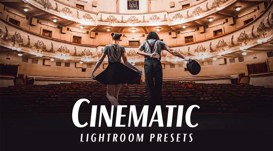
This LUT collection offers a variety of cinematic styles. You’ll find presets for different color temperatures and moods. It’s an easy way to add a bit of Hollywood to your work.
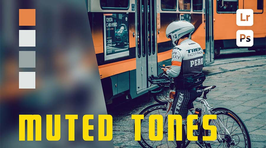
Enhance your lifestyle photography with this set of muted tone presets. They’re great for setting a dark or serious mood. Even better, you can apply these eye-catching looks with a single click.
Create just the right mood with these LUTs. Inspired by a good cup of coffee, they bring rich, warm tones to photos. The large number of presets will help you find the perfect effect for your project.

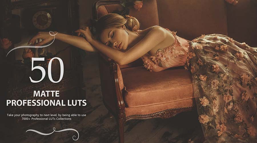
These color-grading LUTs are designed to add cinematic tones to your photographs. Bring out a dramatic matte finish in an instant. You can also adjust these presets to fit your needs.
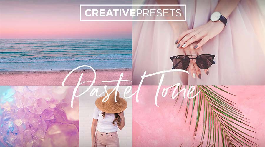
Soft pastel tones are great for portrait and landscape photography. They add a gentle touch and create a light mood. This LUT collection will help you add a look that will produce smiles.
Enhance your urban landscapes with this set of desaturated Lightroom LUTs. Use them to create a moody and contemporary look with just a click. You’ll find a variety of presets here to achieve your desired result.

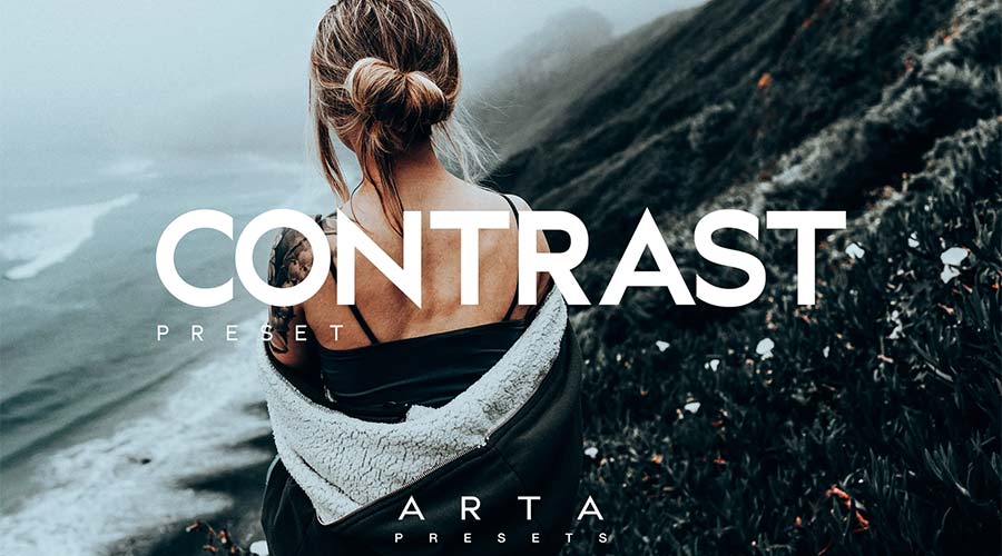
Nothing stands out more than an image with rich color contrast. These presets will help you create high-end contrast effects with minimal effort. Add them to your collection and bring out the best in your photos.
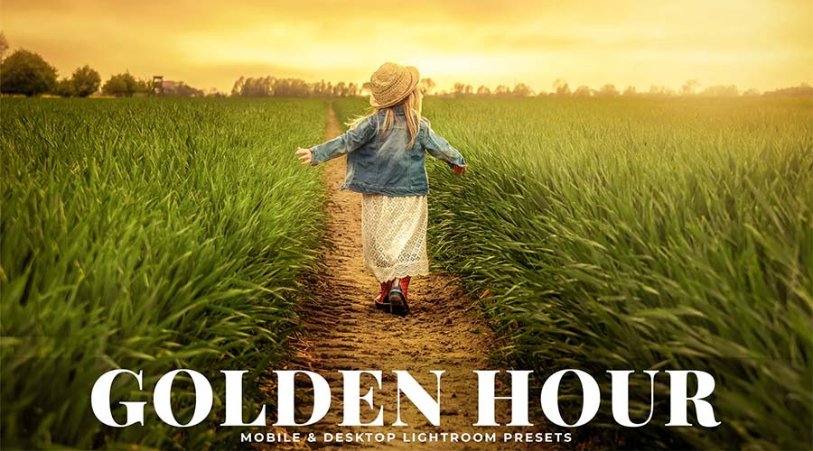
The warm glow of the “golden hour” is a longtime staple of photography. The color-grading LUTs in this pack can help you enhance or even simulate the effect. Best of all, they work well with just about any photograph.
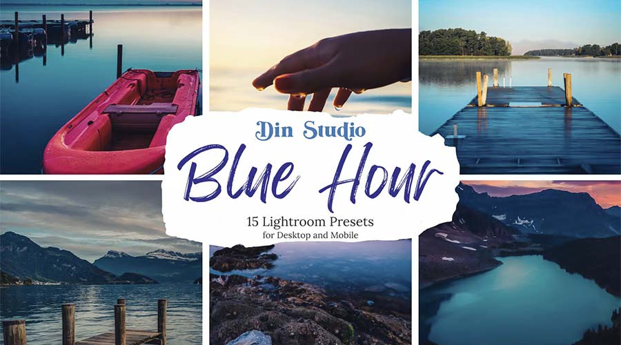
Use this collection of presets to add cool blue tones to your photos. They can bring a moody vibe to your landscapes and portraits. The effect is gentle on the eyes and easy to implement.
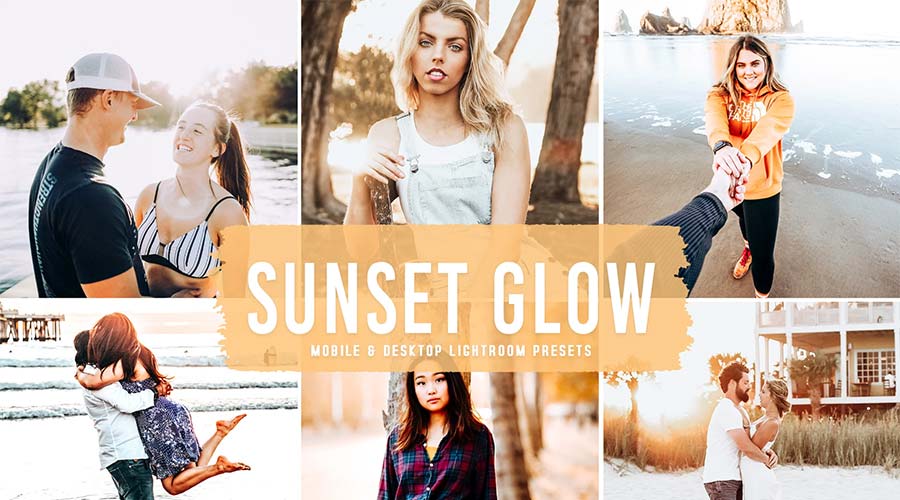
Bring your images to life with a bright, sun-kissed effect. The presets in this collection can enhance even the dullest low-light photos. The gorgeous glow of a sunset is within your reach.
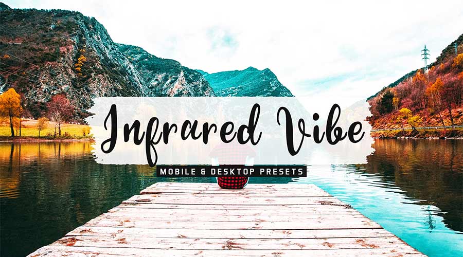
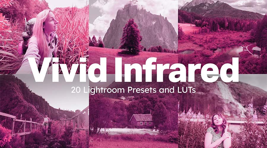
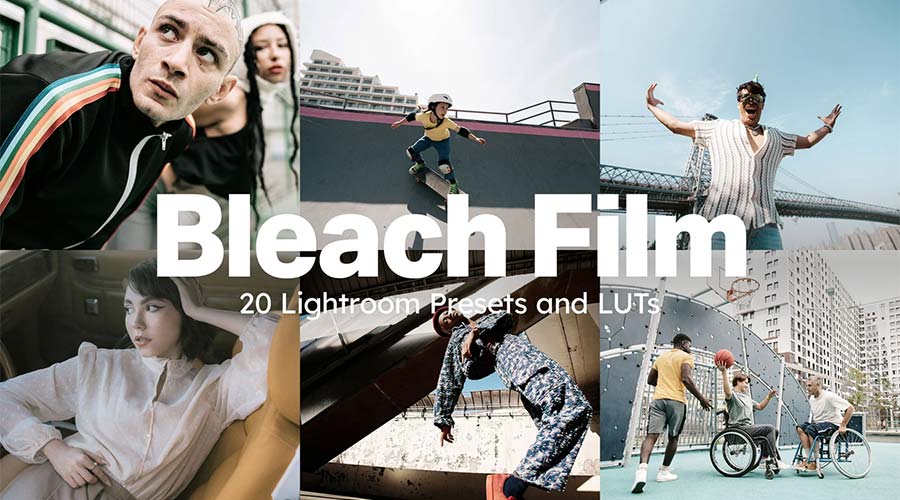
Here’s a fun collection to make your images look otherworldly. Multiple styles are available, each with a unique spin on infrared film effects. Experiment with these presets to discover a whole world of possibilities.
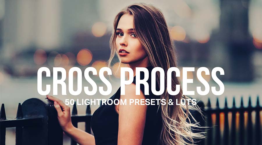
Ensure your color stands out with this set of cross-processed LUTs. Choose your desired color, and the preset will do the rest. It’s a great way to add a dominant hue to your photos.
These LUTs will desaturate your image – resulting in an understated tone. They’re an excellent choice for fashion and landscape photos where a touch of nostalgia is needed. You’ll have professional effects in no time.
Add a vibrant touch with these color-popping presets. You can turn your images from dull to vivid with just one click. Use them to create attention-grabbing social media, web, or print photos.
 #
#
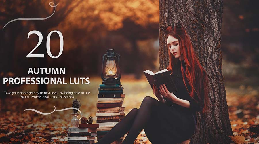
Transform your photos with rich autumn tones that evoke the season’s spirit. Each LUT offers cinematic quality with an array of options to choose from. A simple way to decorate your images for fall!
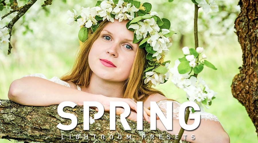
Think of lush greens, pastel yellows, and bright whites. Bring out these springtime colors with a collection that’s blooming with potential. It’s perfect for outdoor nature shots and portraits.
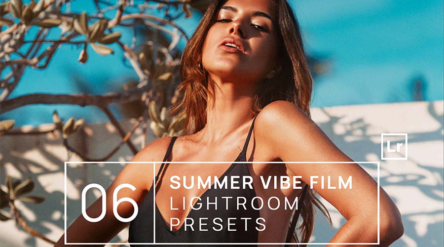
Turn up the intensity with this collection of summer-themed LUTs. They’re designed to accentuate the rich, warm tones of your photos. Use them to beautify your summer shots without breaking a sweat.
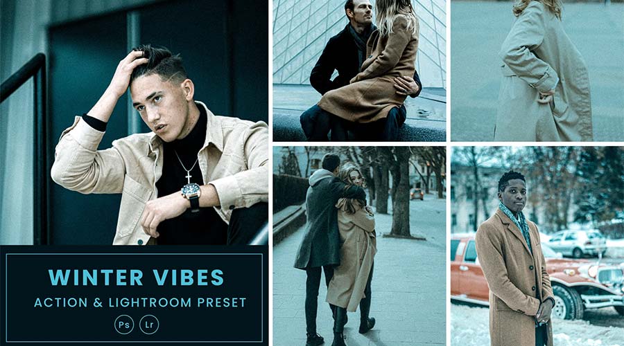
These presets create a sharp and cool style reminiscent of winter. Each option focuses on a different shade, giving you multiple ways to make a statement. Use them on fashion, lifestyle, and outdoor images.