Technology means “science of craft”, and it is what this category is all about. Here you will find articles covering technological advances, innovations, and solutions based on science, computers and systems, engineering, etc…
Working with web design clients means wearing many hats. We’re developers, marketers, and (sometimes) therapists. It’s all about building a great website that meets our clients’ needs.
We can’t forget to add the role of a project manager to the list. It might be just as important as anything we do.
Why? Consider how many projects become stalled and stagnant. Clients often have big ideas and expect us to expedite our work. However, things get bogged down when it’s their turn to contribute.
It could lead to an indefinite hiatus. Months may go by without progress. The site sits there collecting virtual dust while we wonder when we’ll get back to work. The situation is bad for your calendar and your bank account.
Leadership is the best defense against a stalled project. It also helps you deliver a better outcome. Here’s how to use your skills to get things moving in the right direction.
Why You Need to Take Charge
Our clients work across various sectors. They may be accustomed to getting things done within their area of expertise. However, website projects are another ball of wax.
Many facets of a typical project require niche technical knowledge. That makes some clients uncomfortable. Thus, they might not understand their role or what’s going on. This lack of clarity makes it harder for them to contribute to the effort.
Content strategy is another responsibility that stresses clients out. In all likelihood, it’s not something they do regularly. They may not know how or where to start – not good for motivation. This leads to placing the task on the back burner while they tackle their other duties.
Then there are those oddball feature requests. The thing your client saw on a competitor’s (or totally unrelated) site. They see it as part of a great website, even if the reality is different.
Each of these scenarios can benefit from your experience and expertise. It’s time to lead the way!
How to Manage a Project Without Stepping on Toes
Effective project management requires a delicate balance. You want to be honest and direct with your clients while acknowledging their overall authority. This skill doesn’t always come naturally, and it takes practice to get things right.
With that in mind, here are a few tips for gently leading them toward progress:
Be Clear About Project Needs
People tend to work more efficiently when they know what’s expected of them. That’s why any lack of clarity will grind your project to a halt.
Your client needs to know what you need from them. So, provide a list of what you’ll need to do the job right. Cover the basics, like content and image assets. But don’t be afraid to go into detail.
For example, you might ask them to provide text for their About Us page. But what should they include? How much text should they write?
Adding a few specifics could be the difference between whether the content is a perfect fit or a mess. Instead of saying, “I’ll need content for the About Us page”, include a few basic parameters.
“I’ll need content for the About Us page. It should be 3-5 paragraphs of text that highlight: “
Your mission statement;
Your areas of expertise;
A little bit about your history;
Why customers should choose you;
“It would also be nice to have a few images of your location and/or your team. None of the above is set in stone – we can adjust according to your needs. However, this should serve as a solid starting point.”
Now, you’ve given your client a clear task. That’s infinitely easier than expecting them to figure things out on their own. The more details you provide, the more likely they’ll deliver for you. As a bonus, you’ll also encourage collaboration.
Set an Agreed-Upon Project Timeline
Clients often have a preferred (soft) or absolute (hard) deadline for a project. Getting to that point isn’t always easy, though. They may wait until the last moment to provide materials, meaning you’ll have to rush to get things done.
That’s not ideal for anyone. You may miss something important while hurrying to finish. And the overall quality of your work will likely suffer.
Setting a project timeline can help. Provide your client with dates for receiving content or other assets. Let them know how much advance time you’ll need to do your job. It doesn’t hurt to give yourself a day or two extra, just in case.
What if your project doesn’t have a deadline? Create one! That will keep everyone on the same page.
Stay in Touch With Stakeholders
As the old saying goes: Out of sight, out of mind.
A project’s progress can fizzle when active discussions stop. Stakeholders will move on to other items on their agendas. Meanwhile, you’re left waiting for what you need. And there’s no telling how long you’ll have to wait.
You can avoid this scenario by keeping an open line of communication. Be proactive and reach out to stakeholders. Offer your assistance and ask if they have questions.
This move achieves two things. First, you’re demonstrating a personal touch when supporting your client. Second, it puts the project in the front of their minds. It may renew their focus on taking the next steps.
You won’t always see immediate progress. Your client may be too busy when you contact them. However, you can always offer to check in again in a few weeks.
Lead Your Clients to a Winning Project
Every website project requires a plan and someone to ensure it progresses. Clients won’t always be comfortable leading the way. That’s a signal for you to put on your project management hat.
You don’t need to be an extrovert or even a project management expert. You can get by with basic organizational skills and an understanding of how long various tasks will take. From there, it’s all about clear communication.
So, don’t sit idly by while a project goes off the rails. Take on a leadership role and give yourself the best chance for success. It’s a skill you can use again and again.
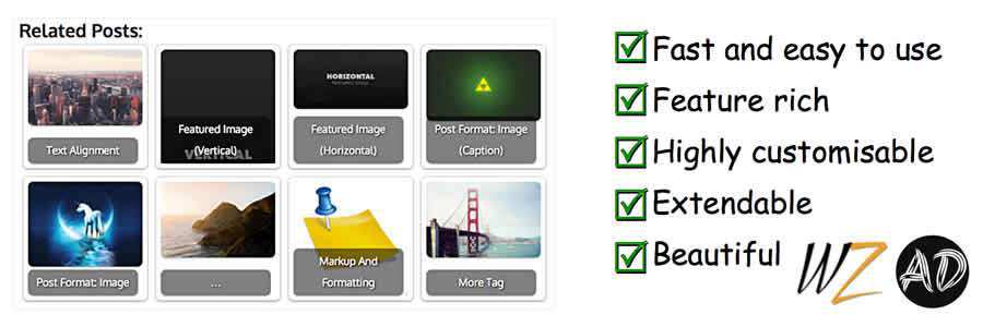
There’s no denying it: WordPress rules. The CMS has so many plugins, ranging from custom forms to more complex usability features. Even better, most of them are totally free.
If you run a WordPress site, you know about their many related post plugins. They automatically pull articles relevant to each post on your site. Granted, this can impact performance – so there is no “perfect” choice.
That’s why we’ve curated this collection of our favorite related post plugins you might pick from. They each have their benefits, drawbacks, and interface styles.
YARPP stands for Yet Another Related Posts Plugin. It was designed as just another option from the many existing plugins at the time. Truth be told – this is one of the best.
It does eat a decent amount of resources on the server, so it helps if you’re on a VPS or dedicated host. But you can use a caching plugin to help speed things up.
Posts can be organized with thumbnails or in a link list inside your article. The templating system is also easy to edit if you know your way around CSS, so it’s easy to blend this into any site.
I’ve used YARPP on a couple of sites, and I’ve been pleased with the results. You’ll feel the same way if you take it for a test ride.
Contextual Related Posts uses a custom algorithm that pulls keywords from each page’s title and main body content. This is a lot more intensive than other plugins, but it also delivers more unique results.
Once installed, it’ll automatically start pulling related posts based on the page content. You can add the shortcodes anywhere or append the related post function to your template files.
I also like how this plugin comes with its own unique caching system. However, that means even if you have another caching plugin installed, like W3 Total Cache, you’ll need to clear both caches to reset your related posts.
This approach certainly cuts down on page size but can be a pain when you have a massive website.
Intelly is one of the newer options that embeds related posts inside your content. Pretty cool!
I have used Intelly Related Posts sparingly, but from what I have seen, it’s a good plugin. The matching system for pulling content is fantastic, and the default templates are easy to work with.
This thing is also pretty much automated. Right from the first setup, it can:
Generate related links for each post
Embed link boxes after natural breaks in content
Pull related post featured images with proper thumbnails
From the backend, you can also customize the color scheme with a few defaults. I’ve yet to find another solid in-post-related links plugin, so if you need that feature, I recommend Intelly.
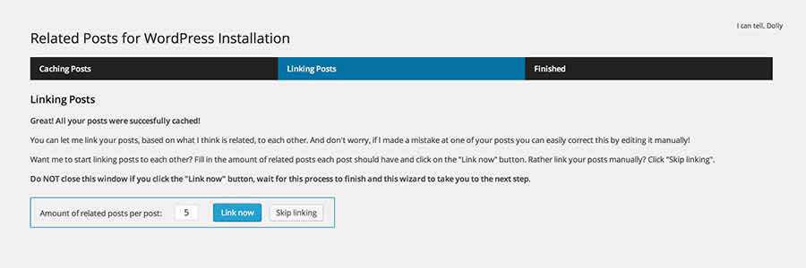
The Related For WP plugin offers most of the features you find elsewhere: custom caching, automated links, and a custom template.
But there is one nice added feature with this plugin that I like. It lets you change links on certain posts if you want to manually alter the related content. The plugin gives you complete control over links on each page, and you can rearrange the order.
For installation, you can use a widget or a shortcode – both of which can work in any theme. The backend has a complete setup wizard to guide you through the process.
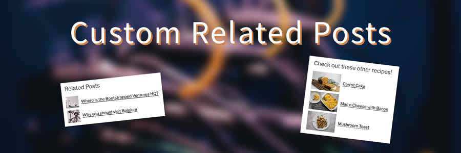
Custom Related Posts is an excellent choice for those who want complete control over related post functionality. It lets you pick and choose which posts you want to display.
One of its key selling points is the ability to define bi-directional relationships between posts. For example, if you’d like two posts to always be tied together, that can be accomplished. In this configuration, your pizza crust recipe will always display as related to your pizza sauce recipe, and vice-versa.
There are also multiple ways to integrate the plugin into your site. Use a traditional shortcode, widget, or Gutenberg block. Featured image display is optional.
Here’s one other option that is relatively new. Related Post by Pickplugins lets you display related article links underneath your page content.
It works just like other plugins, scanning content, categories, and tags to find an assortment of relevant posts. This happens automatically once you install the plugin for the first time. But you also have manual control to choose the links yourself if you want to.
The plugin also has a few unique features, like an optional slider view and a way to set up the related posts inside your archive pages. Overall, it’s a pretty solid plugin to play with. It’s just one of many you can try when looking for that perfect related posts plugin for your site.
If you would like to learn how to create your own related post plugin using ChatGPT prompts, take a look at this article.
Related Post Plugin Quick FAQs
What Are Related Post WordPress Plugins?
They are plugins that will automatically display related content at the end of your blog posts. They help keep readers engaged by suggesting other articles on your site that are similar or relevant to what they’re reading.
Who Should Use Related Posts Plugins?
Bloggers, online publishers, and any WordPress site owners who want to increase reader engagement and time spent on their site would benefit from these plugins.
How Do These Plugins Determine Which Posts Are Related?
Most plugins use algorithms based on categories, tags, or content to automatically select and display posts that are similar to the current article.
Can I Customize How the Related Posts Are Displayed?
Yes, many of these plugins offer customization options for how the related posts appear, including layout, number of posts, and whether to include images.
Do Related Posts Plugins Slow Down My Website?
While they can add some load time, especially if they display images, well-coded plugins are designed to minimize any impact on site speed.
Logos are just as important for gamers as they are for professional athletes. The world of eSports demands a specific aesthetic that uses bold and bright colors to stand out on mobile and desktop screens. The challenge for designers is to create logos that capture the essence of the gamer or team while engaging with eSports fans.
This collection of professionally designed logo templates for gamers offers a range of options for individual athletes, streamers, eSports teams, clans, and fans. These logos showcase archetypal figures and bold design elements that effectively communicate the gamer’s brand and values.
Whether you’re working with an individual athlete or an eSports team, there’s a logo template to suit your needs. You can help your clients show their colors and spread the word with an engaging and fun logo that resonates with eSports fans.
For designers who frequently work with gamers and eSports teams, this collection includes gaming logo template collections that can be easily added to your design kit. With these templates, you can get to work quickly and efficiently, ensuring that your clients are winners in the world of eSports.
If you’re ready to press play and get started on designing stunning logos for gamers and eSports teams, this collection of logo templates is the perfect place to begin.
In PNG, AI & EPS Formats
Sleek and dynamic, this ninja assassin logo template for gamers is perfect for gamers who love their first-person shooters and always demonstrate incredible dexterity. This logo gives every gamer’s brand a suave look that shows they know their way around a stealth quest. It’s fully customizable!
In AI & EPS Formats
If you’ve got a great eSports team on your hands or a distinguished streamer, you’re going to need an amazing logo. Enter: this retro-futuristic gamer boy mascot logo template. This logo is perfect for building a powerful personal brand and looks great on merch, too!
In PNG, AI & EPS Formats
Powerful and futuristic, this logo template for gamers features a ninja in armor. It’s perfect for stealthy streamers and even eSports teams that want to rally audiences around their brands. You can completely customize this exciting logo template in Adobe Illustrator and make sure everyone remembers the name.
In AI & EPS Formats
Help your client’s viewers relate to them with this exciting and modern gamer logo template. It’s perfect for streamers who want to build a personal brand, although it works great for pro players, as well. The color palette and typography choices give this logo incredible movement!
In PNG, AI & EPS Formats
Help the fans show some team spirit with this exciting werewolf eSport logo template! This logo, with a blue and orange color palette, is perfect for teams that are ready to make bank at their next competition. You can easily customize the text and the colors in the Adobe suite.
In PNG, AI & EPS Formats
Modern and unique, the Roboto gaming mascot logo template is definitely one of a kind! It plays with a variety of bold stylistic choices, from the interesting pose of the robot mascot to the dynamic gradient typography. It’s perfect for eSports squads that want to get more hype.
In AI & EPS Formats
Dark and powerful, this dragon eSports logo template is perfect for the teams who know they’re the rulers of every game they choose to play. This logo exudes confidence and power, so it’s going to be a great fit for logos, merch, and other branding materials.
In AI & EPS Formats
If your client is always the gamer who comes out on top, show it with this hunter eSports logo template for gamers. It displays a hunter gearing for a fight in the standard Call of Duty colors – black, grey, and white. This logo also works great for Twitch streamers!
In AI & EPS Formats
Are you working on a logo for an eSports team? Check out this template! It’s the perfect option for teams that provide strong support and powerful offense. With an illustrated hand grabbing for the controller, it’s perfect for teams that compete in console multiplayer games like Call of Duty.
In AI & EPS Formats
If you’re working with an animated and dynamic streamer, they’re going to love this logo! This fun logo showcases a gamer experiencing the thrill of the fight and instantly gives off an engaging vibe. This gaming logo template works best for lone wolf players and streamers.
In AI & EPS Formats
Gaming fans who see this logo are bound to start cheering for the eSports squad sporting it! A combination of eerie and exciting, this samurai logo template is perfect for teams who take pride in the quality of their achievements and their stealth. You can customize it in Adobe Illustrator!
In AI & EPS Formats
Are you looking for a great sports logo template for gamers? You’ve just found it! This sports logo is perfect for gamers who love feeling like they’re on the field even when in their living rooms, and it’s sure to rally loads of support around them.
In AI & EPS Formats
Perfect for streamers, this logo template for gamers features a skull with headphones on. The illustration’s style is very fun and engaging, so it’s perfect for gamers who are ready to launch their first merch line. You can easily customize the logo to fit your client.
In AI & EPS Formats
This logo template tells a story, and it’s perfect for both streamers and teams! It’s versatile, so it works for all kinds of purposes, and you can easily customize this logo for gamers in Illustrator.
In AI & EPS Formats
Show everyone how great troopers can be in a battle (contrary to the Star Wars stereotypes) with this cool eSports logo template. This logo for gamers features a trooper helmet with a white, dark blue, and electric blue color palette. It’s definitely a powerful, on-brand choice for gamers.
In AI & EPS Formats
Wild and engaging, this gamer logo template is perfect for streamers who don’t mind hosting let’s play sessions with folks all over the world. This is a great logo template for gamers, and your clients can easily grow with branded merch and other products later on.
In PNG, AI & EPS Formats
If your clients love ninjas but they don’t want to be too on the nose about it, this logo is perfect! It offers a new take on the popular ninja symbol in gaming and an engaging typography and presentation style. The logo is fully editable in Adobe Illustrator.
In AI & EPS Formats
If you’re working with a client that wants to both emphasize her skills and her femininity, consider this logo. This wonderful logo offers both the enthusiasm of standard gaming logos while also presenting the audience with a cute (and amazing) gamer girl illustration. It’s a win-win!
In AI & EPS Formats
Keep it simple and fun with this gamer boy logo template for gamers, streamers, and squads. If your client is ranking high on the leader boards of their chosen game, they might want a logo that emphasizes their passion. This loud and bright logo is a great and memorable choice.
In PNG, AI & EPS Formats
Give your client the awesome Red Dead Redemption vibe with this cowboy gamer logo template. It’s great for streamers, as well as an eSports squad that isn’t afraid to give their audience the yee to their haw’s. You can easily customize it in Adobe Illustrator!
In AI & EPS Formats
VR is pretty innovative, so if that’s the road you’re following, you’re going to need an innovative logo, too. This logo template for gamers showcases an illustration with gradient VR glasses and typography that follows the same style. It’s an amazing choice!
In PNG, AI & EPS Formats
If your clients love retro consoles and handheld gaming, they’re going to love this logo with retro arcade typography. Inspired by some of the most popular retro gaming design projects, this logo is fun, engaging, and perfect for creating a whole community of video game fans around it.
In AI & EPS Formats
The best gaming logos show the gamers’ personalities, and this one is perfect for squads and teams that love communicating with their loyal fans. Modern and minimalist, this gaming logo works like a charm for a variety of purposes. It can represent an eSports squad or a gaming-related project.
In AI & EPS Formats
If you often work with gamers who love old-school cool kind of style, then you need this gaming logo collection in your kit! You’ll get 16 logo templates for gamers inspired by vintage typography and visuals, with contemporary dynamism perfect for projects, squads, streamers, pro players, and more!
In PSD & EPS Formats
If you need a professional logo for gaming studios, developers, or other professionals in the gaming industry, this template is a great fit. It combines the image of a console with the infinity sign, and expresses movement through dynamic palettes. You can easily customize it in Adobe Photoshop or Illustrator.
In PNG, AI & EPS Formats
This colorful and vibrant gaming logo template is perfect for video game developers and studios that want to attract new fans to their projects! Featuring a cute console controller with minimalist sans-serif typography, this gaming logo template will definitely amaze your customers and make everyone want to play their games!
In AI & EPS Formats
Nothing beats the charm of neon! And if you’re working with vibrant clients who want to entertain their audiences, make sure you add this collection of 8 neon logo templates for gamers to your kit. These unique logos feature motifs such as handheld controllers, arcade machines, and more.
In AI & EPS Formats
Create an engaging and versatile logo for game developers and studios with this gaming logo template. With an interesting rendition of symbols seen on console controllers and gradient typography options, this logo definitely showcases professionalism. You can easily customize it to fit your clients’ brands in Photoshop and Illustrator.
In AI & EPS Formats
This is the only ‘game over’ we ever want to see! This fun logo template features a skull with console controller buttons for eyes and a bold sans-serif heading. It works like a charm for individual players and streamers, as well as game developers and studios.
In AI & EPS Formats
Give your clients more options with these vintage-inspired gaming logo templates. This gaming logo collection features nine gaming logos perfect for gaming projects, tournaments, communities, and similar initiatives. From skulls to console controllers catching fire, these logos radiate charm. You can easily customize them to fit your clients’ brands!
In PSD, AI & EPS Formats
If you’re not looking to school your customers in PVP, and you actually want to educate them, you’re going to love these gaming academy logo templates! This gaming logo pack includes six professional logo templates that you can easily customize and use for your gaming courses.
In AI & EPS Formats
If your gamers are known for playing mystery games or escape room games, they’re going to love these logos. Inspired by traditional mystery motifs, these logo templates for gamers are vibrant and engaging. Help your clients leave the right first impression and draw more fans into their mysteries!
In AI & EPS Formats
Create a professional foundation for your gaming brand or project with this digital gamer logo template. It features a pixelated-style illustration and a modern, sans-serif headline. You can easily customize this logo to your liking in Adobe Illustrator. It’s sure to help you leave a great first impression!
In AI & EPS Formats
Make your retro gaming project more recognizable with these retro gaming club logo templates. Inspired by the 80’s game arcade style in both typography and illustrations, these logos have a particular charm to them, and they’re a bold choice for gamers who love old-school cool.
In PSD, AI & EPS Formats
If your clients prefer creating video games to playing them, they’ll love this gaming logo template. This two-tone logo template features console controller symbols and room for your brand name and a slogan. It’s perfect for gaming studios, developers, and other projects in this vibrant industry!
In AI & EPS Formats
Make the most of the ’80s video game aesthetics and modern ways to kick some serious tooshie with these logo templates for gamers! They’re perfect for individual players, as well as squads and other projects like communities. Retro’s going to make a major comeback!
In AI & EPS Formats
Fully editable and professional, this logo template showcasing a console controller is a perfect fit for video game developers or development studios. Your branding will be improved with this beautiful rendition that both connects you to your gaming roots and signalizes innovation to everyone who sees it, gamer or investor.
In AI & EPS Formats
Perfect for gaming logos, merchandise, and a lot more, these gaming templates are stunners! The illustrations will throw you back to the ’80s (in the best possible way) with vibrant colors and motifs such as dinosaurs and consoles with bold typography. These designs are great for communities and apparel!
In AI & EPS Formats
Minimalist and abstract, this gamer logo template is really unique. It’s also incredibly professional, so it’s a great fit for gaming projects, developers, studios, and more. It features an abstract illustration of hands and a console controller, and you can easily customize it in Adobe Illustrator.
In AI & EPS Formats
Hello, retrofuturism! This stunning gaming logo template collection features four neon logos with both classic gaming and virtual reality gaming motifs. These logo templates for gamers are a great choice for bold gamers who aren’t afraid of exploring new frontiers, and they look amazing with darker color palettes.
Where to Display Your Gamer Logo
With your logo forged, it’s time to let it shimmer in all its glory. Here are the strategic locations in the gaming kingdom:
Streaming Platforms: If Twitch, YouTube Gaming, or Facebook Gaming are your arenas, ensure your logo is prominently visible, be it on overlays, banners, or profile pictures.
Social Media: Gamers are ever-present on platforms like Twitter, Instagram, and Discord. Your logo should mark its territory on profile images, pinned posts, and even watermarked on shared content.
Website or Blog: If you maintain a gaming blog or official site, the header is prime real estate for your logo. And don’t forget the favicon!
Merchandise: Many gamers and streamers diversify with branded merchandise like T-shirts, caps, and mouse pads. Your logo, emblazoned on these, becomes a symbol of loyalty for your fans.
In-game Displays: If you’re into eSports, your logo can find its way onto virtual jerseys, banners, or even in-game billboards in some simulations.
Business Cards & Stationery: Meeting fellow gamers at conventions or industry events? Hand them a card with your logo, leaving a tangible mark of your virtual persona.
Gaming Equipment: Stickers or skins of your logo on consoles, PCs, or even controllers amplify your brand’s presence in the tangible realm.
Eat, Sleep, Game, and Repeat!
Help your clients show their style in the best possible way with these dynamic and fun logo templates for gamers.
All of these templates have been made with gaming aesthetics in mind, so you don’t have to start from scratch or conduct dozens of hours of competitor research to make sure you’re on the right path. Instead, all you have to do is find the right gaming logo(s) on this page and add them to your design kit.
Your clients will love it, and so will their fans. Who knows? Maybe one of these days, you’ll see the logo you designed on your client’s Twitch merch! So bookmark this page, download the templates that suit your client’s style, and get to work. All it takes is a few clicks, and you’ll be set!
If you’re a designer, you probably know that creating stunning typography can be a time-consuming and, at times, challenging task. But what if I told you that you could achieve typographical works of art with just a click of a button? That’s where Photoshop layer styles come in handy.
Photoshop layer styles are pre-configured commands that you can apply to any text layer in Photoshop to create stunning text effects in no time. Whether you’re looking for a metallic, neon, or grunge effect, these layer styles have you covered.
The best part is that you don’t have to be a Photoshop expert to use them. Applying these effects is as simple as clicking a single button, so you can save time and energy while still creating professional-looking typography.
While there are many Photoshop text effect tutorials, the quickest and easiest way to achieve beautiful text effects is to download one of the free Photoshop layer styles available online. So why not give it a try? Download one of the free Photoshop layer styles we have for you below and take your typography game to the next level!
With this free PSD template, you can convert regular text into a modern, colorful, and stunning typographical style, giving you a unique and fun effect.
Thanks to this pack of Photoshop layer styles, you can instantly transform any text into 80’s style typography. The package contains 18 different styles.
Free to Download
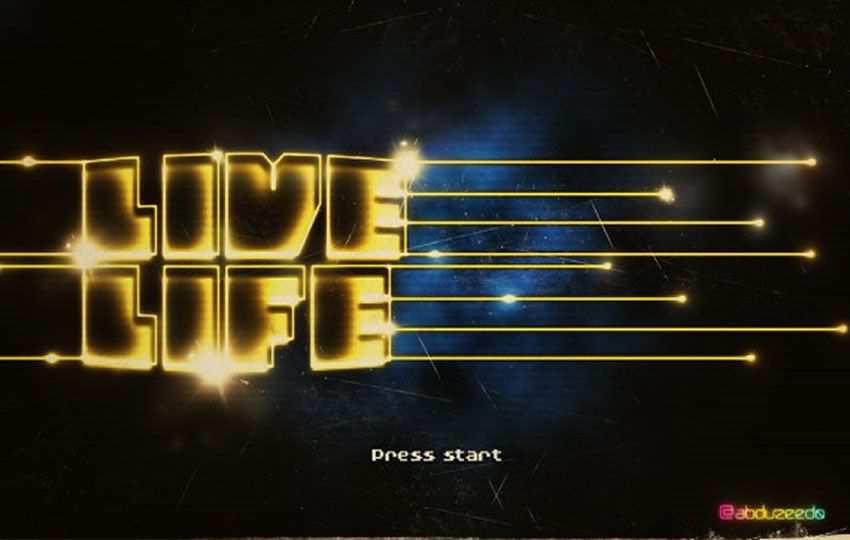
Use this layer style to give any text a video game-style appearance. The article will walk you through the exact steps necessary to reproduce this effect, and you can even download the Photoshop file to follow along.
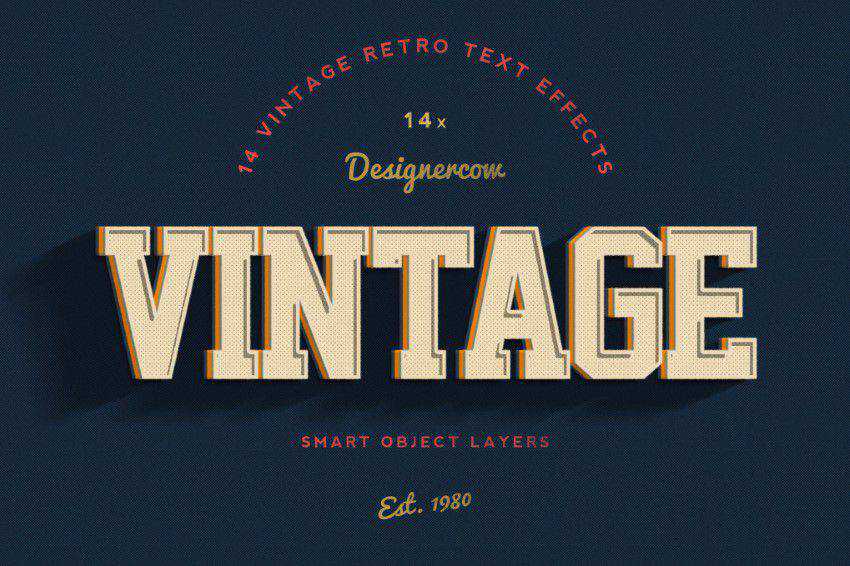
With this layer styles pack, you’ll be able to go back in time and make any text appear vintage. The package contains 18 layer styles.
Free to Download
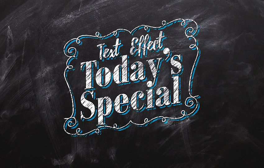
This free PSD template is a realistic chalk lettering text effect that will transform your text into stunning hand-written typography on a chalkboard.
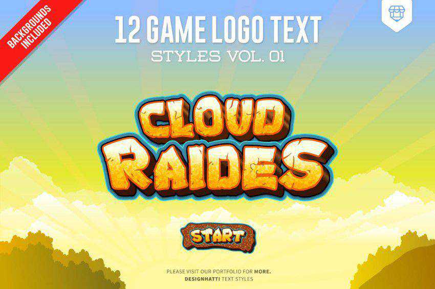
Give your text a more playful appearance resembling video game titles with this layer styles pack.
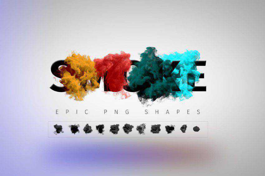
Use this layer styles pack to make your text smokier. The package contains 11 different smoke effects.
Free to Download
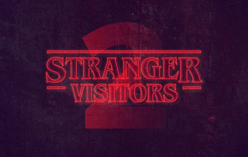
Following the original aesthetics of the hugely popular TV show, this free Photoshop text style perfectly captures the ambiance and mood of Stranger Things.
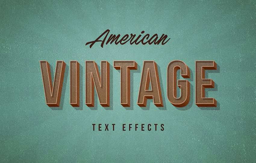
Add a touch of retro style to your text with this retro vintage styles pack for Photoshop. The package includes ten different styles.
Free to Download
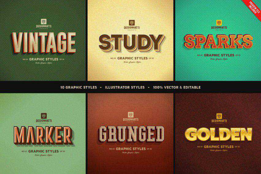
These free Photoshop text styles perfectly embody old Hollowood movies, retro ad posters, and those vintage street signs from the 1930s, 40s, and 50s.
Free to Download
Make your text glow in the dark with the help of this layer styles pack. The tutorial will walk you through the steps necessary to achieve this effect, and you can download the Photoshop file to follow along.
Free to Download
This free PSD template is bundled with three vintage text effects (and photo effects) that are the embodiment of good taste and simplicity.
Free to Download
With this free 3D Photoshop text effect, you can add depth and a sandwich texture to your plain text. Type your text in the smart layer and save the changes.
Free to Download
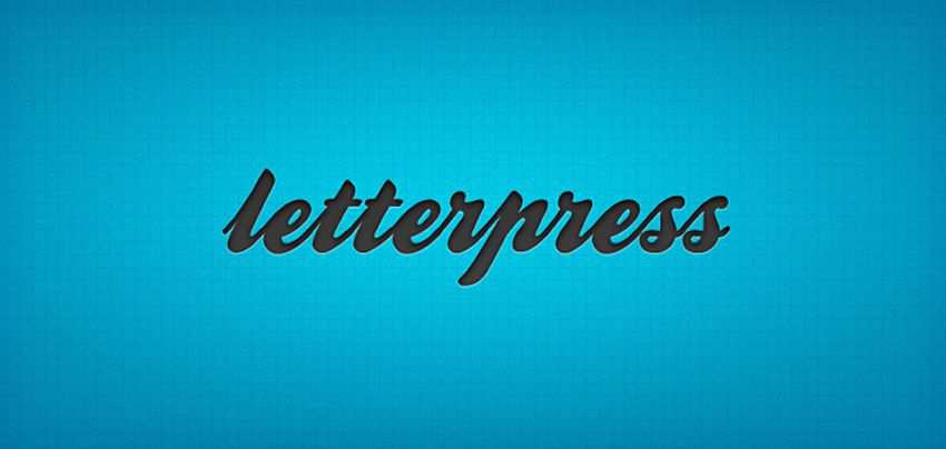
To apply this letterpress effect, type your text and apply the style from the Styles palette. It’s super simple.
Free to Download
Use this tutorial to learn how to create casino-style text in Photoshop. As usual, the tutorial includes the Photoshop file so you can easily follow along.
Free to Download
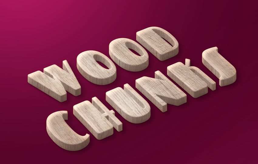
Open the smart object, type in your text, and apply the changes. You will quickly have a fun wood-style typographical effect.
Free to Download
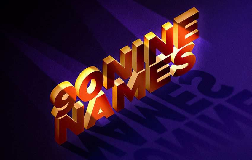
Double-click the smart-object layer and add your own text or graphic. You can also change the background color, text color, and 3D depth color.
Free to Download
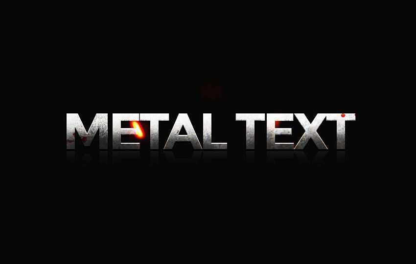
With the help of this layer styles pack, you will instantly give your text a metallic look and feel.
How to Install & Use Layer Styles in Photoshop
Here’s a straightforward guide on how to install and use layer styles:
How to Install Layer Styles in Photoshop
Open Photoshop: Launch the program.
Locate the Layer Styles Panel: In Photoshop, you can find the Layer Styles panel within the Layer Style dialog box. Go to the Layer menu, select Layer Style, and choose Blending Options.
Import Layer Styles: To install new layer styles, you’ll need to import them. Click on the specific layer effect that you want to add a new style to. A dialog box for that effect will appear. Here, you can adjust settings for the effect. At the top of the dialog box, you’ll find a small gear icon. Click on it, and from the dropdown menu, select Import Styles. A file dialog box will open. Navigate to the location where you have the layer style file (usually with a .asl extension) saved, select it, and click Load.
New Layer Style: After loading the layer style, you should see it added to the list of styles within the Layer Style dialog box. It will be available for you to use on your layers.
How to Use Layer Styles in Photoshop
Select a Layer: Choose the layer in your project to which you want to apply a layer style. You can do this by clicking on the layer in the Layers panel.
Access Layer Styles: Once your layer is selected, go to the Layer Style dialog box, Layer menu > Layer Style > Blending Options.
Apply a Layer Style: Within the Layer Style dialog box, you can enable and customize the layer styles you want to apply. Simply check the box next to the layer style you want to use, and it will be applied to your selected layer.
Adjust Settings: Each layer style has its own set of settings that you can tweak to achieve the desired effect. Click on the name of the layer style to access its settings, and make adjustments as needed.
Preview and Confirm: As you adjust the settings, you can preview the changes in real-time on your selected layer. Once satisfied with the result, click OK to apply the layer style to your layer.
Save Your Work: Don’t forget to save your project to keep the applied layer styles intact.
Use Layer Styles in Photoshop Today!
These Photoshop layer styles for text effects allow you to add depth, dimension, and visual interest to your text designs.
With a range of customizable effects in your toolbox – and because of their ease of application – layer styles are an essential resource for creating eye-catching and dynamic text effects in your design projects.
Designing a user interface is a complex task that requires careful consideration of various design elements, including layout, typography, color, and usability. However, with the right tools, the process becomes much more manageable.
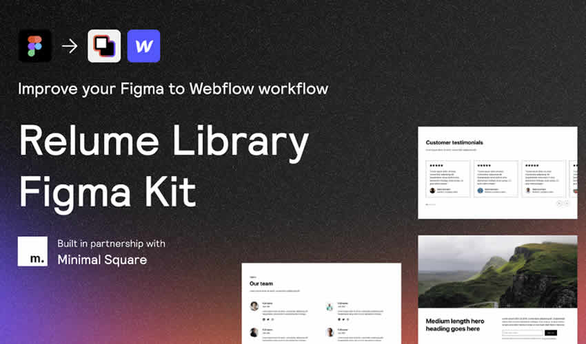
Figma is a widely popular prototyping tool for designers, known for its range of user-friendly features that make creating beautiful interfaces easier. As a collaborative design tool, it allows multiple users to work on a project simultaneously, making it perfect for large or remote teams.
Designing an interface from scratch can be time-consuming, which is why using a web or a mobile UI kit is a great way to speed up the design process. By using a premade design kit, you don’t have to spend time creating each UI element from scratch. Instead, you can focus on laying out those elements in the most logical and visually appealing way. A UI kit can also help ensure consistency throughout your design, making your interface look professional and polished.
We’ve curated a collection of the best free mobile and web UI kits and templates for Figma. Check them out below, download them, and save time on your next UI design project. With these UI kits, you’ll be able to create high-quality interfaces in a fraction of the time it would take to design them from scratch.
If you’re new to Figma, you might like to take a look at this collection of Figma tutorials.
Download this 24-page responsive personal portfolio Figma template. It includes both desktop and mobile versions, and it is also compatible with Sketch and Adobe XD.
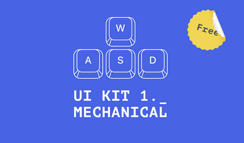
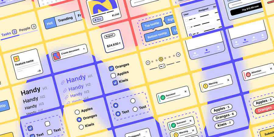
Mechanical is a free UI Kit for desktop interfaces that includes a full set of components, including buttons, inputs, dropdowns, calendars, menus, toggles, sliders, and table elements.
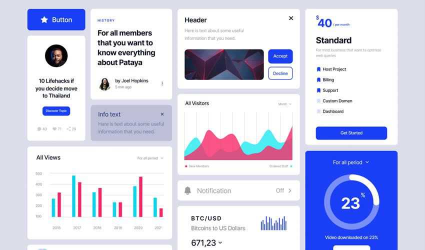
Try this Figma kit if you need to create a web dashboard or a stats panel. The template includes a light and dark mode and several components to help you create a powerful and modern dashboards.
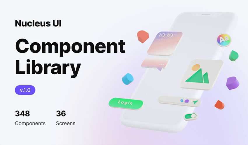
Nucleus is a free UI library with 300 components and over 30 screens. It provides all the building blocks you need to rapidly design your next mobile app.
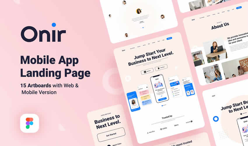
This template is easy to use and customize and includes well-organized layers, 15 artboards, and three page variations for creating mobile landing pages.
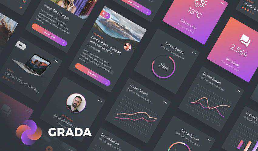
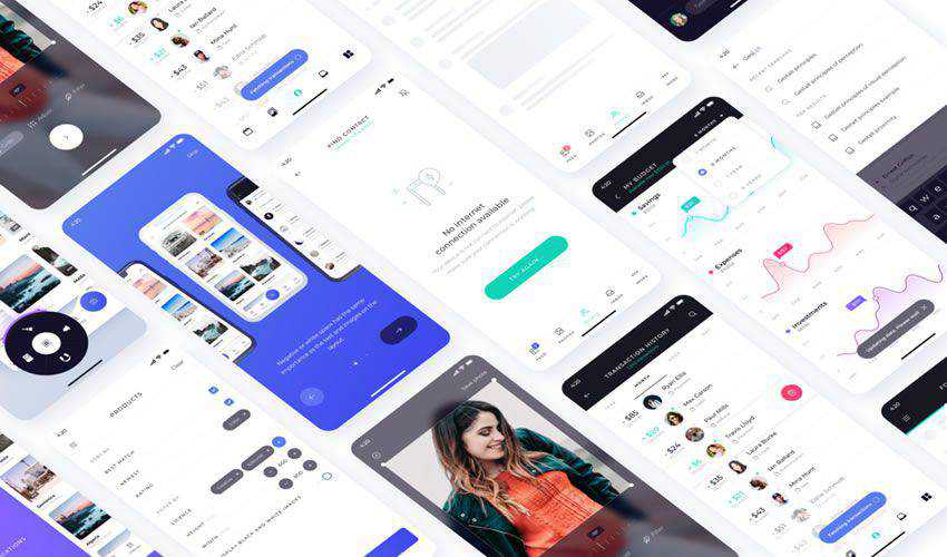
This is a beautiful and dark UI mobile kit for Figma. It has many of the elements needed to create rich mobile interfaces, so be sure to add it to your library.
If you’re working on a ticketing app, this UI kit will come in handy. It works with both Figma and Sketch and includes ticket buying screens, seat selection, and more.
This kit is based on Google’s Material Design, and it incorporates components such as bars, avatars, badges, expansion panels, and more. The kit is free for personal and commercial projects and fully compatible with the React Material-UI library.
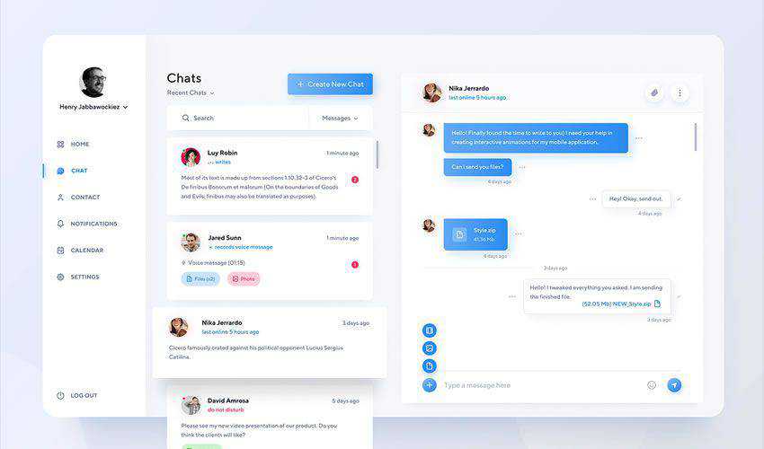
Consider this free Figma UI mobile kit when working on a chat dashboard. The kit features a full-screen interface for a chat app, and you can easily customize it to match your project needs.
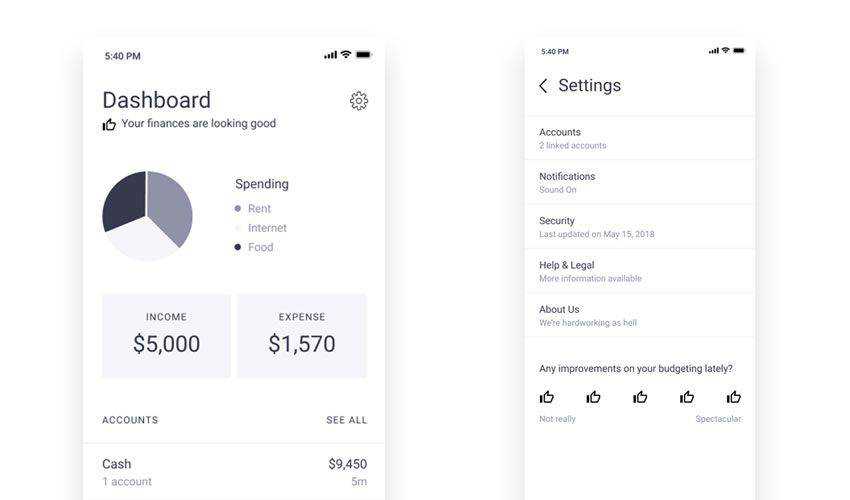
These finance wireframe templates will come in handy whenever you need to create an interface for a payment processor, banking, accounting, or any other finance app. It can be used in personal and commercial projects.
Deca is a beautifully designed UI library of components. With over 150 components, you will find everything you need to complete your next project quickly.
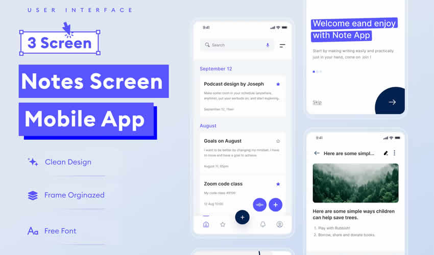
This beautiful minimal UI kit contains 12 screens to bring your app vision to life. The kit includes various icons, screen elements, and fully vectorized elements.
This Figma starter kit contains basic UI elements such as forms, buttons, and icons. It is available in light and dark versions and is free for personal and commercial projects.
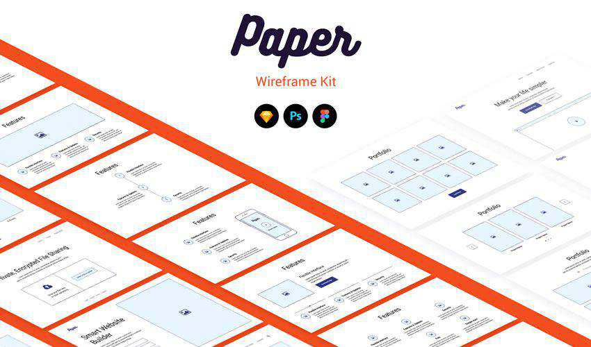
This simple wireframe kit is a great choice when you need to start prototyping your design quickly. To use it, select the components you need, drop them on your screen, and start customizing them.
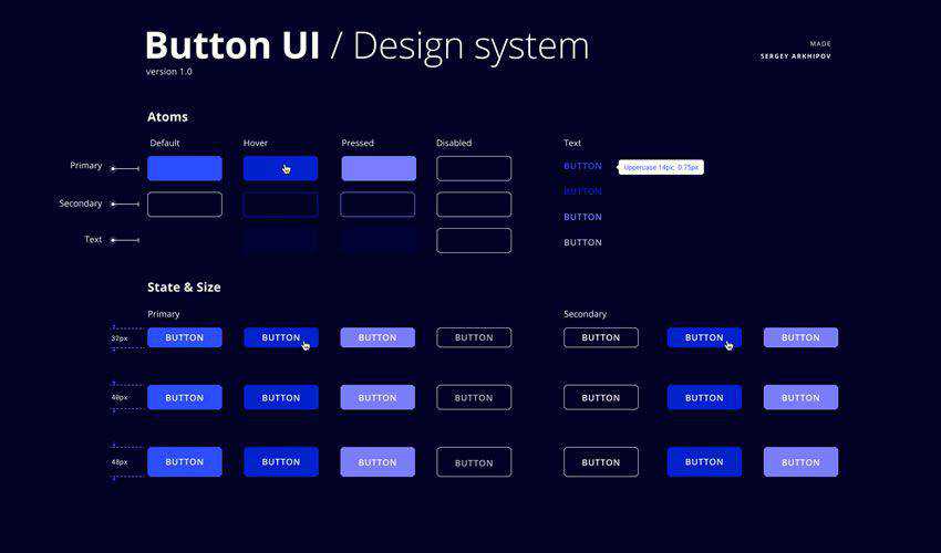
This kit touts itself as the ultimate design kit for Figma. You can easily create high-fidelity wireframes, user interfaces and style guides for desktop products. It’s fully customizable and free.
This dashboard UI kit is an excellent choice to mock up a web or mobile app dashboard. It comes with fully responsive mobile screens and includes a collection of charts, graphs, onboarding screens, a set of icons, and a detailed style guide.
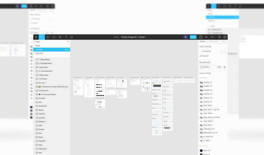
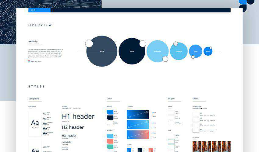
If you need to create a design system in Figma, this kit has everything. The kit contains patterns, typography, color, and other settings needed to create a complete styleguide.
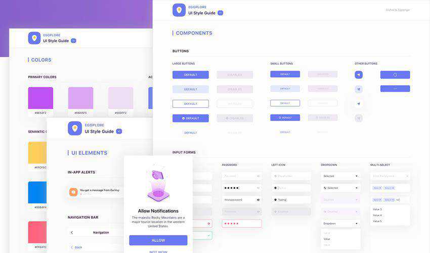
This is a simple and free UI style guide for Figma that you can download, use, and adapt to your needs. The kit is free for personal and commercial projects.
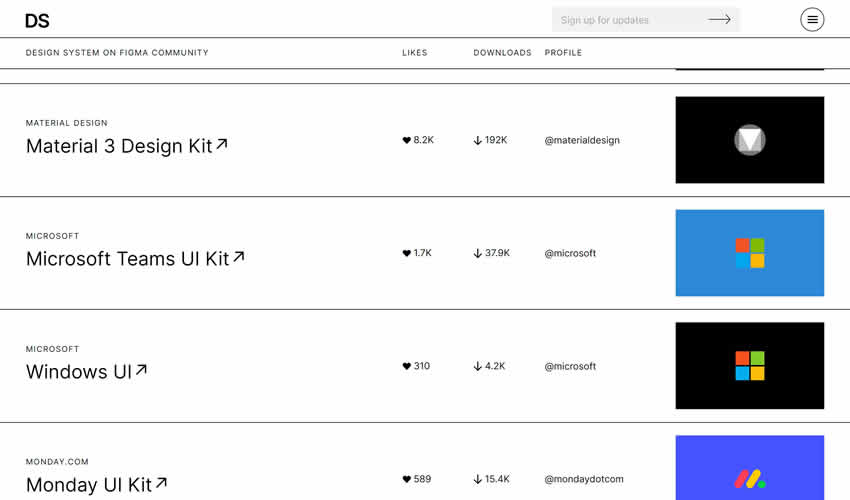
This is a fantastic resource for anyone who uses Figma. It is a directory that allows you to discover and download all of the open design systems currently available for Figma.
This set of Dripicons was explicitly created for Figma and can be downloaded and used in both personal and commercial projects. You can duplicate this file into your own Figma account with a single click.
Ripple Icon Library
The free Ripple icon set includes over 500 icons in three styles (line, fill, and duo-tone), all of which are completely editable.
If you’re working on a cryptocurrency or blockchain project, this is the free icon set for you. Over fifty logos of the most popular services are included in the template.
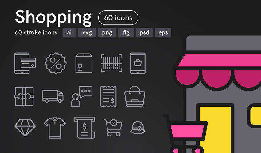
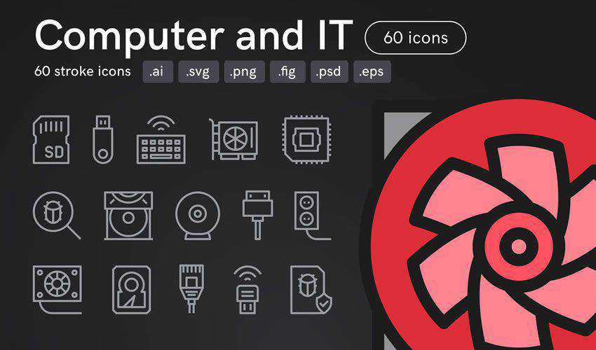
This set of 60 icons is perfect for an online store, shopping application, or website. The icons have adjustable line widths and can be used in Figma, Illustrator, Photoshop, and more.
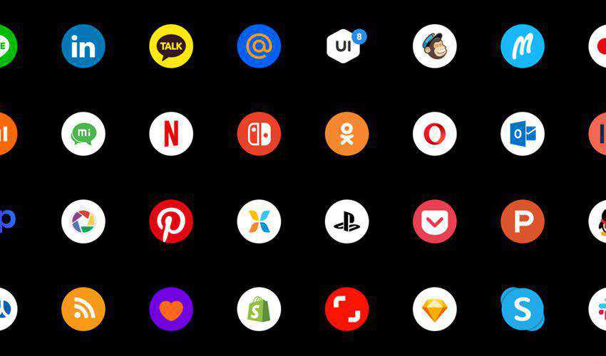
Try this set if you want to add social media icons to your designs. The set contains over 100 icons that are easy to customize and can be used in personal and commercial projects.
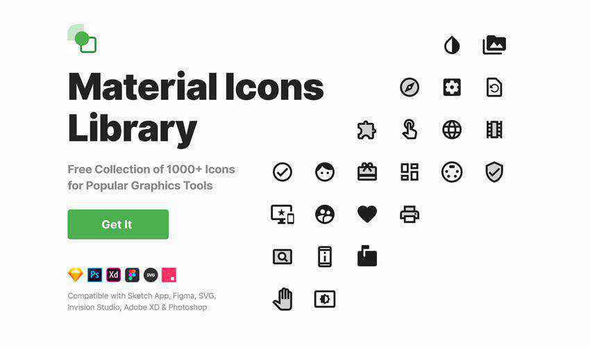
This free collection of icons includes over 1000 icons that can be used in any type of project or prototype, including commercial and personal projects.
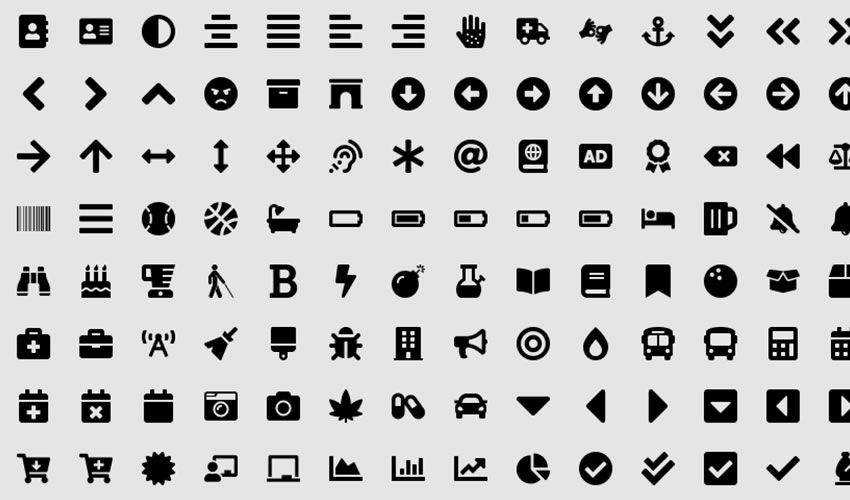
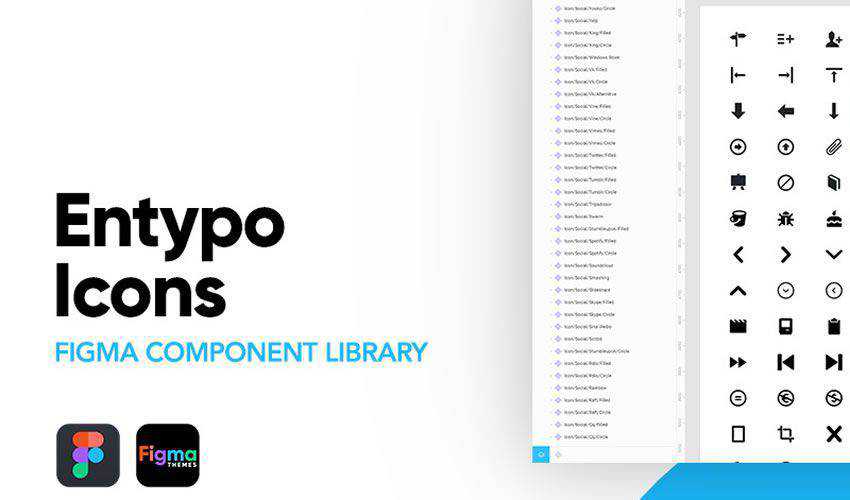
This library of Entypo icons was made specifically for Figma. It includes 411 vector icons ready to use for your next UX design project. The library can also be used for free in personal projects.
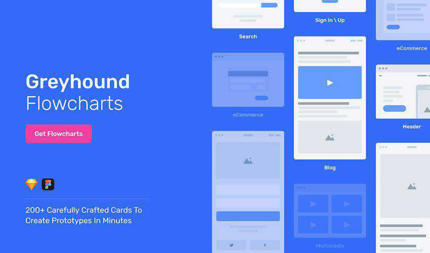
This set of flowchart templates comes with more than 200 cards to help you quickly create flowchart and sitemap prototypes. The kit is free for personal and commercial projects.
This free template has been designed so that you can quickly create professional presentations of your UI creations. It comes with a variety of completely customizable buttons, charts, and text blocks so you can make your presentation your own.
Figma UI Kit & Template FAQs
What is Figma?
Figma is a popular web-based UI (User Interface) and UX (User Experience) design tool. The tool allows you to create, collaborate, and share your work online.
Why Use Templates in Figma?
Templates will speed up your design process. They offer ready-to-use components and layouts, which you can customize to fit your project, saving time and effort.
Are These Templates Really Free?
Yes, they are! The Figma templates above are available at no cost. It’s always good to check their license, though, as some might have certain restrictions.
Can Beginners Use These Figma Templates?
These templates are great for beginners. They provide a solid starting point and can help you understand how to structure your UI designs effectively.
How Much Can I Customize These Templates?
You can customize a lot! Adjust colors, fonts, and layout elements to fit your specific needs. The flexibility varies with each template, but generally, there’s plenty of room for creativity.
Do I Need Any Special Software to Use These Templates?
All you need is Figma, which is accessible through any web browser. You don’t need to download any additional software to use these templates.
Can I Use These Figma Templates for Commercial Projects?
Many templates are available for both personal and commercial use, but always check the specific terms set by the template designer, as some might have limitations or require attribution.
Conclusion
Figma makes it easy to quickly create beautiful prototypes for mobile apps, web apps, dashboards, sitemaps, and any other UI project you need. With the help of these Figma UI kits, you will be able to prototype your designs more quickly, so be sure to add them to your library today.
Designers, photographers, and digital artists spend many hours working in Photoshop, whether designing, editing photos, or creating digital art. As a professional in these fields, you may receive photos from clients that need touch-ups or have to edit your own photographs. In both cases, Photoshop actions can be extremely useful for streamlining repetitive tasks and achieving a specific, and often stunning, photo effect.
Actions are pre-recorded sets of instructions that automate the process of applying a sequence of edits to an image. By using actions, you can create complex photo effects with just a few clicks. Countless actions and presets are available for free, but finding high-quality ones can sometimes be challenging.
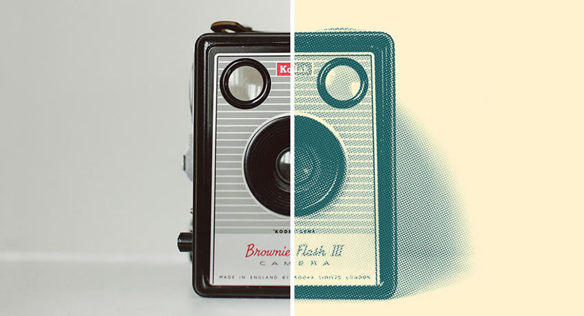
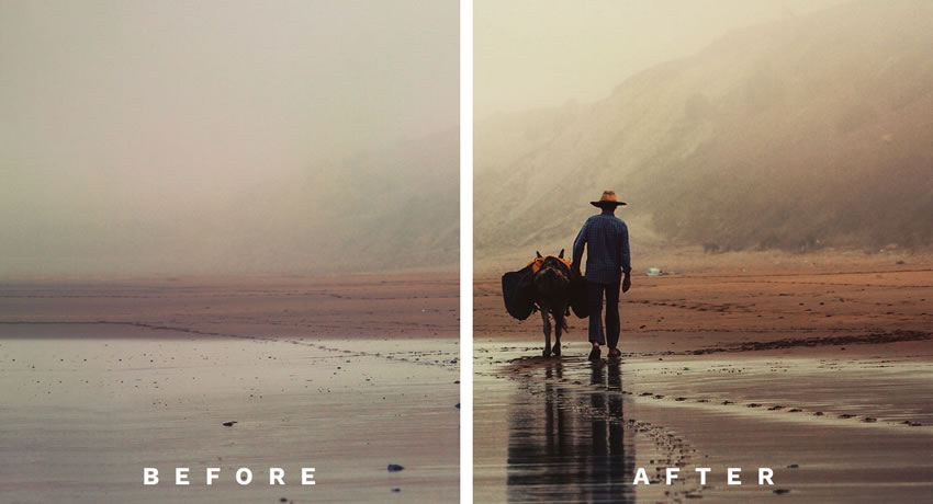
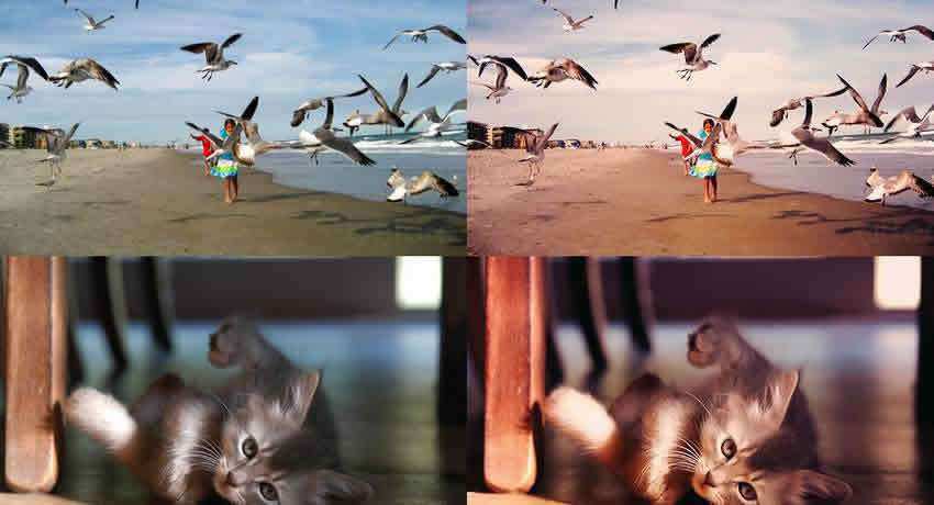
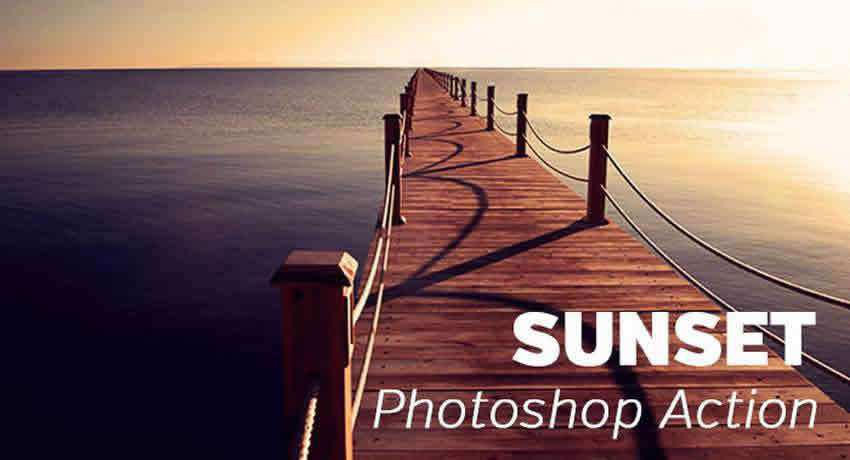
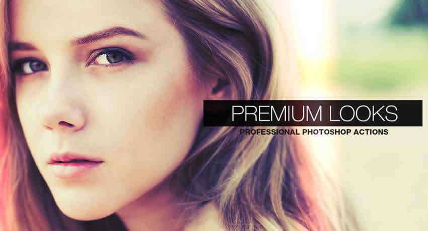
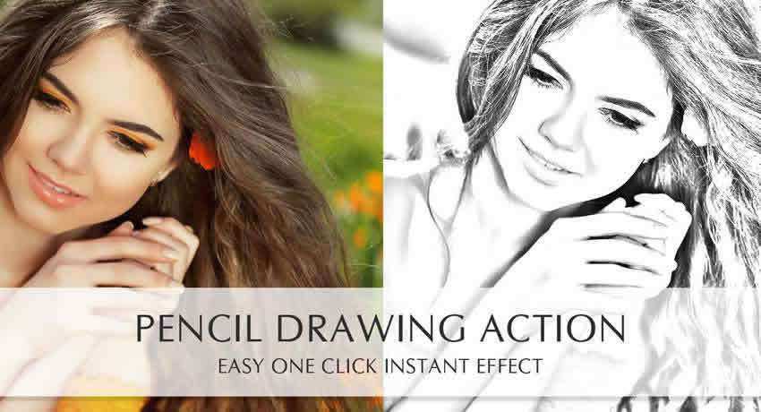
We’ve curated a collection of over 40 Photoshop action packs that are all available to download for free. These actions will give you the tools you need to apply various effects to your photos, from matte and film to vintage styles, stunning black and white conversions, and even HDR.
With these actions and presets in your toolkit, you’ll be able to save time while editing your photos and won’t have to spend hours scouring the web for high-quality free actions. Whether you’re a professional photographer or a designer, these actions will help you achieve the look you want without spending hours on each individual photo.
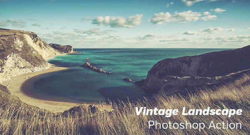
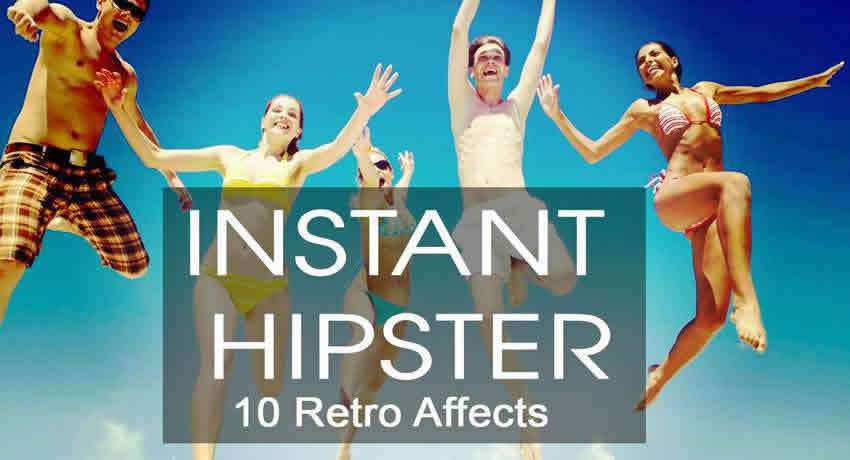
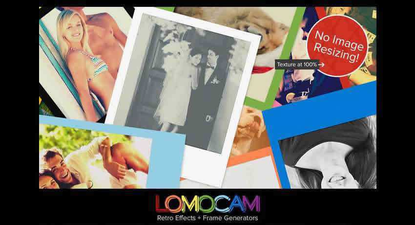
Nostalgic Photoshop Actions
These free Photoshop Actions can create a range of photo effects, including a vintage or retro look, a washed-out or faded effect, a gritty or grungy feel, or even a black and white or sepia-toned effect.
The free Retro Engraving Photoshop action replicates vintage engraved illustrations and applies a glitchy, line-based texture (similar to old banknotes or book prints) to your photos.
Wedding photographers rejoice as this free Photoshop action will allow you to add a vintage effect to your wedding photos. The collection comes with a total of 15 individual actions.
With this collection of Photoshop actions, you will be able to generate vintage, lomo, and retro effects, and quickly apply them to your photos.
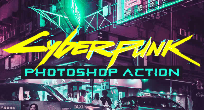
Classic Film Effect Free Photoshop Actions
These Photoshop actions can create the effects commonly found in classic films and cinema. They can add a cinematic feel to your work, such as a soft and warm film look, a faded or desaturated effect, a film grain texture, or even a dramatic and moody style.
This free action applies a specific set of effects that will give your photos a cyberpunk style. Cyberpunk is characterized by a futuristic feel, featuring neon lights and sci-tech elements.
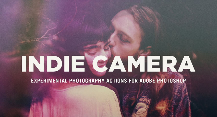
The free Indie Camera Photoshop action recreates the aesthetic of quirky and low-fi indie film cameras. It will add soft contrast, subtle color shifts, and light leaks to your photographs.
This free film-inspired Photoshop action set will add a grainy, soft tone, with mild contrast shifts to your images. It will create a dreamy, nostalgic, film-like look, making it perfect for portraits.
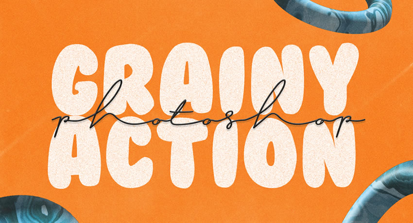
This simple Photoshop action will add a fine layer of digital noise or grain to your photos, giving them a textured or gritty aesthetic. You can download it for free.
The Cross Processed free Photoshop action replicates film developed with the wrong chemicals, giving your photos a high contrast, irregular color shifts, and a retro, experimental feel.
Make your photos come to life with this Film Effect Photoshop action. The action makes your colors pop and applies them non-destructively.
Color Effect Free Photoshop Actions
These actions allow you to add warmth or coolness to your photos, improve contrast, or even apply selective color effects to specific areas of your photo. You can create a variety of moods and styles, whether you want a vintage, a cinematic look, or a colorful, vibrant style.
This Photoshop action is sure to make your photos stand out, as it adds a subtle touch of crimson to any image. The action is easy to adjust and apply.
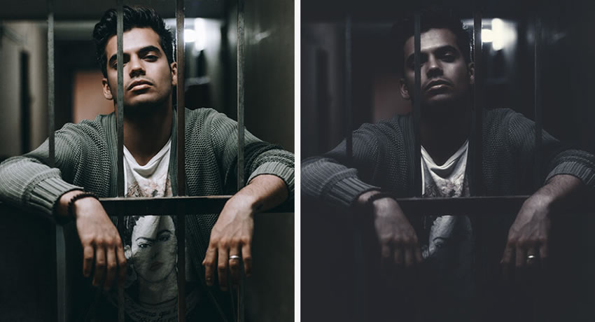
The free Dark Mood Photoshop action will deepen shadows, desaturate tones, and add contrast to your photos, creating a dramatic, moody, and atmospheric effect.
If you want to apply a soft, almost pastel-like look to your photos, this collection of Photoshop actions is a must. The action works best for portrait and outdoor photos.
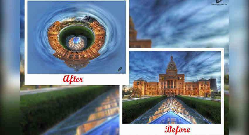
Tiny planets are all the rage, but creating them from scratch takes work. This Photoshop action will change that and allow you to transform any photo into your very own tiny planet.
This Corrupted VHS Photoshop action will make your photos seem as if they were captured on an old VHS tape, giving your shot a distinctive and artistic appearance.
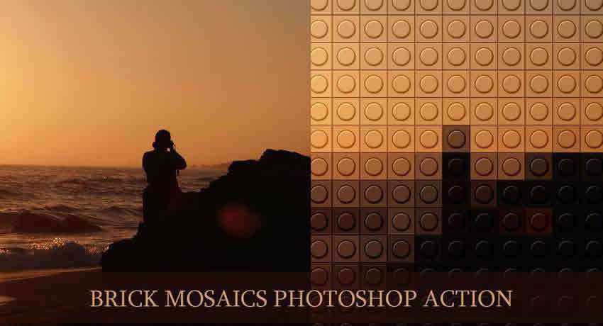
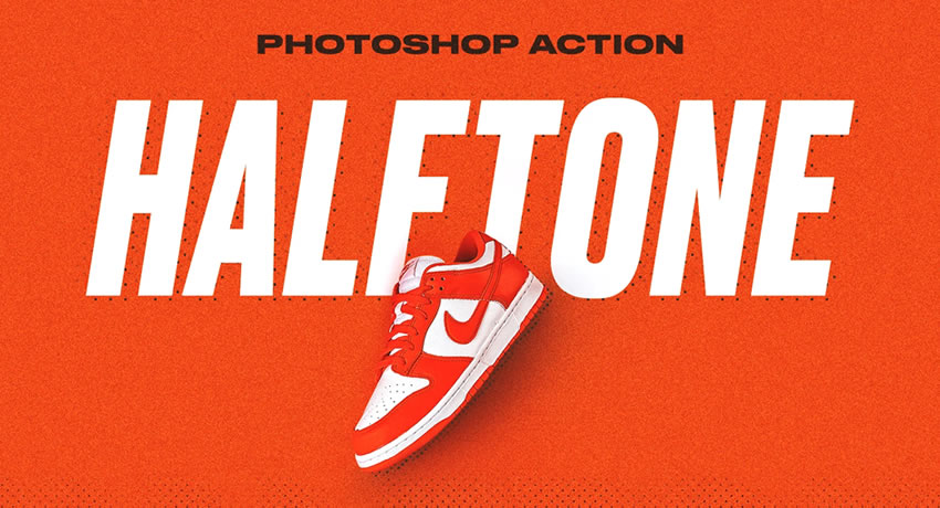
Turn your photos or graphics into a dot-based halftone pattern with this simple Photoshop action. It is perfect for comic-book styles, pop art, or retro printing effects.
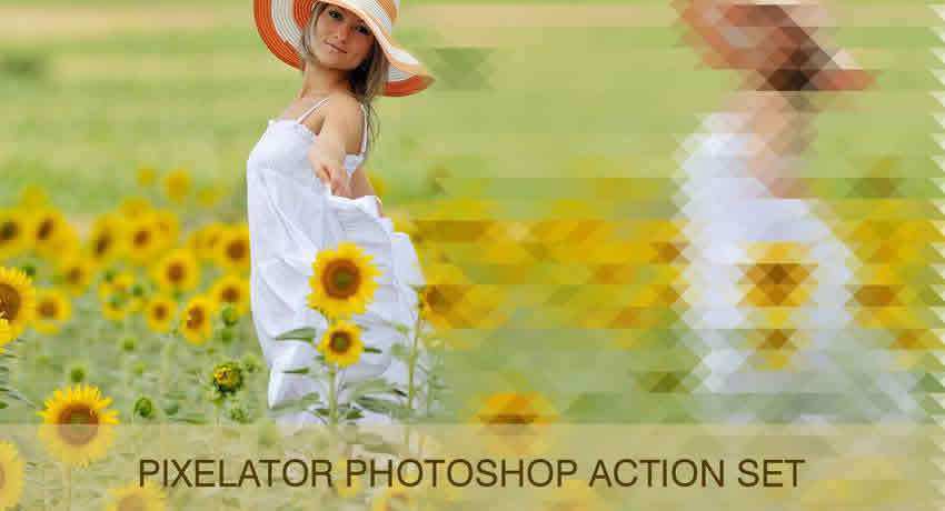
Similar to the action above, this Photoshop action collection will pixelate your photos. Perfect for creating unique backgrounds. The collection also includes frame and border styles.
Try this Photoshop action if you want to produce a cool-looking dispersion effect. Make any photo appear as if it’s dispersing. Play the action and make adjustments as necessary.
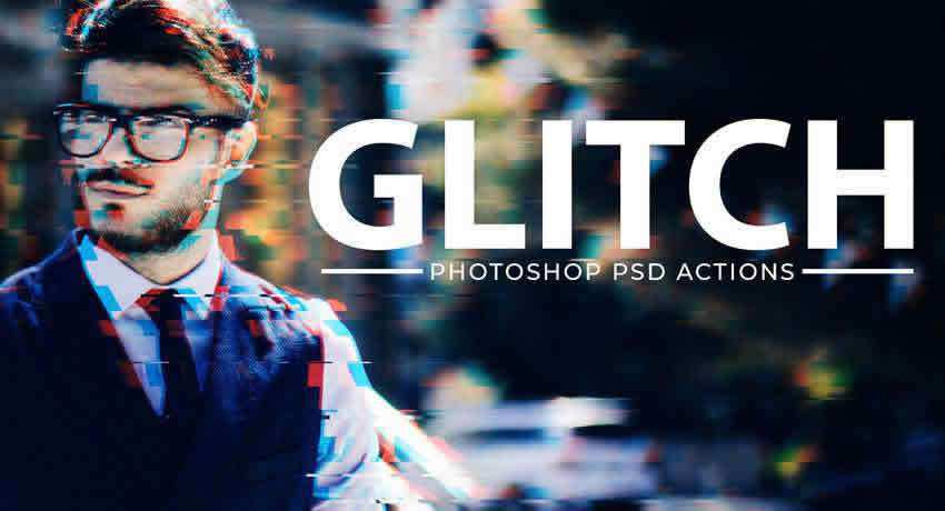
This free Photoshop action adds a subtle glitch effect to your photos, giving them the appearance of old VHS tapes. The action works non-destructively, and you can make adjustments.
High Dynamic Range Free Photoshop Actions
These Photoshop actions can help you achieve a range of HDR styles. These actions will improve your photo’s contrast, saturation, and sharpness, resulting in a bold and vivid photo effect.
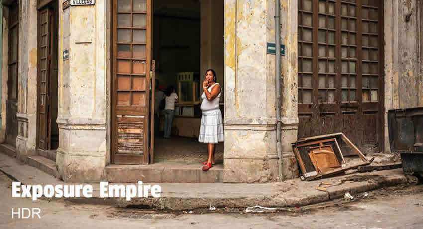
Use this Photoshop action to expand the dynamic range of your photo and apply a beautiful, bold effect. The action works with both Photoshop and Lightroom.
Warm & Faded Free Photoshop Actions
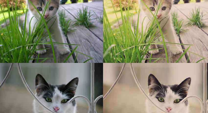
These actions will add a matte effect to your photos by reducing contrast and saturation, and adding a subtle haze or film-like grain. They help to highlight the texture and depth of your photos.
With the help of this free Photoshop action, you will be able to quickly and easily apply a subtle matte effect to your photos. The action is available as both a Photoshop action and a Lightroom preset.
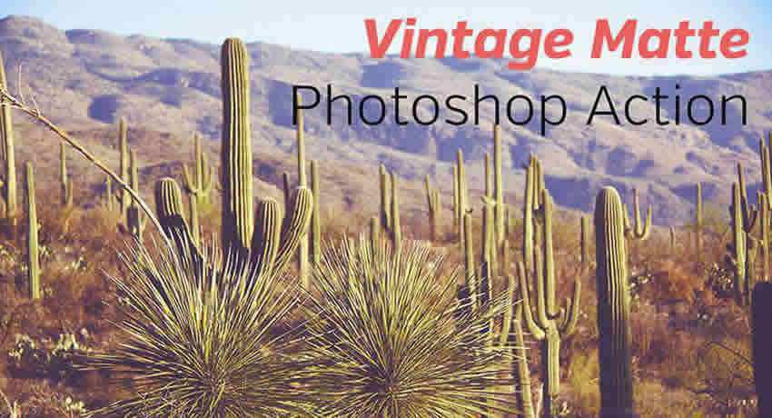
The Vintage Matte Photoshop action will make it easy to add a lovely vintage effect to your photos. The action supports non-destructive editing.
Light Effect Free Photoshop Actions
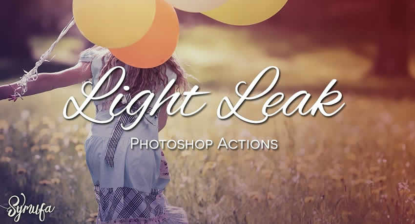
These actions replicate the appearance of light leaks, which happens when light enters the camera, creating a washed-out and soft effect on your photos. They can help you achieve various styles, from a soft, romantic look to a more dramatic and surreal effect.
Add bright light leaks to any photo with the help of the Photoshop actions in this pack. The action creates layers and supports non-destructive editing.
These free actions allow you to add various light leak effects to your photos, creating the illusion that light has leaked into the camera body during exposure.
Add a touch of class to your portraits with the help of this Photoshop action. The action contains five different effects and two light leaks that can be combined for a unique look.
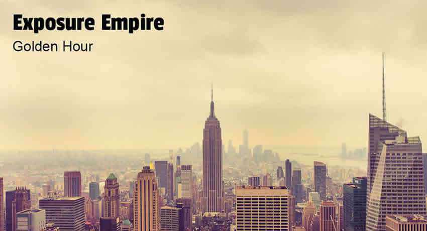
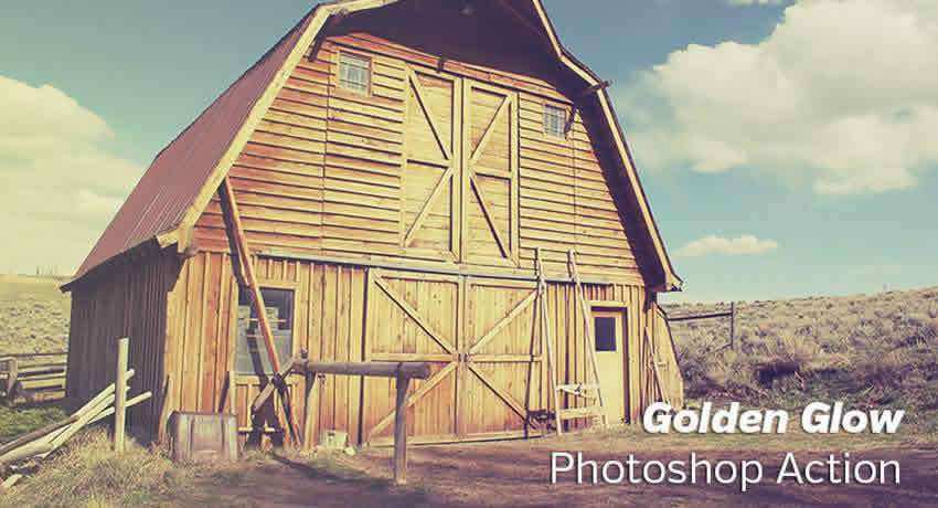
Golden Hour Free Photoshop Actions
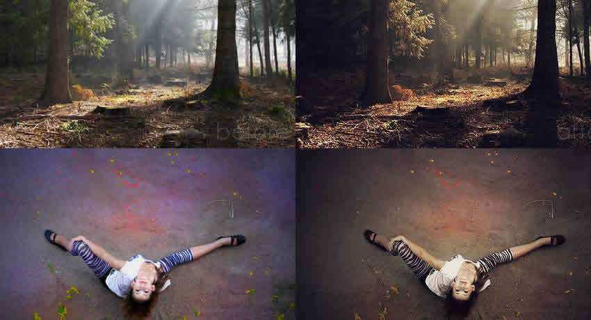
These Golden Hour actions replicate the soft, warm glow of golden hour light, allowing you to bring out the beauty and atmosphere of your photos.
Use this Photoshop action whenever you need to make a photo appear as if it were taken during the golden hour. It works well with cityscapes and nature photos.
This Golden Glow action will lighten your photo and give it a golden tint. Use it with landscape and nature photos, but don’t be afraid to experiment with other types of photos as well.
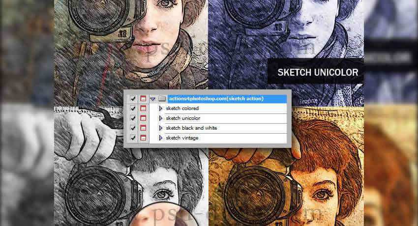
Drawing Effect Free Photoshop Actions
These actions will add a hand-drawn effect to your images, creating a unique and artistic look. They will add depth and texture to your photos.
This set of Photoshop actions makes it easy to apply the sketch effect with a single click. You can even adjust the result to your liking.
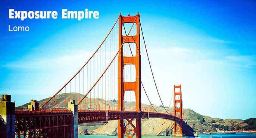
Lomo Effects Free Photoshop Actions
These Photoshop actions replicate the look of the Lomo camera, which creates photos with high contrast, vibrant colors, and vignetting effects. They will add a nostalgic touch to your photos.
Apply a Lomo effect to your photos and make them appear as though they were taken with a Lomography camera. The action produces a fun vintage effect.
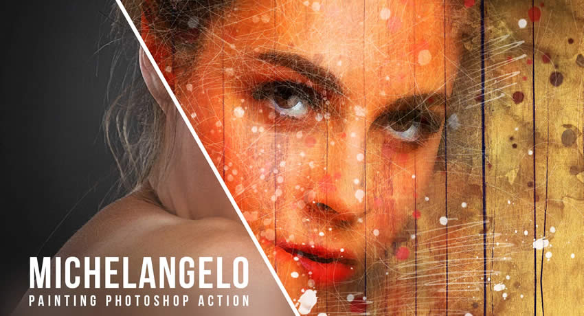
Soft Color Free Photoshop Actions
These watercolor effect Photoshop actions replicate the artistic charm of watercolor painting. They will add depth, texture, and vivid colors to your images.
The aptly named Michelangelo Painting Photoshop Action will quickly transform your photos into beautiful watercolor works of art. You will also get a free watercolor brush (ABR) and pattern PAT file for Photoshop.
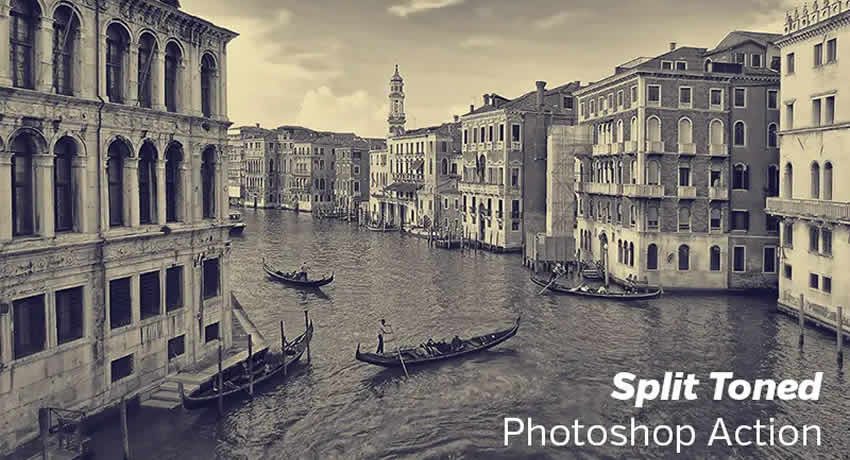
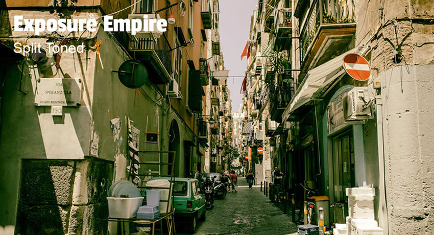
This free split-toned Photoshop action will apply different color tones to shadows and highlights, creating a moody, cinematic, or vintage color effect.
How to Install Photoshop Actions
Here’s a quick tutorial on how to install and use Photoshop actions:
Download and unzip the action file.
Launch Photoshop.
Go to Window > Actions.
Select Load Actions from the menu and go to the folder where you saved the action file to select it. The action will now be installed.
To use the newly installed action, find it in the Actions panel.
Click the triangle (▶) to the left of the action name to see the list of available actions.
Click the action you want to play and press the play button at the bottom of the Actions panel.
How to Create Your Own Photoshop Actions
Creating your own Photoshop action involves recording a series of steps you perform on a photo or graphic and saving them as an action. Here’s a step-by-step guide to creating your own:
Open an Image: Launch Photoshop and open the photo you want to use as the base for creating the action.
Open the Actions Panel: Navigate to the Window menu and click on Actions to open the Actions panel.
Create a New Action: In the Actions panel, click on the folder icon to create a new action set. Click the New Action button (represented by a ■ square icon) to create a new action.
Name and Set Shortcut (Optional): Give your action a descriptive name that reflects the edits you’ll be recording.
Record the Steps: Click the Record button in the Actions panel to start recording and perform the editing steps you want to include in the action.
Stop Recording: Once you’ve completed the editing steps, click the Stop button (■ square icon) in the Actions panel to stop recording.
Test the Action: Open another photo to test the newly created action. From the Actions panel, select the action and click Play (▶ triangle icon) to apply the recorded steps and effects to the new photo.
Adjust & Customize: If needed, you can open the action in the Actions panel and adjust settings or delete unnecessary steps.
Save the Action: To save the action for future use or sharing, right-click on the action in the Actions panel and choose Save Actions. Select a location on your computer and assign a name to the action file. The action will be saved with an .atn extension.
Load the Action: To use the action on another computer or version of Photoshop, you can load the action set by going to the Actions panel’s menu and selecting Load Actions.
You’re a creative talent. The last thing you want is to be stuck performing the same task over and over again on various images. These Photoshop presets and actions are for you, freeing you up for the real work: being creative.
AI models like ChatGPT and Gemini have only been around for a few years. Although many of us have become reliant on them, we still recall what life was like before they came around.
But what about future generations? For them, these tools will have always been an integral part of everyday life. Just as I can remember a time without smartphones, my teenage daughter can’t. She was born after the iPhone took the world by storm. Touchscreens and app stores are all she’s ever known.
I believe AI’s long-term impact will be even greater than the smartphone. We already see the technology infiltrating industries and education. Who knows where we’ll be by, say, 2030?
Many of us worry that AI will replace us at work and spread falsehoods. Those concerns are legitimate. However, I’m starting to worry about another issue: the devaluing of human creativity.
Creative industries such as design will feel the brunt of the impact. Here’s why the next generation of designers will inherit a much different world.
Artists Already Face Competition From Generative Tools
Generative models have improved their image-creating capabilities. Write a prompt, and within a minute or so, you’ll have an image matching your instructions. The process will only get faster.
The results aren’t always perfect. For example, I find ChatGPT’s model is inconsistent (and sometimes incoherent) with styling. But, after a few revision attempts, I often find myself accepting the output as good enough.
I now opt for AI-generated images instead of stale stock photography. It’s within reach and often a closer match to my needs. That’s both astonishing and a bit sad.
Yes, it takes less time to acquire a “passable” image. I don’t have to sweat over the details in Photoshop. Nor do I have to hire someone more talented to do it for me. In short, I’m willing to accept a lower-quality item because it’s easier.
I admit to being on the low end of the market. My graphic design skills aren’t the best, and I don’t have a budget for a professional. My turning to AI tools probably isn’t putting anyone out of work.
The danger is when companies that do have a budget for hiring professionals opt for AI. We’re already seeing that happen (to mixed results). More will surely come to the dark side.
Will New Designers Learn the Fundamentals? Will It Matter?
Traditionally, web and print designers learn about fundamentals. Philosophies regarding color, typography, and accessibility are crucial to producing quality work. Those lessons come from formal education and real-world experience.
But what do fundamentals mean in the age of AI? Quality control is not a strength of the current tools on the market. So, someone starting in design and using one of these apps may never get the opportunity to learn.
We’re seeing a similar trend in programming. For example, the ease of generating code has led to a significant uptick in WordPress plugin submissions. Now that “anyone” can code, the tenets of security and optimization could get lost in the shuffle.
There’s also a question about which tools future designers will use. ChatGPT’s text-based UI isn’t a design tool. However, Photoshop has integrated AI into the app, and it’s not alone. It seems like every major tool is jumping on the bandwagon. Project workflows could drastically change.
The boost in productivity is nice. However, we can generate assets without thinking twice about whether the result is any good. Such questions may never occur to a designer who hasn’t learned the fundamentals.
In a way, it’s reminiscent of the anything-goes 1990s. We built websites because they looked cool, regardless of whether they worked. Future generations may use AI without ever questioning the results.
Less Time to Create Something Beautiful
We humans aren’t the most patient of creatures. Thus, designers have always had to balance quality with project deadlines. AI might make the situation worse for creatives.
The ideal use for AI is as a helpful tool for generating small project assets or running utilitarian tasks. It’s a way to speed up the process while still relying on human know-how.
But some will undoubtedly give it an outsized influence. It’s not hard to imagine a stakeholder treating a designer as a mere prompt engineer. “We need this social graphic in the next five minutes. Just generate something. No, we don’t have time to worry about the font kerning.”
Project timelines may also be unreasonably accelerated. Clients will expect more productivity in less time and at a lower cost. Such thinking will give designers fewer opportunities to perfect their work.
That’s a shame, as it’s often the little details that make design stand out. Doing everything “fast and cheap” removes room for human creativity. Ironically, it also devalues an entire industry of professionals.
In this scenario, designers are no longer major contributors to a project’s direction. They become just another link in the supply chain.
Designers Gain Productivity While Losing Creative Control
The current crop of AI models can do some amazing things. Yet, they lack human logic and sensibilities. That makes them perfect for busy work, not creativity.
Regardless, continued technological advances and sales pitches will likely result in greater adoption. Similar to other technologies, stakeholders will be sold on the Utopian dream of a single tool that can do it all. Train AI on the law, and you’ll no longer need a lawyer. Train it on your branding materials, and you’ll no longer need a traditional designer.
The result is less space for an organic design process. You know, the thing designers are skilled at. The thing people spend thousands of hours learning and refining. The thing that sells everything from donuts to diamond rings.
I hope this won’t be the case, but I’ve seen this movie before. Perhaps, after a period of relying on machines, people will recognize the value of human creators and go back to them.
If not, the next generation of designers will play a much different role.
Most designers would probably rather use Figma, Photoshop, or InDesign for creating a resume. That makes sense. Those applications give you more control over the layout and typography. But sometimes Word is just easier. It’s quick to open, easy to share, and doesn’t need any special software to view.
Word files are practical. They’re what most employers expect. And when used well, they look polished and professional. They’re clean, well-structured, and often thoughtfully designed.
They don’t try too hard. Fonts are balanced. Spacing is right. Sections are clear. Whether you’re applying to an agency or sending a PDF to a client, these Word resume templates give you a reliable base to build on and add your own creative flair.
Note: All of these resume templates are in Word format. But if you prefer working in a more creative application or need extra customization, you may also be able to edit them in Figma, Photoshop, InDesign, Canva, or Illustrator, depending on the template you choose.
Minimal Resume Templates for Word
These minimal templates will give you a clean foundation to build on. With no clutter or decoration getting in the way, these resume layouts focus on type, spacing, and structure.
They’re great for creatives who want full control over the design but still need a clear starting point. The layout is already solid, so it’s easy to adjust fonts or move sections around without breaking the template.
Modern Resume Templates for Word
These modern-style templates are helpful for designers who want a layout that already has a bit of visual rhythm. These files make smart use of alignment, modular blocks, and white space.
There’s room for short descriptions, links, and personal branding. For creatives who don’t want to build a resume layout step by step in Figma or InDesign, these Word templates offer a solid base.
Colorful Resume Templates for Word
These templates use color in a way that feels intentional and controlled. As a designer, you probably have strong opinions about color. These layouts give you something to react to and refine.
You can easily edit the palette to match your brand or remove it entirely if needed. Color is used to guide the eye and break up sections, not to decorate for decoration’s sake.
Corporate & Business Resume Templates for Word
These templates give you a framework that fits a business or corporate environment without feeling generic. You still get a well-organized layout with careful spacing and strong hierarchy, but without the creative styling that might distract in a more formal setting.
These templates are especially useful if you need to send your resume to a recruiter or upload it to a system that favors traditional formatting.
Why Word Still Works for Designers
Word isn’t flashy, but it gets the job done. You can open a file, make quick edits, and have something ready to send in minutes.
Hiring managers are used to Word and PDF resumes. They don’t need to ask how to open the file or deal with broken formatting.
Word always holds its structure. A well-designed template won’t fall apart when you update it. That matters when you’re working fast or applying for multiple roles.
You can always move your layout into InDesign or Figma later. But starting in Word keeps things simple. It gives you a working layout without any extra layers.
Conclusion
These templates aren’t meant to do the job for you. They’re just a starting point. You still need to put in the work. Write clearly. Keep it honest. Make sure your information is accurate and easy to follow.
You don’t need to design anything flashy. Clean beats clever. Let your experience speak for itself. Pick a layout that suits your work, adjust the text, export it to PDF, and that’s it, you’re ready to send!
Websites don’t age gracefully. Left unattended, they inevitably fall behind the latest best practices and technologies. We especially see the impact on sites built with WordPress.
It’s not that the content management system (CMS) is unstable – quite the opposite. It’s just that the software has been in existence for over 20 years. Thus, you’ll find old WordPress sites all over the interwebs.
Custom code is a common culprit. That snippet you wrote a few years ago may not work so well these days. It could be incompatible with the latest version of PHP, hinder performance, or contain security flaws. You might also be reliant on outdated JavaScript libraries or CSS techniques.
Part of bringing your site up to modern standards means refactoring outdated code. That can be a tough task, but you don’t have to do it alone. You can use AI tools to help identify and fix issues.
We’ll show you how AI can bring new life to old code. The result is a website that stays current and is better equipped for the future.
What AI Can and Can’t Do for Your Code
First, let’s set some reasonable expectations for refactoring code with AI. These tools can be helpful, but don’t expect miracles.
Consider the types of issues and the amount of code you share. For example, uploading an entire theme and asking AI to fix every error it detects won’t go very well. The large language models (LLMs) we’ve used lack context and can’t “think” in terms of a whole application. Remember, it doesn’t have the rational logic of a human programmer.
Instead, focus on a code snippet or a single file within a theme or plugin. A one-at-a-time approach usually yields the best results.
Also, be sure to provide as much information as possible in your prompts. Spell out your goals and any errors you’re experiencing in plain language. The more details you share, the more likely AI will be able to help.
It’s also worth noting that AI may not be up to date on the latest versions of WordPress, PHP, or other items. That great new technology that came out today won’t yet be included in the model. Keep that in mind when asking for help.
The right tool makes refactoring code easier. However, you’ll have more success treating it as a trusty sidekick rather than a superhero.
Improve Your Code’s PHP Compatibility
PHP versions are only supported for a limited time. Web hosts have also been known to abandon support for outdated code. Thus, a site built in the days of PHP 7.4 may not be compatible with 8.x or your web server. That could mean a broken feature or a site that refuses to load.
Then, take these errors to your favorite AI tool and, one by one, try to resolve them.
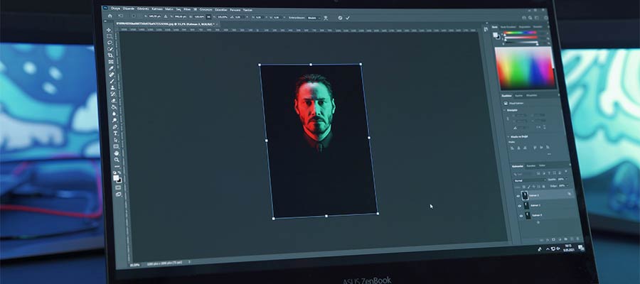
We produced the above error when running an old theme in PHP 8.2. To solve it, we asked ChatGPT for help:
Our ChatGPT Prompt:
The following PHP snippet produces an error in PHP 8.2: "Fatal error: Uncaught Error: Call to undefined function create_function()"

Please make it compatible with PHP 8.2.
The create_function() function was deprecated in PHP 7.2 and removed in PHP 8.0, which is why you're seeing this fatal error in PHP 8.2.

To make the code compatible with PHP 8.2, you should replace create_function() with an anonymous function using the modern closure syntax. Here's the updated version:
We edited our snippet to use the suggested code, and the error was fixed.
Modernize Your JavaScript
Does your legacy site suffer from old and bloated JavaScript? AI may have the perfect antidote.
Scripts written five or more years ago are likely dependent on an old-school library. You might, for example, remember all the glory that was script.aculo.us. A recent query shows it hasn’t been updated since 2010. Yikes!
WordPress bundles jQuery, which is still maintained. That doesn’t mean your custom scripts are using the latest code, though.
Even if an old script works, there are likely more efficient and secure options available. It might hinder performance or make it easier for a hacker to exploit your site.
AI can help you refactor your scripts to use newer libraries. You might also consider switching to vanilla JavaScript, which is more powerful than ever.
In this example, we asked ChatGPT to convert a jQuery script to vanilla JS. The script adds or removes a CSS class depending on a user action.
Our ChatGPT Prompt:
Please convert this jQuery script to use vanilla JavaScript instead:
ChatGPT heeded our call for an independent script.
ChatGPTs Response:
Here is the vanilla JavaScript equivalent of your corrected jQuery code:
ChatGPT’s JavaScript Output:
document.addEventListener('DOMContentLoaded', function() {
  var sidebar =  document.getElementById('sticky-sidebar');
  var savedClass =  localStorage.getItem('savestickysidebar');
  if (savedClass) {
  sidebar.classList.add(savedClass);
  }
  var toggleButton =  document.getElementById('sticky-sidebar-toggle');
  toggleButton.addEventListener('click', function() {
  sidebar.classList.toggle('hidden');
    if  (sidebar.classList.contains('hidden')) {
  localStorage.setItem('savestickysidebar', 'hidden');
  } else {
  localStorage.removeItem('savestickysidebar');
  }
  });
  });
Converting this script gives us one less jQuery dependency to worry about. AI made the process that much easier.
Give Old Code a New Lease on Life
Refactoring your WordPress site’s code is part of a good maintenance routine. It keeps your site safe, performant, and functional.
In days past, these tasks could be painfully difficult. You had to research, test, and write a fix. PHP and console errors were helpful, but manual labor was still required. You might spend days or weeks obsessing over a piece of unruly code.
AI tools have the potential to shorten the entire process. They can often tell you what’s wrong and how to fix it. Even if their first answer doesn’t get you 100% of the way there, they usually point you in the right direction.
So, don’t be afraid to dig into that old code. A few prompts might be all you need to give it a fresh coat of paint.
Food icons are used everywhere. You’ll see them on restaurant menus, mobile apps, food blogs, delivery sites, and product packaging. They help make content easier to follow, add a bit of character, and guide users through information without needing much explanation. When designed well, icons support the layout without getting in the way.
If you’re working on a food-related project, building every icon from scratch usually isn’t the best use of time. Free icon sets can help speed up the process and maintain design consistency. You get a ready-made foundation to build on, which is especially useful when you’re under a deadline.
This collection shares a selection of free food icon sets worth keeping on hand. Each one has been picked for quality, style, and usefulness. Whether you’re designing something simple or more detailed, you’ll likely find something here that helps you get the job done faster and better.
Free to Download | 100 Icons in EPS, SVG & PNG Formats
23 Icons in AI, EPS & SVG Formats
Free to Download | 15 Icons in Illustrator AI Format
50 Icons in EPS, PNG, PSD & SVG Formats
Free to Download | 40 Icons in Figma Format
25 Icons in PNG, SVG, EPS, AI & Figma Formats
Free to Download | 30 Icons in AI, EPS, SVG & PNG Formats
40 Icons in SVG, AI, EPS, PNG & Figma Formats
Free to Download | 25 Icons in Figma Format
25 Icons in AI, EPS, PNG & SVG Formats
Free to Download | 25 Icons in AI, EPS, SVG & PNG Formats
50 Icons in PNG, PSD, EPS & SVG Formats
Free to Download | 25 Icons in AI & EPS Formats
40 Icons in AI, EPS, SVG & PNG Formats
Free to Download | 20 Icons in Figma Format
20 Icons in EPS, PSD, SVG & PNG Formats
Free to Download | 20 Icons in Illustrator EPS Format
Free to Download in Figma Format
Free to Download 20 Icons in Sketch & Figma Formats
Free to Download in Illustrator EPS Format
Free to Download | 30 Icons in Figma Format
Free to Download | 12 Icons in Illustrator AI Format
Free to Download | 50 Icons in Illustrator EPS Format
Free to Download | 20 Icons in SVG Format
Free to Download | 22 Icons in SVG & PNG Formats
Free to Download | 90 Icons in Figma Format
Free to Download | 80 Icons in AI, EPS, SVG & PNG Formats
What to Look for in a Good Food Icon Set
Style matters. Icons in the same set should match. That means using a consistent look, like outline, filled, flat, or line-based. If the style is mixed, it can make your layout feel disjointed.
Pay attention to the file formats. SVG and PNG are the most common and work well across many platforms. If you use design software like Illustrator (AI & EPS), Photoshop (PSD), Sketch, or Figma, it helps if the set includes files you can open and edit directly.
Always check the license. Some icon sets are only free for personal use. Others are cleared for commercial work. It’s best to know upfront so you don’t run into problems later.
Think about variety too. A good food icon set should include more than just one or two items. Look for icons that cover different types of food, drinks, kitchen tools, and any other food related items.
Final Food Icon Thoughts
Free icon sets can still be high quality. Many are created by professional designers and made available for public use. If you come across a set you like, bookmark the source. Having a few trusted libraries makes future projects easier to start.
Try to keep your icons consistent throughout a design. Mixing styles across different sets rarely works out. It’s usually better to stick with one well-made pack that covers everything you need.
A small collection of reliable, free food icon sets can save time and make your work look more polished. They’re useful to have, even if you don’t need them right away.