Blaze UI is a free open source UI Toolkit that provides an excellent structure for building websites quickly with a scalable and maintainable foundation. All components in Blaze UI are developed mobile-first and rely solely on native browser features, not a separate library or framework. It helps us create a scalable and responsive website quickly and efficiently with a consistent style.
In this article, we will learn about various kinds of inputs using the Blaze UI framework. Text inputs are used on the webpages to take text type input from the uses.
Blaze UI Input types:
- Text Input: This input is used to take input from the user in text format.
<input class=”c-field” placeholder=”…” type=”text” />
- Colors Input: This input is used to provide color to the input area. If there is any kind of error while entering input then the border of the input will change its color to red and if the input is correct then the color will change to green.
Error:
<input class=”c-field c-field–error” placeholder=”…” type=”text”>
No Error:
<input class=”c-field c-field–success” placeholder=”…” type=”text”>
Disabled:
<input class=”c-field” disabled placeholder=”disabled” type=”text”>
- Icons Input: This input field is used to show what kind of input to give in that input field.
<div class=”o-field o-field–icon-left”>
<i class=”far fa-calendar-alt c-icon”></i>
<input class=”c-field” type=”text”>
</div>
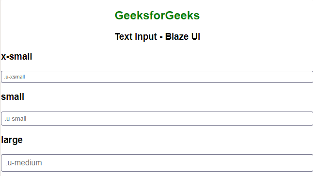
- Sizes Input: This is used to give what will be the size of the input when the user enters any data.
<input class=”c-field input-size-class” placeholder=”… ” type=”text”>
- Inline Input: This is used to take input in fixed block size in a single line.
- Fixed Width: This is used to set the width of a specific input field from the input group.
- Stacked: This is used to take input in a stacked format.
- Buttons: This is used to take input in a button format.
- Rounded: This is used to take input in a rounded format.
- Checkboxes and Radios: This is used to take input in the checkboxes and radios format.
- Fieldsets and Legends: This is used to apply Blaze’s styles to ensure consistent fieldset behaviors.
- Disabled Fieldset: This input is used to disable a fieldset which will disable all controls within it and Blaze UI will apply the disabled styling.
- Labels and form elements: This is used to take input in the labels and form format.
- Hints: This is used to make the hint visible at all times.
Example 1: In the following example we have created the input with colored input.
HTML
|
|
Output:

Example 2: In the following example, we have created the input using the small and large fields.
HTML
|
|
Output:

Reference: https://www.blazeui.com/components/inputs/


