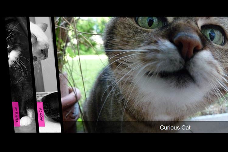
The accordion UI has long been a favorite of web designers. It’s handy for storing a significant amount of content in a limited space. Plus, it adds the kind of interactivity clients love on mobile and desktop devices.
Accordions are also evolving quite a bit. Thanks to advancements in CSS and JavaScript, it’s now possible to go well beyond the standard UIs we’re used to seeing. Everything from animation to alignment can be tweaked to create something unique.
Today, we’ll introduce you to eight accordion UIs that showcase what can be achieved with modern coding techniques. Let’s get started!
Pure CSS Horizontal Accordion by Aysha Anggraini
Accordion UIs have traditionally been vertical – but no rule says things have to stay that way. This horizontally-oriented snippet reveals content on hover. Even better is that there’s no JavaScript required.
See the Pen Pure CSS Horizontal Accordion by Aysha Anggraini
Funky Pure CSS Accordion by Jamie Coulter
CSS both powers and styles this accordion, turning it into an interactive event list. Animation is used to aid in tab transitions and introduce decorative icons. Overall, it’s a slick UI and demonstrates that accordions can be both useful and beautiful.
See the Pen Funky Pure CSS Accordion by Jamie Coulter
Minimal Accordion in React by Matthew Vincent
JavaScript libraries such as React are also fertile ground for building accordion components. This attractive snippet features smooth animation and a minimal design. It’s a perfect fit for modern web applications.
See the Pen Accordion – React by Matthew Vincent
Native Accordion with <details>by Giana
With the details HTML element, you no longer need other languages to create an accordion UI. As in this example, CSS is merely used as a way to enhance the styling. This native feature means great performance and more accessibility. Oh, and it’s also supported by all modern browsers!
See the Pen Native accordion with <details> by Giana
ARIA Accessible Accordion by Kiri Egington
Accessibility is a prime concern for all UI elements. For accordions, the focus is on more than just having readable fonts and acceptable color contrast ratios. The ability to navigate each section via keyboard is also important – which is where this snippet comes in. By using the TAB and ENTER keys, it’s possible to go through each section and consume its content.
See the Pen ARIA Accessible Accordion by Kiri Egington
Gracefully-Degrading <details>Accordion (Vanilla JS) by Keith Pickering
As we previously mentioned, an HTML-powered accordion is possible via the details element. However, the user experience can still be enhanced. Here, CSS and vanilla JavaScript has been used to add animation and calculate each section’s height. If a user doesn’t have JavaScript enabled, the UI will gracefully degrade.
See the Pen Gracefully-degrading <details>accordion (Vanilla JS) by Keith Pickering
Pure Accordion CSS by Tuna
This pure CSS accordion demonstrates what a few clever design features can add to the mix. The author makes great use of typography to ensure that each section’s title stands out. In addition, hashtag links are used to theoretically take users to related subjects. There are a lot of possibilities to fit into a relatively tiny space.
See the Pen Accordion by Tuna
Responsive CSS Accordion Gallery with Zoom Animation by Daniel Subat
An accordion-based photo gallery? Not only is it possible, but also very nicely implemented in this snippet. There’s a lot to explore:CSS image filters, hover effects and transforms make for a compelling UX. Despite all of that goodness, the amount of code behind the scenes is minimal.
See the Pen accordion gallery zoom animation (css, responsive) by Daniel Subat
Bring Out the Accordions
Accordion UIs have withstood the test of time. Thankfully their looks have finally caught up to their utility. Designers can take advantage of the latest CSS to achieve virtually any style, while JavaScript can add advanced functionality.
Perhaps the biggest revelation is the ability to create these interfaces using native HTML. This puts compatibility and accessibility at the forefront. It also ensures that we’ll be adding accordions to our projects for years to come.
Want to see even more examples of what accordion UIs can do? Check out our CodePen collection.

